The two very distinct entrances of each store
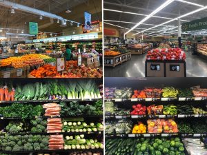
For the Grocery store project, I decided to focus my research on comparing five different categories between Whole Foods and Walmart, in order to understand the difference in material culture and implications that separate both stores, aside from prices. The first category focused on the entrance of the stores. On the left picture, we have the entrance of Whole Foods, which was full of plants, fresh fruit, and a few boxes of niche drinks like La Croix. Personally, when I walked in, I felt more invited, the place was very decorated and it felt like it was inviting you into the experience of the store by giving you a snipped of the kinds of things inside. Also, the decoration and the lighting made it feel more of a local and home like place that attracts customers, and encourages the ideology of Whole Foods being an experiental place. In contrast, the picture on the right shows the entranc of Walmart, which was fully empty and was very spacious and big. The place felt very familiar because I am used to the Walmart structure, however it can be said that it is not very inviting or appealing and feels more like you are walking into a hardware store or a storage place. Moreover, the lack of decoration and poor lighting just made it feel more empty and poor, which gives into the idea that Walmart is not an experience but rather just a quick trip to buy what you need.

Comparison of the produce sections and their arrangement
For the second category I decided to focus on the produce section, meaning all the fresh fruits and vegetables that are found at the very entrance of the store. When you walk further into Whole Foods, you find yourself directly in the produce section, and everything is laid out perfectly in the shelves and the tables. In itself, it looks way too perfect, all fruits look perfectly colored and organized, and everything looks appetizing and even healthy. Moreover, nothing was packaged, and everything was said to be fully organic, with labels of where it came from. Personally, I was very impressed and amazed, giving into the experience of being at Whole Foods, yet it made me begin to wonder about the selection process to provide the best of the best and the most organic. Definitely, this is a place for people who have the interest and the money to afford this kind of service and product. On the other hand, the produce section at Walmart (seen on the pictures on the right) was located a few steps after the entrance. Although the fruits and vegetables were organized almost identically as in Whole Foods, the main difference came from the fact that most products were packaged and had labels all around concerning the price, meaning that they were mass produced rather than local. Moreover, the difference in lighting and position of the section was a big impact into the appeal of the products; at Walmart there was a lot of light but the place was immense, making the produce look less appetizing. Similarly, the main focus on this section was on the low prices, whereas at Whole Foods it was on the organic, fresh, and niche nature of the produce.

The meats and cheese sections of both stores
The third section I analyzed focused on the meats and cheese sections. On the left we can see these sections for Whole foods, and it is clear that the products are presented out to the public to choose, and there seems to be no packaging whatsoever, further portraying the organic and fresh nature that Whole Foods has. Moreover, given that they seek to make buying more of an experience, the sections are located in counters, for the customers to ask for the products to the workers, who would serve to explain and suggest about the different selections. In the case of the meats, they all look very fresh and appealing, and the way they are presented seems almost perfect, making me think more about the selection process; what do they do with the meats that are not as aesthetically perfect? In the case of the cheeses, there is a huge variety to choose from, and there were even lots of free samples to try new cheeses from different parts of the world. In contrast, we have these same sections for Walmart, which presented the products fully packaged and processed, for the customers to serve themselves to whatever they wanted. I think the main two differences come in the idea that at Walmart, the customer knows what he/she wants, and just goes and selects the brand they want, grabbing the package by themseleves, which allows for a faster process of shopping. However, the products do not look very appealing and seem less organic and healthy. There also seems to be less of a variety, which further helps the point that the customers know exactly what is in there, and what they want to buy, and if they don’t know, it seems to be like the many labels help them figure it out easily.

Comparison of the selection of alcohol in the stores
For the fourth category I decided to look at the alcohol sections, mainly wine and beer, in both stores. We can see on the left that Whole Foods had an entire section full of craft and artisinal beers and foreign alcohol, like sake, that satisfy a more niche customer with a particular taste in these. I thought it was really interesting how there was a lack of common brands, and everything seemed to be very exotic and exciting. As for the wines, there were four isles with bottles of wine divided into countries of origins. All of these seemed to be very expensive and quite exotic, once again targetting to a more wine-knowing audience. However, my main observation comes to the fact that the wine section is about five times bigger than the beer one, which is quite small for that matter, making me think that Whole Foods targets both an older audience, but also a more “sophisticated” and maybe pretencious. On the right, however, we have the beer section at Walmart, which was full of big cases, kegs, and 12-packs of generic brand beers like Budlight and Budwiser, clearly targeting a broader audience that both includes older and younger people. In the case of the wine section, it was one side of the isle that contained different wines separated by prices, staring from cheap boxed wine, to some very expensive ones. Once again, my main observation came with the size of the sections, the beer one was about 3 times bigger than at Whole Foods, and it seemed like it was targeting audiences buying in bulk for parties or events, as everything was sold in packs. Moreover, the wine section was significantly smaller at Walmart, and the difference in categorization show the different type of customer and their interest.

Comparison of the different bags provided
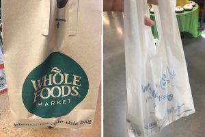
For the last section I decided to analyze and look at the different types of bags that the stores provided when buying products. We can see the bag from Whole Foods on the left, which is made out of recycled paper, and is fully reusable and recyclable too. Moreover, the bag seems to give more of a environmentally friendly, but also aesthetic vibe that gives into the whole idea that Whole Foods is more of an experience through all of its phases of consumption. The bag also indicates that the users are also concerned about the environment and have the same type of ideology, creating an audience that shops at Whole Foods for the quality and the experience of saving the environment and being healthy in every aspect. However, on the right we have the bag for Walmart, which was completely made out of plastic, and seems to be very cheap to make for the store to use. In itself, the bag is very simple and serves its purpose without the need of anything in particular to make it appealing, given that customers are probably just gonna throw it away. Moreover, the bag is exactly the same to every other store’s plastics bags (Target, Walgreens, etc.), excpet for the Walmart print on the front. This just proves that Walmart cares more about the purchase, rather than the whole experience of buying, being more focused on the customers buying more.
It is clear that both stores have very different stories and aims when it comes to their customers. Whole Foods looks to provide organic, healthy, exotic, and niche products for an audience with a very particular taste, as well as caring for the environment, and looking to make buying an entire experience. Walmart, on the other hand, looks to provide the best deals, every possible product, and every big brand for a broader audience that includes pretty much everyone. Morever, they look to make buying affordable and accessible, and focus on the capitalist nature of buying.