Flowers at Whole Foods

Flowers at Walmart
The first thing I saw when walking into both Whole Foods and Walmart was flowers. However, the flowers at Whole Foods were much more expensive than the ones at Walmart because the ones at Whole Foods appeared to be arranged in a nicer way. Along with this, it was clear to me that the flowers at Walmart were set up at the entrance for a special occasion, in this case Easter, while the flowers at Whole Foods were less obvious in this aspect, because the flowers at Walmart were decorated with colors associated with spring. This may be because the Walmart flowers are arranged and set up to catch the consumer’s attention to sell these flowers before Easter passed.

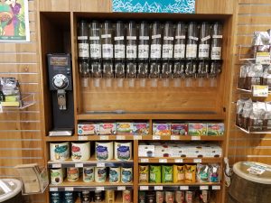
Coffee at Whole Foods

Coffee at Walmart
The coffee at Whole Foods was set up as dispensers above packets of coffee. This display is much more aesthetically pleasing than the set up at Walmart, which simply consisted of bags/cans of coffee on shelves. The fact that the coffee at Whole Foods is more aesthetically pleasing than the coffee at Walmart supports the idea that a shopper pays for the experience of shopping at Whole Foods while Walmart is just a store where a shopper buys something and leaves soon afterwards.

Chips at Whole Foods

Chips at Walmart
The chip section at Whole Foods is not only much smaller than that at Walmart, but it also appears to be much healthier. This appeals to the type of customer who shops at Whole Foods, someone who is very health conscious and is willing to spend more money for healthier options. A customer at Walmart, however, most likely is looking for the cheapest option rather than the healthiest option and therefore does not mind buying a less healthy option.

Prepared Food at Whole Foods

Prepared Food at Walmart
The prepared food section at Whole Foods appeared to take up a larger part of the store than the same section at Walmart, further supporting the idea that one is meant to stay at a Whole Foods for a longer period of time than at Walmart. There was also more variety at the Whole Foods, including a sushi bar, than at Walmart.

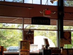
The restroom sign at Whole Foods

The restroom sign at Walmart
Finally, the restroom sign at Whole Foods was easy to find, much easier than the sign at the back of Walmart. Whole Foods’ sign was also written in prettier font than the sign at Walmart. As opposed to the sign at Walmart, which appeared to be fitting for a hardware store, the sign at Whole Foods was inviting and made the store seem cozier.
As seen through the sections compared at these stores, it can be concluded that while one goes to Walmart to buy products, one pays for the experience at Whole Foods.