By: Marian Silvera Hariton
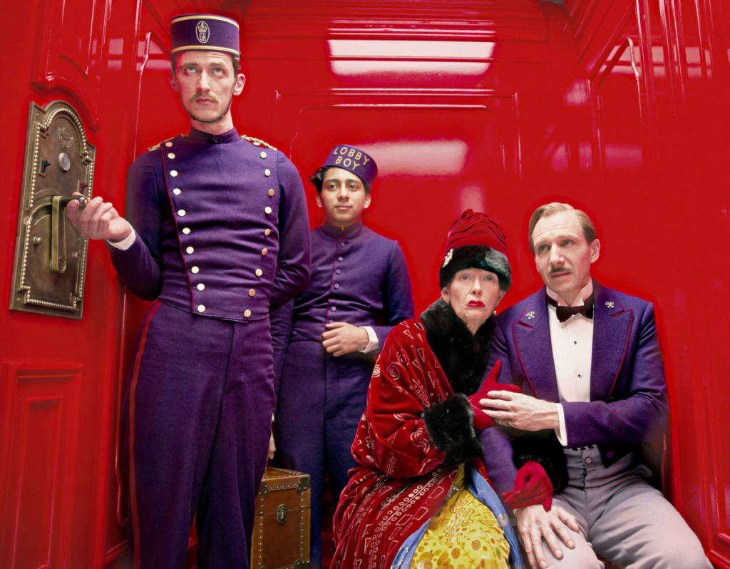
Greetings, Dear class. Before reading my analysis, please watch this excellent YouTube video that deep dives into the Mise-en-scène in Wes Anderson’s films, especially “The Budapest Hotel.” This video talks about how Anderson uses symmetry in almost every shot throughout his films. The video highlights how this symmetry tells us a story about the relationship between Zero and M. Gustave. It shows how, in the film, when they first meet, Zero is always positioned on the back of M. Gustave, showing their distant relationship, and as they gradually get closer as friends, they appear together in the shot. More on this in this video by Joseph McNairy: https://www.youtube.com/watch?v=0pyHqCJEIjc.

Zero and M. Gustave are not portrayed as equals at the film’s start. Zero needs to work to gain M. Gustave’s respect.

Now, onto my analysis:
Anderson utilizes mise-en-scène as a visual and thematic guide in the Grand Budapest Hotel. Meticulously designed sets, distinct color palettes, and impeccably symmetrical shots create a surreal world. Also, the changing aspect ratios of the movie, signaling different eras and time periods in the film, add complexity to the storytelling.
The relationship between the film’s environment and mise-en-scène is profound. The Grand Budapest Hotel is not just a backdrop but almost a character. Each corner of the hotel narrates a part of its story – from when it was at the height of its glamour to its gradual decline. The story shows Gustave’s journey from a high point of success to a period of relative obscurity. The attention to detail in the set design immerses the audience and enhances their connection to the environment’s evolution.
The film’s structure is like a series of compartments, each with a unique narrative element. This mirrors the film’s overarching theme of storytelling, as characters share their memories within the broader narrative framework. These thematic compartments keep the audience engaged and curious, ensuring there is always something new to discover as the story unfolds.
In “The Grand Budapest Hotel,” Anderson masterfully captures the essence of nostalgia, evoking a longing for the past, be it the charm of the pre-war era or the purity of youth. These contemplative moments and the significance of memories add depth to the characters and the plot, connecting with those fondly remembered days gone by.
The film emphasizes the role of memories in shaping the narrative. Storytelling preserves them and provides meaning to the past, motivating the characters. It explores the intricate relationship between narratives and memories in shaping identity and the story.
The film focuses on the idea of returning, which triggers emotions and unresolved issues that eventually lead to closure. Characters revisit the Grand Budapest Hotel and confront their past, a theme many people can relate to.
The film also incorporates historical context into its storyline in a subtle way. The political turmoil of the time, including hints of fascism, Nazism, and communism, serves as a backdrop. It reminds us of the historical context but focuses on Anderson’s unique narrative. The historical elements contrast the characters’ personal dramas with the broader historical events unfolding in the background.
In summary, “The Grand Budapest Hotel” is a masterful exploration of storytelling, memory, and nostalgia, infused with Wes Anderson’s signature mise-en-scène and distinctive narrative structure. While the film lightly touches upon historical themes, it primarily revolves around the profound influence of memories and stories in shaping our identities. It is a whimsical, visually captivating, and thought-provoking cinematic experience that invites us to reflect on the enduring power of narrative and memory in our lives.

Question for the class:
How do you think Wes Anderson’s use of mise-en-scène, particularly in the meticulously designed sets and distinct color palettes, contribute to the overall themes of nostalgia and storytelling in ‘The Grand Budapest Hotel’?
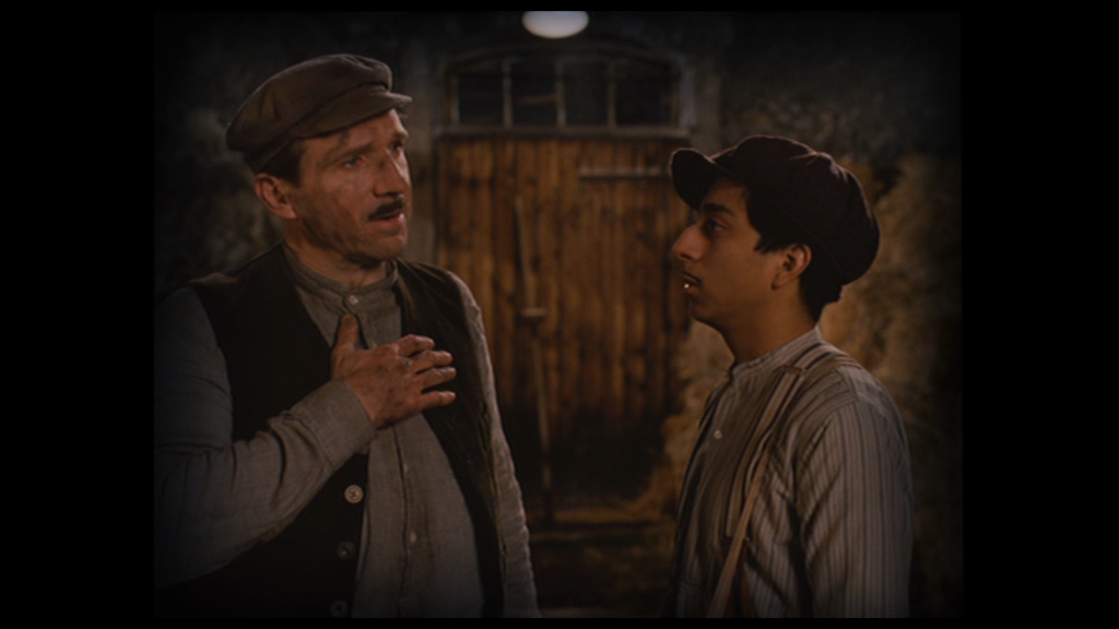
Hi Marian! Thank you so much for such a detailed analysis of the film. After watching the video you attached and the article you have written, I have gained a way more profound understanding of the film. Especially the role of color and symmetry in this film has helped so much with nostalgia and storytelling. For example, when Zero recalls his past memories that were happy, such as his time with Agatha, the camera would focus its center on Agatha’s face, filled with vibrant and warm colors, signifying happiness. In contrast, during Agatha’s saddest moments, the memories turn into dark and white, and it is often filled with snow (Joplinng riding his motorcycle in the snow, and the soldiers shooting Gustave in a snowy weather). Therefore, it is reasonable to deduct the Snow and the colors black and white signifies sadness and negativity in this form.
In addition to color, I believe that symmetry also plays a huge role in this film. I have noticed quite alot of the scenes in the film are symmetrical, and the video you posted has answered most of my questions regarding the symmetry signifying Zero and Gustave’s ongoing relationship. From Zero being a background as a lobby boy to sharing half of the frame with Gustave (signifying him becoming Gustave’s equal). Ultimately, The GrandBudapest Hotel is a great example of a film that maximized its use of color, form, and space to aid storytelling and nostalgia.
This is a wonderful analysis of the Mise-en-scène in the movieThe Grand Budapest Hotel. I just want to go a bit deeper into the color patterns and symmetrical patterns used in the movie. I consider this film as an absurd comedy with a deep underlying message. For M. Gustave, his lifelong journey was first a absurd comedy: being guilty for killing his wife, stolen the painting which actually belongs to him, experienced such a tortuous way to prove his innocence… The film maker uses the overall coloring to make a contrast between a nicely, wonderful pictured scene to such a mysterious and absurd story. This aims to make the film funny, by juxtaposing a wonderful colored and symmetrical designed scene with a somehow absurd and “stupid” character behaviors. Moreover, for storytelling, every scene was actually designed to put the speaking character in the very middle of the screen, and the switches between scene to scene follows the exact same pattern. I believe this creates a more direct “storytelling-like” feeling, as the story was actually being told by Mr.Zero, by the writer, by the film maker, to the audiences.
Hi Marian! Excellent analysis and an interesting video. It helped me understand the elements and choices Wes Anderson makes in the film. It also aids the viewer in appreciating how every choice the director makes is purely intentional, down to the aspect ratios and props. Every single decision tells a story! What a wonderful way to learn about Mise-en-scéne.
In your analysis, you mention that the film’s structure is like a series of thematic compartments. This idea brings to mind the several boxes shown in the film, for instance, Mendl’s pastry boxes. This recurring image becomes a motif. I also noticed how the film is divided into chapters, so as to compartmentalize the narrative. Boxes remind me of gifts and surprises, and there is one at every turn of this movie. And they also remind me of memories, which sometimes we keep in boxes, evoking the theme of nostalgia.