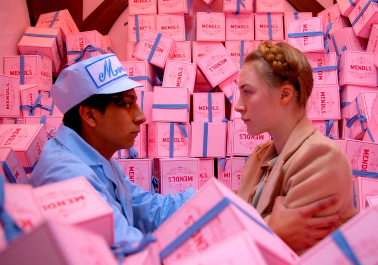
In Wes Anderson’s The Grand Budapest Hotel, many elements of mise-en-scené are coherently utilized throughout the film to tell the story of a once bustling hotel during the time under bureaucratic rule. Wes Anderson’s films are known for being aesthetic: beautiful punchy color schemes partnered with symmetric compositions, often also accompanied by dreamy diegetic music. These themes are apparent in almost all Wes Anderson films, giving him a very unique and recognizable style. Focusing on his film The Grand Budapest Hotel, this analysis will focus on Anderson’s use of color as a main element of mise-en-scené in the film.
The Grand Budapest Hotel is a story within a story within a story within a story. That’s 4 different timelines (and 3 different aspect ratios)! Wes Anderson uses a different aspect ratio for each timeline throughout the movie, making it easier for viewers to keep track of reality between timelines. Additionally, the aspect ratios were not chosen randomly for each timeline. Anderson wanted to match the most popular aspect ratio to the respective timeline. For example, all scenes filmed of the story of Monsieur Gustave/The Grand Budapest were filmed in 1.37:1, which was commonly used in films (especially silent films) during the 1930’s. This adds a touch of realism in the film and for us as viewers as it seems to transport us nostalgically through time.
Color! Aside from aspect ratio differences, we are faced with 4 different timelines with 4 different color palettes as well. These colors give us viewers a much deeper understanding of each timeline even if we don’t spend much time in them. The first timeline we are set in front of the Authors grave with toned down colors of grey, beige, and white. This setting with the young girl could be seen as “current reality” where colors are dull, there is no magic, and life is relatively mundane. With the later introduction of brighter palettes as we travel through time, we begin to see the stark contrast of mood and environment of “current reality” and the reality of the old Grand Budapest. In the second and third timeline of the author, and author speaking to an old Zero at the desolate hotel after the war, we begin seeing hues of orange, blue, and red. These semi saturated colors show signs of a once beautiful hotel that now feels lonely and wearied down over time. They play into a mood of bleakness, yet with a past. Finally as we are introduced to the story told by old zero, we are faced with bright colors of purple, red, orange ,and blue. These bright colors give Zero’s story a mystical feel, almost as if it were a dream. These transitioning of color schemes moves us in a way that feels nostalgic, with zero’s story’s bright colors as a remembrance of the “good old days” before the war and when the Hotel bustled with people.
Looking into only Monsieur Gustave’s world, we see more play with color scheme to display theme. The deep contrast of the brightly saturated Hotel, and the grey ZZ bureaucratic outside world convey themes of hopefulness and hopelessness throughout the story. For example in times of hardship and trouble we see Zero and Gustave dressed in grey behind grey background. Another example would be the brightness of the cake box in the grey and blue jail cell, showing hope of escape because of the tools hidden inside. Additionally the grey serves as ominous clues that something bad may happen next to our beloved characters. For example when the bright colors of inside the train are then contrasted by the grey soldiers and white snow when Gustave looks out the window in confusion. The use of these contrasts are also used throughout the story for comedic effect. When the grey colors of the outside ZZ world are then brought into the hotel when Gustav gets arrested, it seems unnatural hence Gustave’s own confusion and alertness when he starts running from the authorities. Lastly, colors are used to distinguish the antagonists and protagonists of the film. We see Zero and M. Gustave dressed primarily in purple, and the Antagonists such as Dimitri and Joplin are dressed in black. These colors are helpful for keeping track of the characters as well as their intentions. Brighter colors are normally associated with the good, and darker the bad.

Dear Anna,
I really liked your analysis of the use of color in this film. I found that at some point in the film, after staring at the reds, the purples, the yellows, pinks, and blues, your eyes get used to the color. I agree that Anderson uses this to contrast the “ZZ” and the other dark and drab villains of the film. However, I also think Anderson does this, gets our eyes so used to seeing these colors, so that when we see antagonists of the film, and the final train scene goes black and white, it’s so visibly jarring to us in the audience. I was physically taken aback in my seat during that scene, not just because of what was going on with the actors, but because the lack of color was so sudden and noticeable, it really had a deep effect on me.