Focusing on this weeks reading “Chapter 5, The Shot: Cinematography”, I will be walking through the cinematography of one of Sofia Coppolla’s first short films, Lick the Star. This 14 minute short film released in 1998, follows a simple story line, built into an angsty girl punk soundtrack. For context, the story follows a highschool girl Chloe and her friends as they devise a plan to get revenge on the boys at their school. Inspired by the book “Flowers in The Attic” Their idea called “Lick the Star” is later revealed to us as a plan to poison the boys at their school. Around the plot, the narrator Nadine navigates highschool after being absent for a period of time, and watches as Chloe uses her power in school up to her demise. As my favorite short film ever (I’ve probably rewatched this about 10 time) I’ve attached the link below for your enjoyment as well. ENJOY!!
https://youtu.be/61lC3U6qYrc?si=u4hwn4PLspx3YFF8
Lick the Star is shot on 16mm black and white film, giving the whole film a very homemade feel. Since this is a short film we are easily able to follow the main motif through Coppola’s use of tonality and changes of frame speed. Chloe’s dark lipstick and clothing signifying her power at school, which at the end is taken away as a rumor begins to spread about her. This change is shown in a series of tonal changes. The way Coppola put together each scene, with camera angles and manipulation of speed of motion, is also an element use to introduce Chloe and her dynamic throughout the film in a beautifully crafted intro scene.
In Film Art: An Introduction, Chapter 5 walks us through the elements of what make up cinematography. For Lick the Star we will be focusing on only the use of contrasts and camera movement, however other elements of cinematography throughout the film are also working towards the goal of the story telling. In the textbook the authors introduce the main elements that tonality consists of: contrast, and exposure. Contrast is defined as, “The comparative difference between the lightest and darkest areas of the frame.” Contrast can be high, medium, or low. Higher-contrast refers to more pronounced highlights and shadows, and less mediums in between. Low-contrast is the opposite. Since “Lick The Star” is filmed in black and white, we only deal with black, white, and gray. High-contrast shots are usually used in more dramatic contexts compared to more dreamy looking low contrast shots. Cinematographers are able to control contrast through lighting choices, film selection, and post-production editing.
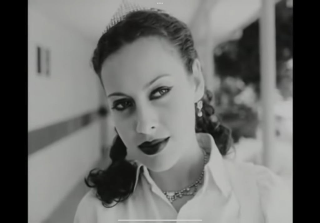
Chloe herself as a character is used as a source of contrast with her dark makeup, and dark clothing choices. This makes her stand out, reinforcing her position as “queen bee” in a visual sense. Further this contrast is then used against Chloe to show her losing her power at the end of the film as she becomes the victim of highschool gossip. (Attachment 1: Peak Chloe, Attachment 2: Fallen Chloe)
In Chapter 5, the authors also examine the use of speed of motion as a element of cinematography. Speed of motion can be adjusted in two ways: the speed (rate) that the film was shot, and the rate of projection afterwards. In “Lick the Star ” we see Coppolla’s manipulation of the rate of her film during the shooting process. Speed of motion is commonly used by cinematographers to add emphasis to specific scenes; for example to show high drama, or high power. A common (fairly generic) example would be when we see two characters fall in love, their meeting is usually in slow motion for that dramatic effect. These stylistic choices can be used to add suspense, show emphasis, distinguish fantasy from reality, and mark turning points in film. Very versatile!
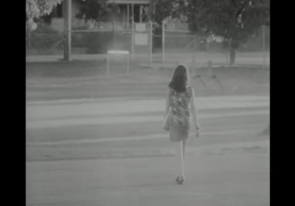
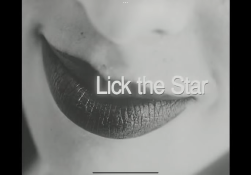
In Lick the Star, the amazing introduction scene (0:54-1:27) shows Chloe walking in slow motion through the halls of her highschool. This almost long shot show Chloe as “a cool girl” and probably very socially dominant in the context of her highschool. Extra notes: Note the times of clip cuts as they synchronize with the music score in the back. Close ups of Chloe’s eyes, and mouth introduce the contrast motif used throughout the film.


