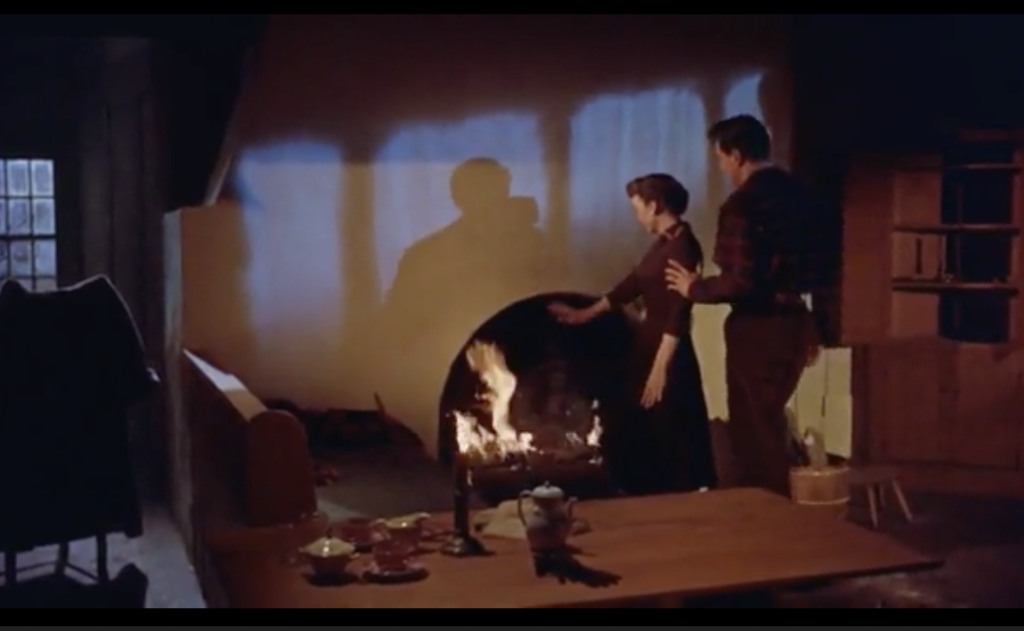
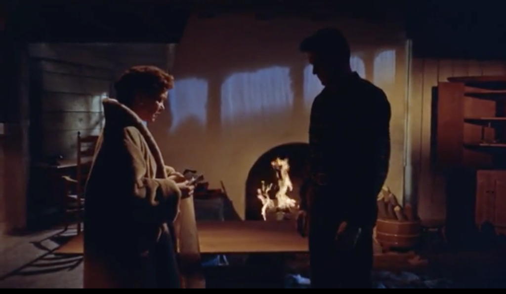
In All That Heaven Allows, director Douglas Sirk creates a cinematic environment in which we as viewers were supposed to take notice of. I think the first thing that should be discussed in this movie is the mise-en-scene, specifically in the scene where Cary initially rejects Ron’s proposal. In the first frame shown below, the lighting is very bright on both characters, illustrating the great place their relationship is in. This is emphasized with the placement of the characters, where Ron is touching Cary and in the next shot is hugging her from the back. In the shadow above the fire, it looks as if he kissing the back of her head. Everything in this frame is placed to signify their joy. Now in the second frame, moments after Cary rejects Ron’s proposal, the lighting on the characters is completely different, but with the same setting. In this frame, Ron’s character is essentially a silhouette, emphasizing his dejection, directly contrasting the first frame where he is completely shown and joyous. The use of props in this scene also contributes to the mise-en-scéne. Cary accidentally knocking down and breaking the tea pot that took “days and days” to find the pieces and build mirrors their relationship. The building of the teapot was the development of the relationship, Cary’s cheerfulness over it is the symbol of the intimacy of their relationship, and the breaking of it is the symbol of their broken hearts. Although in the end of the scene they do end up agreeing to get married, I think the symbolism of the teapot was a phenomenal mechanism of emphasizing the progress of their relationship in those moments.


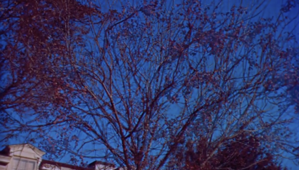
A specific type of editing I noticed was a constant use of dissolves. The specific transition that caught my eye was the use of the dissolve on the tree after Ron left for some time. As he leaves, the camera pans to the tree in Cary’s front yard, and then the tree’s leafs dissolve in the edit and the tree transitions from a fall look to a winter look. The use of dissolve to represent a passage of time is very effective and it is a very easy and visually pleasing for the viewer.

A final thing that I took notice of was the tempo of the shots in this film. Specifically in the scenes where it was only Cary and Ron, each shot was relatively long. In majority of their scenes, they are both always in frame rather than using shot-reverse-shot for their conversations, thus there is no need to keep high tempo with their shots. I feel this choice increases the intimacy in each scene and forces the viewer to really focus on both characters.
Overall, this film was entertaining to watch and was definitely well thought out by director Douglas Sirk in terms of mise-en-scéne and editing.
Hi Corey,
I found it really interesting how you talked about the tempo in the reverse shots. I did not consider how the speed in which the shot changes could evoke a feeling in the audience. However, to add to this, I think that the lack in speed in which the reverse shot changes could also evoke suspense or sorrow in the audience. For example, the scene where Ned is talking to Cary about his disappointment in her for wanting to marry Ron Kirby, the shot is a medium-close shot of Cary even when Ned is talking. This allows the audience to see Cary’s emotions and her expressions to everything that Ned is saying. Through your mention of the tempo, I noticed how the editing is really key in making the audience feel the complex emotions that the director wants.
Additionally, to add to your point about the transitions, I also noticed Sirk’s use of transitions. This compared to the other films that we had watched. I thought that Sirk utilized a lot more fading and soft transitions instead of hard cuts that I thought “The Grand Budapest Hotel” had. Both films I thought were strategic in their use of transition. As for “All That Heaven Allows”, I thought that the soft transitions allowed for a more intimate feeling and a sense of confusion that the characters were feeling, which transferred to the audience. In “The Grand Budapest Hotel”, I thought that the editing of the transitions allowed the film to be more fast paced, which fit the action that that specific film had.
Hello Corey!
I think your observations are great, I had an additional comment on the lighting during the proposal scene between Ron and Cary. Upon reading this I also thought of the “proposal” scene between Harvey and Cary earlier in the movie. During this scene, the focus is predominantly on Cary, with the shot being a close-up of her face as Harvey explains why he wishes to marry. Cary’s face is illuminated by the light in her home and they both stand at the doorstep, almost calling attention to their departure. Rather than situating both characters in light and in focus, the audience knows her feelings without being explicitly told at the moment. I like to juxtapose this scene with the proposal scene between Ron and Cary because Douglas Sirk places both characters in the frame, and for a moment, in light. Just as you said, Ron and Cary are at a happy point in their relationship and the lighting and staging appear to be direct proof of that. In the case of Cary and Harvey, there is never a visual cue provided to signify any type of attraction, represented by the difference in lighting/staging of both scenes.
Maybe this just jumped out to me but I figured it was pretty cool to draw direct parallels. Amazing job!