When watching The Grand Budapest Hotel, I always find the graphics aesthetically pleasing. After doing some research, you would not believe how much detail and effort Wes Anderson put into the symmetrical composition of the film.
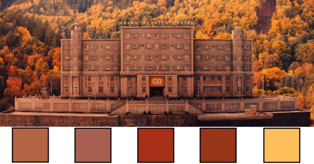
The inside of the hotel changed over time with new bosses and changing fashion. Even though Mustafa owned it all along, he probably didn’t pay much attention to the changes. He might have been busy traveling or too distant to care about how it looked. The colors inside matched the outside, both lacking excitement and following the latest trends, showing how the hotel lost its grandeur and became ordinary.
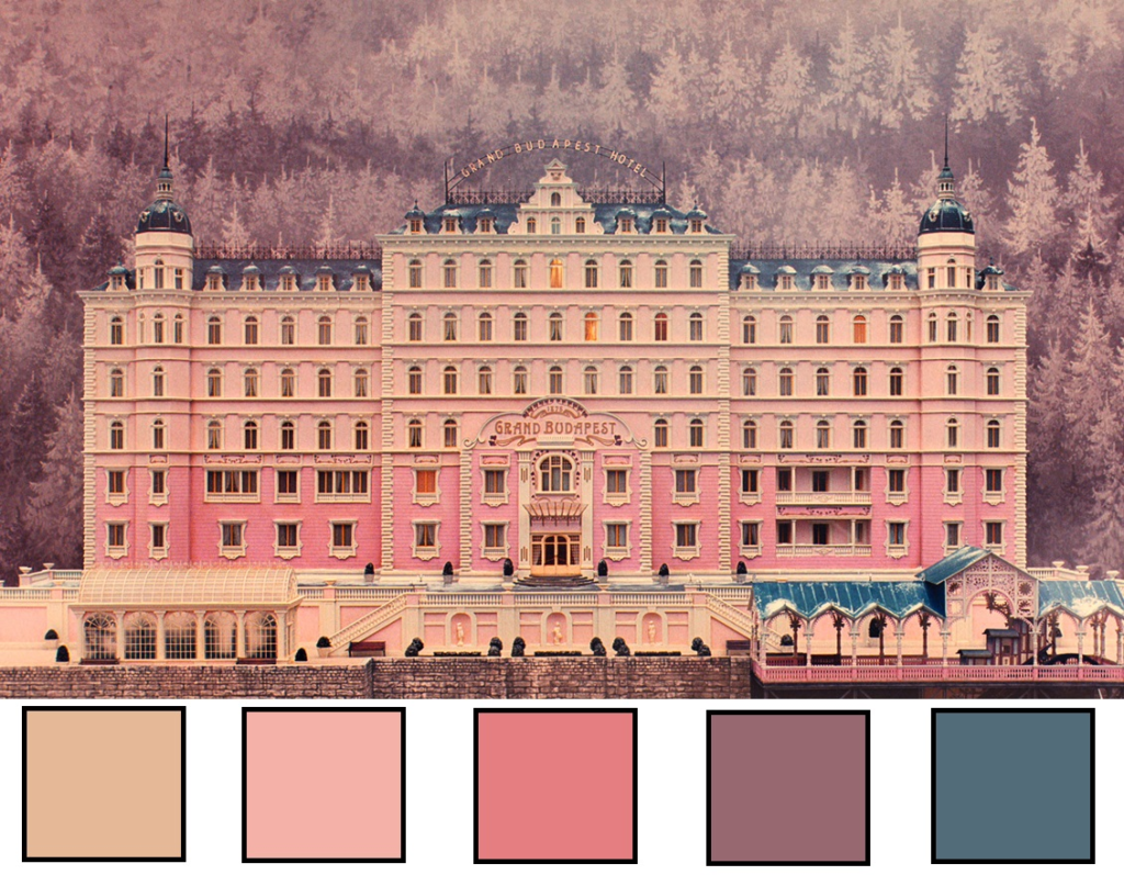
The colors used throughout the movie stick to a particular set of choices: creams, light pinks, deep purples, and rich reds. It resembles a pastry from Vienna, filled with creamy frosting and covered in soft colors like it’s waiting for a cherry on top. It looks so delicious, almost like you’d want to take a bite.
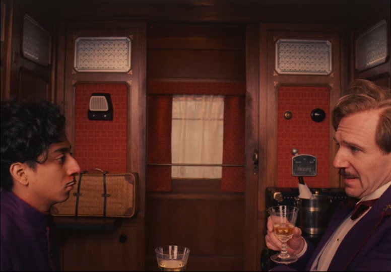
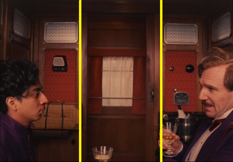
Wes Anderson follows a rule where he divides the frame into three parts. This helps make the picture feel balanced and comfortable to look at. For example, if we split it into three parts vertically, the middle part is empty, just a plain window with curtains. On the left, there’s a handbag that leads our eyes to a doorway and a character named Zero. On the right, M. Gustaf’s hand and a bottle of champagne frame the shot, ending with M. Gustaf himself. This makes the picture look nicely balanced and even.
Sources: https://papierhuis.com/2017/06/23/movie-madness-the-grand-budapest-hotel/