The term mise-en-scéne relates to all of the elements placed in front of a camera during a film. Wes Anderson displays mastery over all of these concepts in his film The Grand Budapest Hotel. However, his use of two elements, prop, and setting, is distinctly worthy of analysis. Anderson carefully crafts the world in which the story takes place and selects the objects the characters interact with to convey key plot elements in the film while maintaining a vivid and whimsical, yet heartfelt and nostalgic, style. One aspect of the setting and props that stand out is the use of text in the scenery and props to convey key expositional information.
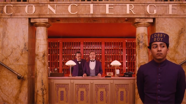
Though at some points in the film, words are added digitally onto the screen during the editing process, Anderson makes a point to use the text that occurs on parts of the set and props, like letters and newspapers, with legible lettering, in the film. The purpose of these shots is to help move the story along for the audience, providing them context for location changes.
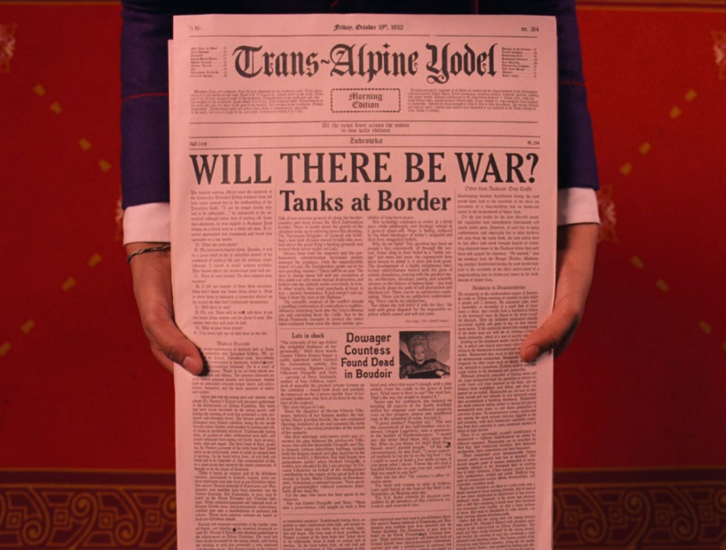
One example of this is the scene where Zero brings Gustave a newspaper. The audience first sees him exiting a small stand adorned with a large sign reading “PRESS,” keying viewers into the fact that exciting news will likely be revealed momentarily. Zero glances at the front page, then rushes to bring it to Gustave, once again building suspense. Finally, as Gustave looks down at the paper, the audience can finally read its contents, and two notable headlines stand out. The first, “WILL THERE BE WAR? Tanks at Border,” provides context for the political climate in which the film’s main plot will be taking place. Lower down, a subheading reading “Dowager Countess Found Dead in Boudoir” again provides viewers with information about the dowager’s death through props instead of dialogue. Here, Anderson’s choice to use bold fonts and physical text reveals these two grim plot developments in a lighter way, allowing a dark storyline to unfold while keeping the film playful.
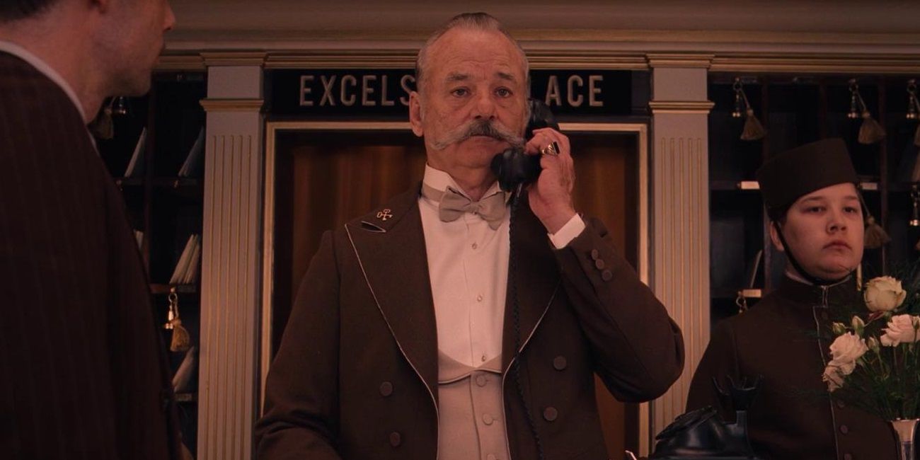
Text in the setting serves a similar purpose of providing exposition while maintaining style, including the writing outside Gustave’s prison and the signs on each hotel contacted within the Society of the Crossed Keys.

All of the text shown in the film was created by graphic designer Annie Atkins. Atkin’s told Adobe Create Magazine that around 95% of the time, the work she produces is not visible to viewers aside from a blur in the background. This fact emphasizes Anderson’s intention with allow the viewers to read typography at so many moments during the film. Atkin’s supported this point when she discussed the process of working with Anderson, noting that he “was completely involved in every aspect of his filmmaking, and [she] worked very closely with him. . . every day.”
While any aspect of Grand Budapest’s mise-en-scéne could be analyzed for its role in crafting a stylistically distinct piece, Anderson’s employment of text in Grand Budapest‘s props and setting is particularly notable. Each time text from the characters’ world is legible to viewers, it furthers the audience’s understanding of the plot while enhancing the film’s quirky and charming style, demonstrating Anderson’s attention to the details of his film’s mise-en-scéne.