
By Amy E. Elkins, former Manuscript Processing Graduate Assistant, Manuscripts, Archives, and Rare Books Library (MARBL)
In my previous post on Robert Lowell's Land of Unlikeness, I highlighted Lowell's time in prison for conscientious objection to WWII, and his collaboration with Harry Duncan at the Cummington Press during this period. The collection of Lowell's letters to Duncan includes correspondence about Gustav Wolf, the illustrator behind the Cummington Press edition's title page. Wolf, an accomplished artist and German refugee, and his wife Lola lived and worked at the Press with Duncan in the early 1940’s. During their stay, Wolf produced woodcut illustrations for the books, and his art had a particularly significant impact on Lowell's earliest conceptions of fine press book design.
In Land of Unlikeness, Lowell struggled to reconcile his Catholic faith with the complexities of war. Iconic images of faith are made grotesque and violent, depicting a world inhabited by the “apes of Lucifer” and “Christ the Drunkard,” where “A stray dog's signpost is a crucifix.” In the volume's introduction, poet Allen Tate describes the tension between poetry and religion as follows: ” [T]he Christian symbolism is intellectualized and frequently given a savage satirical direction; it points to the disappearance of the Christian experience from the modern world, and stand, perhaps, for the poet's own effort to recover it.” Lowell’s efforts were similarly recognized and lauded by Duncan.
The challenge of preparing an illustration for the book was assigned to Wolf. Writing to Lowell on August 3, 1943, Duncan explained, “There’s a possibility that the book will be designed and illustrated with a few woodcuts by Gustav Wolf, a German refugee at the Cummington hostel. He had a sound reputation for graphic work in Germany, and it’s my conviction that he can give more metaphysical power to a wood block than anyone else alive who’s work I’ve seen.” The metaphysical power of Lowell's poetry was to prove a good match for the skill and intensity of Wolf's craft. The thread of religious and political tension running through Wolf’s illustrations similarly ran through Lowell’s concerns about censorship. Early in the publishing process, Lowell withdrew a poem called the “Prayer for the Jews” because, as he explains, “everyone to whom I have showed it so far insists on misunderstanding as anti-Semitism!” (letter dated July 31, 1943). Lowell's wife, Jean Stafford, wrote to Duncan in an undated letter, thanking him for the woodcut sketches; having just been released from prison, Lowell chose the design he liked best. Stafford reflected,
The sketches are, perhaps, a little sacrilegious—a better word is blasphemous—but many of the poems are blasphemous in a sense and I’m afraid that he would not be given a Nihil Obstat if he asked for one.
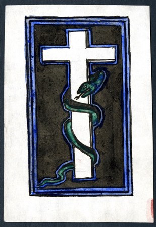
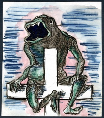
Included in Lowell's files in the MARBL Cummington Press collection are the woodcut drafts done by Wolf that Safford sent back to Duncan. The drawings are done in ink, colored by watercolor, and vary in their depictions of a grotesque figure clutching a cross.
|
Above: Ink drawings by Gustav Wolf. |
|
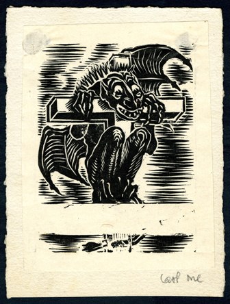
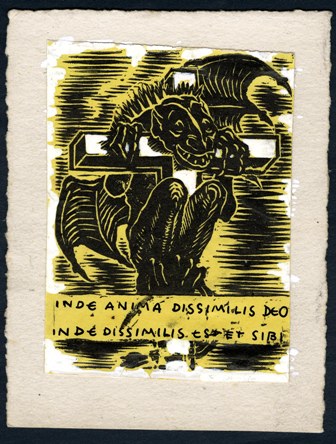
It is possible to further construct Wolf's process of design and selection through an additional mounted woodcut prints included in the collection. In these drafts, he tests colors and the positioning of two different monsters. The content of the woodcut and the poetry's religious themes are joined by the volume's epigraph. Lowell takes the book's epigraph from St Bernard: “inde anima dissimilis deo inde dissimilis est et sibi,” or, “a likeness no longer like its original is like itself no more.” Wolf leaves a space in his woodcut for the epigraph, joining the visual meaning of the image with the book's greater significance in a Catholic tradition.
|
Above: Mounted woodcut prints by Gustav Wolf. |
|
As observed by Lowell's wife, the sacrilegious aspects of the poetry are merged with Wolf's illustration. Not only was the result satisfactory to Duncan, Lowell greatly admired the book's powerful aesthetic. The clear, black and type on the title page is set off against the pastel blue of the woodcut illustration, just as the visual impact of the grotesque monster is softened by the delicate coloring. Lowell's small, first book of poems is simply printed but set off by its high quality and precise aesthetic. In praise of Duncan and Wolf's work on Land of Unlikeness, Lowell writes in 1944, “I think you did a beautiful job on my book. The paper, type and woodcut are all splendid.”
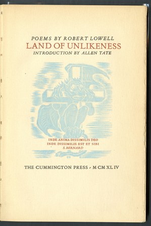
Title page of Robert Lowell's Land of Unlikeness, Cummington Press, 1944.
Lowell returned to Wolf's illustration as he worked on future poems. On June 11, 1944, he wrote to Duncan with a proposal for a new, formally experimental poem: “Would you be interested in a long (about 800 lines) satirical poem in blank verse? It is quite lucid and would be a wonderful foil for Mr. Wolf's wood-cuts.” Wolf and his wife had by that time left Cummington, but it is evident that Duncan's presswork and Wolf's illustration made an impression on the poet. Because MARBL holds the letters, illustration drafts, and finished book, it is possible to see the aesthetic, political, and religious conversations taking place around the conception and printing of Land of Unlikeness.
Visit the collection's finding aid to learn more about the material and the MARBL website to find logistical information such as hours and directions to the library.