Our last assignment furthered our archaeological analysis to the consumer location of supermarkets. By contrasting the “ethos groceries” of Whole Foods and Walmart, our class explored the identity, ideals, and inequality expressed in the material evidence of each location.
SIGNAGE

Marketing signage at Whole Foods

Marketing signage at Walmart
My first category of comparison focused on the signage found at Whole Foods and Walmart. As seen, Whole Foods markets the naturalness of their products, such as their “real food” and “better eggs,” while Walmart focuses on “low price” and “rollback” spending for better living. The signage serves as an indication of the priorities and values held by the store itself and of their customers.
PRODUCE PRESENTATION

Produce presentation at Whole Foods

Produce presentation at Walmart
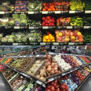
My second category of comparison examined the produce presentation at Whole Foods and Walmart. Although I expected more variance between the two locations, the types of produce seen and the overall presentation was relatively similar. Based on my past experiences with various Walmarts, this certain Walmart we visited appears to be more affluent and therefore may not be representative of all Walmarts; However, this may also indicate Walmart’s efforts for better produce in addition to their price. On another note, a distinct aspect about produce at Whole Foods was their shelves of pre-cut fruits in small boxes, a convenient and comfortable way to eat your fruits.
SIMILAR PRODUCTS — SIZING

Sizing of similar products at Whole Foods

Sizing of similar products at Walmart
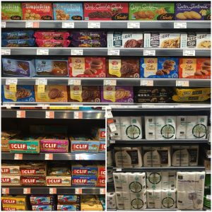
My third category of comparison looked at the sizing of similar products at Whole Foods and Walmart. While Whole Foods was selling small boxes of snacks, individual Clif Bars, and 12 rolls of toilet paper per package, Walmart had snacks in “Party Size,” 12 Clif Bars a box, and 36 rolls of toilet paper per package. Although there was overlap in the types of products seen, such as the Clif Bars, the amount per purchase clearly differs, and appears to affect the audience the supermarket appeals to. For example, in terms of being family-friendly, Walmart would be the better option.
MAGAZINES

Magazine racks at Whole Foods

Magazine racks at Walmart
My fourth category of comparison focused on the magazine racks found at Whole Foods and Walmart. In line with Serazio’s analysis of Whole Foods’ “ethos groceries,” I noticed that the magazines at Whole Foods’ speak of an implicit counter-cultural narrative. The “special collectors edition: Pink Floyd” and “Rock and Roll” magazines market to a small crowd of people. This is seen in contrast to Walmart’s “Cosmopolitan” and “People” magazine with captivating titles such as “Trump Plan to Take Out Kim Jong Un!” and “Trapped in a Bad Marriage” that serve to attract the general public. Essentially, the magazine choices at each location reflect the identity and interest of their customers.
APPEAL AND AUDIENCE

Appeal and Audience: Whole Foods’ Aesthetics

Appeal and Audience: Walmart’s Accessibility
My fifth category of comparison explored the potential appeal and audience of each supermarket by examining Whole Foods’ aesthetic and Walmart’s accessibility. Documented in my collage of images, the layout of Whole Foods is built on aesthetic living, highly appealing to the “bourgeois, bohemian, and baby boomers.” On the other hand, Walmart sustains a more unsentimental daily living of a vast public through low price and accessibility for the disabled (vehicles not seen at Whole Foods). There exists exclusive and unequal notions between the two supermarkets. Despite many negative aspects of Walmart seen through social media, this observation had me reexamine the preconceived idea of Walmart and to understand how this consumer location has become essential for certain individuals.