Great Value is the generic brand name found in Walmart stores.
“Values Matter” appeared as a tagline in advertisements for Whole Foods grocery stores.
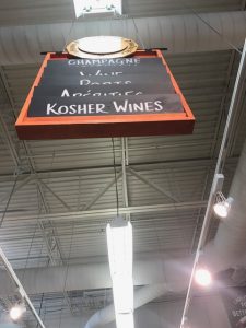
Figure 1.1 This image is of a sign hanging from the ceiling in Whole Foods that denotes what is in the aisle below.
Signage:
Off the bat, there are a lot of differences that stand out to me from the very beginning. While the green color of the Walmart signs are brighter, it is muted enough to where it is easy to find if one is looking to find it, but doesn’t necessarily stand out. Meanwhile, the Whole Foods sign has pretty muted colors like wood and black but taken as a color scheme, it really pops to the eye when walking around. Both of the signs have lettering done in white but the Whole Foods sign is much easier to read because of the sharp contrast created. So it seems that the two stores are putting emphasis on different things-
Walmart makes the sign easy to find and just as easily overlooked
Whole Foods makes the sign aesthetically pleasing enough to want to look at it without needing to know the information it provides
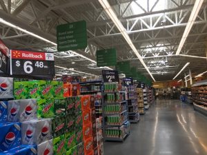
Figure 1.2This image was taken at Walmart. As can be seen in the photo, there are aisles upon aisles, the contents of which are sorted with the green signs hanging up above.
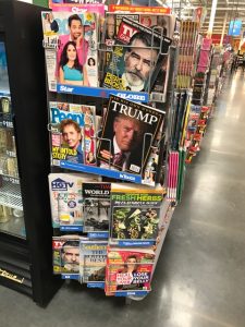
Figure 2.1 This image was taken in Walmart, by the checkout lanes. The rack is addled with entertainment magazines.
Magazines:
I think that this point of comparison provided for the most division between the two stores. While both grocery stores had magazine racks placed by the checkout lanes, the nature of the magazines were vastly different. As can be seen in Figure 2.1, magazines in Walmart were mainly focused on the entertainment genre. As can be seen in Figure 2.2, magazines in Whole Foods seem to be more focused on self improvement. The Walmart magazine rack had many more magazines and all of them had similar color schemes; they are almost all based on a white background with bright colors to get the attention of passerbys. At Whole Foods, the magazine covers seem to have more muted color schemes and in general don’t catch the eye with much urgency. These magazine racks are a good juxtaposition of what values each store caters to-
Walmart keeps with mass consumption and what the general public like to see
Whole foods concentrates its energies in providing options for being a more aware and better consumer
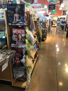
Figure 2.2 This photo was taken in Whole Foods, beside a checkout counter. Most of the magazines seem to be centered on self improvement.
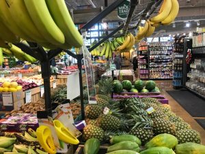
Figure 3.1 This image was taken at Whole Foods. The photo shows the selection of fruit available in one cart in the produce section of the grocery store.
Fruit and Produce:
This is an instance where appearances sometimes fool you at first glance. When comparing Figures 3.1 and 3.2, it almost seems as though produce sections in Whole Foods and Walmart might be maintained up to the same standards. While this would be nice, it just isn’t true and that can be seen in the details, especially in the spectrum of colors present. Walmart might have a more sprawled out produce section, it’s the same fruit and same colors over and over again. In Walmart, there is mostly yellow and orange and green and not much variety. Figure 3.1 shows just one segment of the produce section at Whole Foods which, while smaller in size, is condensed and situated much like what I imagine a Charming Charlie’s produce section might look like if such a thing existed. Whole Foods has a much larger spectrum of colors and places emphasis on this by organizing their fruit in a way so that all of the yellow-green fruit are kept together. These differences make different impressions of the stores when compared to each other-
Walmart likes to keep a large stock of common produce
Whole Foods puts emphasis on variety of produce available
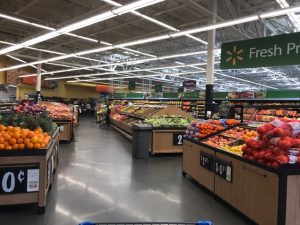
Figure 3.2 This image was taken in Walmart, in the fresh produce section. The image shows the displays of fresh fruit available for purchase in the store.

Figure 4.1. This image was taken at the Whole Foods the class visited. The picture is looking onto the meat and poultry corner of the store.
Meat:
The colors in these two scenes speak for the kind of aesthetic they represent. Whole Foods has large signage with bold lettering to catch the attention of consumers while keeping packaging and display minimalistic and in the same hues. Walmart, on the other hand, maintains the same color theme as the rest of the store in this section but has many different color labels on the same cuts of meat in order to show different companies and brands. The setup gives two different feels for the poultry section of the store-
Whole Foods holds resemblance to old-school butcher shops and their displays
Walmart keeps signature box store aesthetic with many choices all prepackaged and mass produced

Figure 4.2 This image was taken at Walmart, in the fresh poultry section of the store.

Figure 5.1 This photo was taken facing away from the entrance to Whole Foods, looking at the parking lot for the grocery store.
Parking Lot:
While this last section seems to have the least bit of difference between the two, it speaks to the different values of each stores. While each streetscape looks pretty similar, there is an absence of color in the Whole Foods parking lot that adds a sort of classiness or upscale-ness to the lot. Walmart has yellow traffic bumpers and red paint on the asphalt, which is not as aesthetically pleasing. It is also important to note that Walmart had very minimal parking on the surface lot and subterranean parking. Meanwhile, Whole Foods had a traditional sprawled out parking lot. This is significant because the location of both stores are prime, expensive real estate. So the parking lots go to show how the corporate values the specific location-
Whole Foods is making an investment that will pay off because it values it’s customer’s experience
Walmart is getting the most value for the property on which they are located by minimizing space, although it might be a small inconvenience for it’s customers.

Figure 5.2 This image was taken right outside of the front doors of Walmart, looking out at the parking lot and surrounding streetscape.
Ending thoughts:
Color tells a lot about in which stores place their importance and values. Walmart and Whole Foods live up to their advertised “values”.