I have never been able to see the blue and black dress either. Every few months or so, when that same picture of the dress resurfaces, I have to squint and strain my eyes, scanning each pixel for the infamous blue and black stripes. However, it’s the same old white and gold dress, engrained in my retinas.
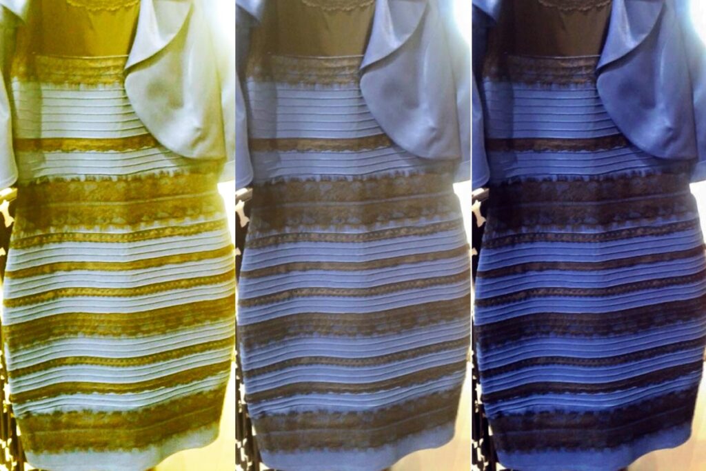
Figure 1: This is an example of the various illumination contexts the dress could be perceived under that would lead to the assumption that it is different colors, from high illumination to low illumination
I am not alone in my perception of this visual mess. About half of the population agrees that the dress in that picture is gold and white. I will not act like this is the only way the stimulus can be perceived and that anyone who disagrees is crazy; this is simply not true. The real problem is figuring out why the phenomenon is so apparent.
For starters, the dress is black and blue in real life. Half of the population that disagrees perceives the dress as under a certain illumination (Rabin, 2016). The difference in perception is all thanks to a small structure in the eye called the macular pigment (MP). The MP is located in the central retina and is responsible for the absorption of short-wavelength light (Loughman, 2010). This means that those with a higher density of MP can distinguish between warm and cool colors much more efficiently. A total of 19 subjects in the experiment saw the dress as black and blue, and 17 saw it as white and gold (Rabin, 2016). The experiment itself comprised of subjects being primed by a white screen on a 22′ ipad and then being shown the picture of the dress. The stimulus (dress) would be processed by the eye and then into the optic nerve and the occipital lobe.
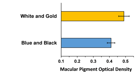
Figure 2: This graph from the paper shows the relationship between the volume of subjects that perceived the dress as either white and gold or black and blue and the density of MP in their eyes.
Looking back, I can see where the confusion about the dress’s color stems from; The light shining on the dress is likely yellow light, altering the colors more than white light would. Even beauty standards alter the context of the colors. I could never imagine the dress being black and blue because I think that color combination is very ugly for a dress. Regardless of its actual or perceived color, the dress has sparked a discussion on human perception that will last for years to come.

Figure 3: is an artist’s rendition of the difference in light that could be one of the causes for such a drastic difference in how the color of the dress is perceived
Resources
Loughman, James et al. “Macular pigment and its contribution to visual performance and experience” [El pigmento macular y su contribución al rendimiento y experiencia visuales]. Journal of Optometry vol. 3,2 (2010): 74–90. doi:10.1016/S1888-4296(10)70011-X
Rabin J, Houser B, Talbert C, Patel R (2016) Blue-Black or White-Gold? Early Stage Processing and the Color of ‘The Dress’. PLoS ONE 11(8): e0161090. https://doi.org/10.1371/journal.pone.0161090
Hi Naylah! I really enjoyed reading your post. I found it very informational and entertaining at the same time. I was the opposite of you when it came to seeing the colors of the dress; I used to always see blue and black. When I saw the image again after a while, I was able to see gold and white, but also black and blue. After reading your post, I can see how the MP and different lightings can have an impact on how people can perceive the dress as gold and white or black and blue.
Very cool on exploring the connection between perception and actual color absorption by the eye! I was also tricked by the same photo before, I used to be very certain that this cloth must be white and golden because of the visual cues caused by environment, but know I realize that there are multiple perspective that our brain could give to us based on such visual perception trick.
Naylah,
It was interesting to learn about the reasons behind the differing perceptions of the iconic dress. Personally, I have always seen the dress in its original black and blue coloring, but I have found it intriguing to understand why so many people perceive this completely differently. Finding out that a difference in the Macular Pigment is responsible for all of this resolves the uncertainty. I enjoyed your inclusion of an artist’s representation of the color theory behind this phenomenon. It helped me to see the realistic differences depending on the lighting surrounding the image. Overall, I really enjoyed diving into the individual differences that produce this unique image.