The Guardian recently posted a dataviz comparing Ebola to other infectious diseases. It’s from a forthcoming book entitled Knowledge is Beautiful and it is indeed beautiful. Unfortunately, it’s a really bad viz. Below is my alternative viz (using the Guardian’s data), along with a critique.
The basic issue is evolution. Because viruses reproduce quickly so they’re a great example of Darwin at work. Basically a win for a virus is to reproduce a lot. A lot, a lot, a lot. Darwin is simple that way. So once a virus has infected a host, it makes sense to breed like crazy. With one caveat: if you over-reproduce and kill the host, you might lose your transmission vector. So be careful. And if you wait too long, the host might recover: her immune system might learn how to wipe you out. So viruses have to balance virulence and transmission efficiency. You can kill your host quickly, but then you’d better have lots of means of infecting other people. Alternately, if you’re willing to let your host drag around for a week with the sniffles, going to work and school, then you don’t need to be especially infectious. The host will give you plenty of occasions to find new hosts. (I’m blogging with a head cold so this is personal). But overall we should see a clear pattern: more lethal viruses should be more transmissible.
Indeed, my viz below (using the Guardian’s data) shows this rough correlation between virulence and transmissibility. Salmonella doesn’t last long on surfaces, but instead it lets its infected host live and spread the disease through other means. C.diff and tuberculosis are more lethal, but they can survive on surfaces for longer. The Norovirus seems like an outlier, but this makes sense. It spreads primarily through surface contact, so its durability on surfaces is unexpected high. By contrast, Bird Flu is unexpected weak on surfaces, but it spread primarily through droplets. And Ebola is weak on surfaces because it spreads overwhelming through bodily fluid.
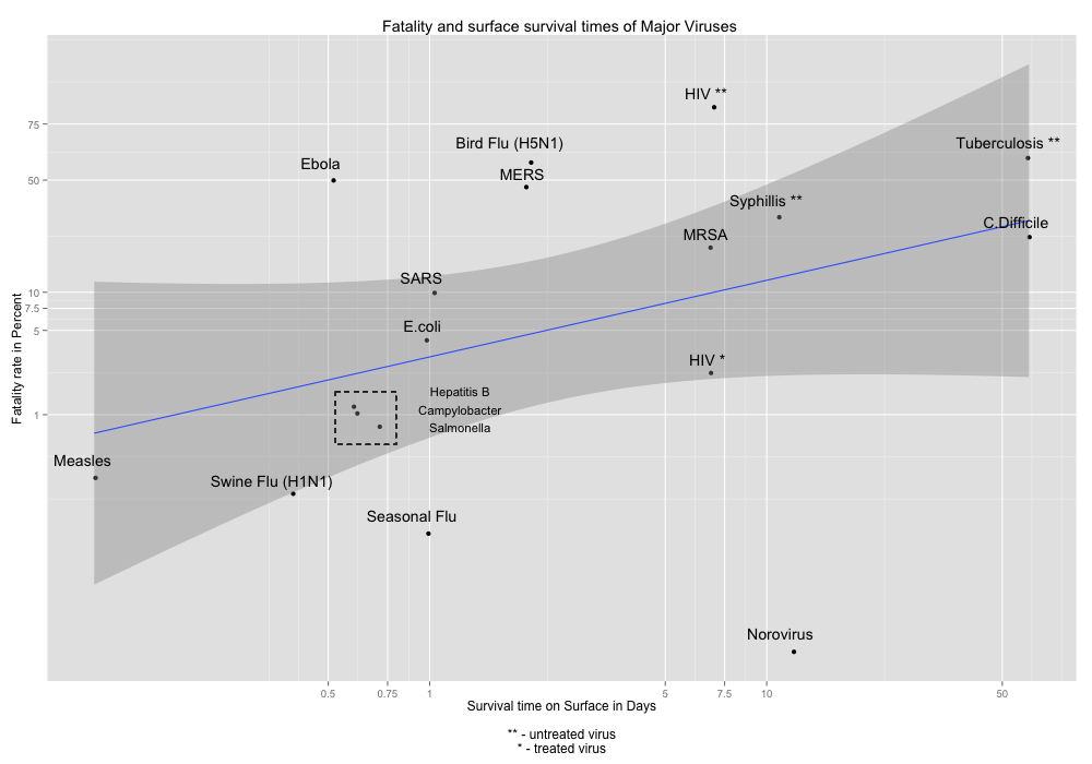
But it’s clear that the Guardian’s data is extremely buggy. The data are scraped from the web and are full of errors: HIV does NOT survive on dry surfaces for seven days. That’s probably seven hours. Same for syphilis.
An even bigger problem is that Guardian viz seems to refute Darwin. On their graph deadly diseases seem LESS infectious. What’s going on? First, their x-axis doesn’t make much sense. The reported average rate of infection doesn’t tell us about how well a virus might spread under neutral or ideal conditions. Rather, it tells us how people and public health systems respond to outbreaks. HIV transmission, for example, has dropped in around the world because people have intervened to cut off disease vectors. The difference in HIV prevalence around the world tells us about education, public health, and culture, but not much about the virus itself. Also the x-axis should be on a log scale. And the y-axis should be on a logit scale. Using the fatality rate on a linear scale builds a non-linearity into the relationship, since fatality has to asymptote near 0% and 100%.
So the Guardian graph is indeed beautiful. But it also misuses faulty data to refute evolution. Outside of that it’s great. I’m going to take more ibuprofen now.