Camera movement, while innocuous at face value, can drastically change the audience’s understanding of the film and its connection to the characters. Alfonso Cuarón’s Gravity is a masterclass in this idea, with the camera movement acting throughout the film as a physical representation of the inner emotions felt by the characters. Specifically, the most exciting example of this (to me) can be seen when Sandra Bullock’s character, Dr. Ryan Stone, and other astronauts aboard the satellite are first struck by debris. Securely fastened to a support beam, Dr. Stone is sent flying in a fast circle while Commander Kowalski directs Stone to disconnect so she doesn’t fly off to where she can’t be saved.
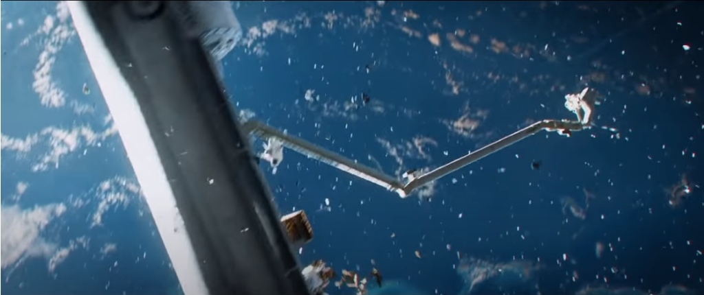
Above, we see an establishing, long shot of the crash as the camera continuously reframes Dr. Stone and the wreckage in the center. It is important to note the directions that the camera moves, changing x, y, and z levels, giving the audience a feel for how fast she is being thrown around (x and y) while also emphasizing the closer to the camera (farther away from Earth) she is traveling (z). However, while the spaceship is still in the shot in this scene, Cuarón wants to focus on the specific emotions of Stone.
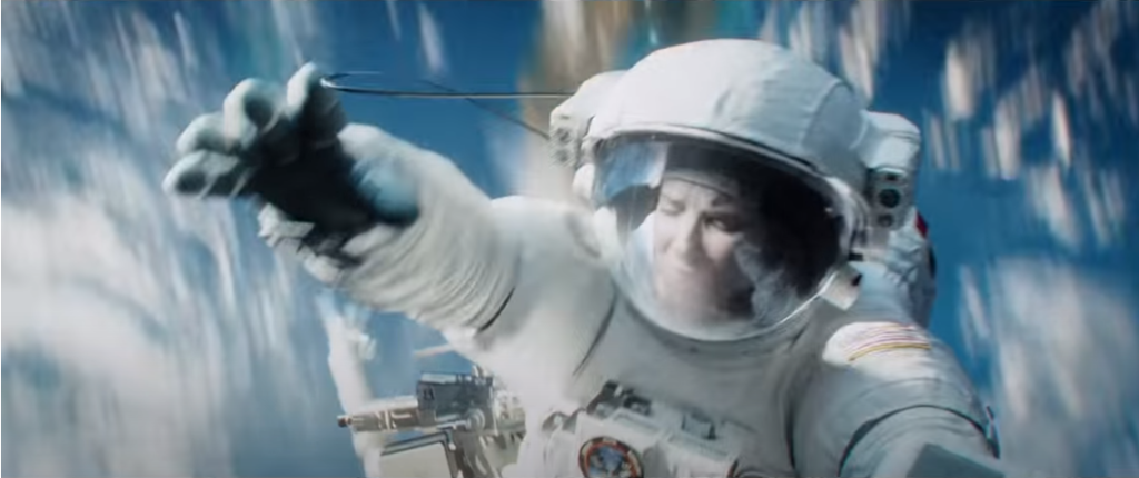
In order to accomplish this, the camera now solely tracks Dr. Stone, blurring the background in a flurry of white and blue to illustrate how quickly and uncontrollably she is spinning. Now, rather than viewing the wreckage as a whole, we are connected to Stone’s panic and worry. Since we see her face, we now become a part of this terrifying and intimate moment where she has to detach from the vessel. As the camera slowly pans down her body, focusing on her detachment, we feel a sense of urgency since we can no longer see the Earth or any other life around her.
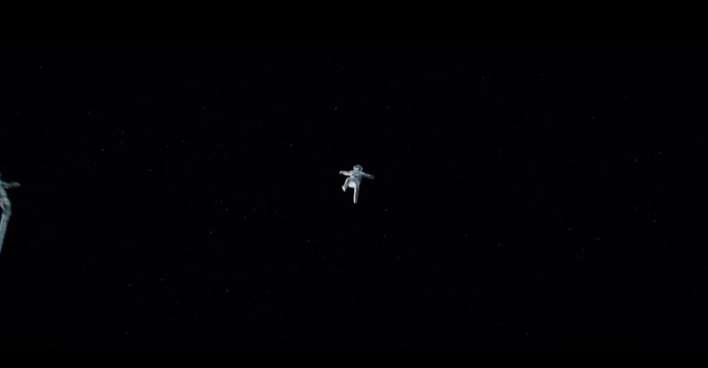
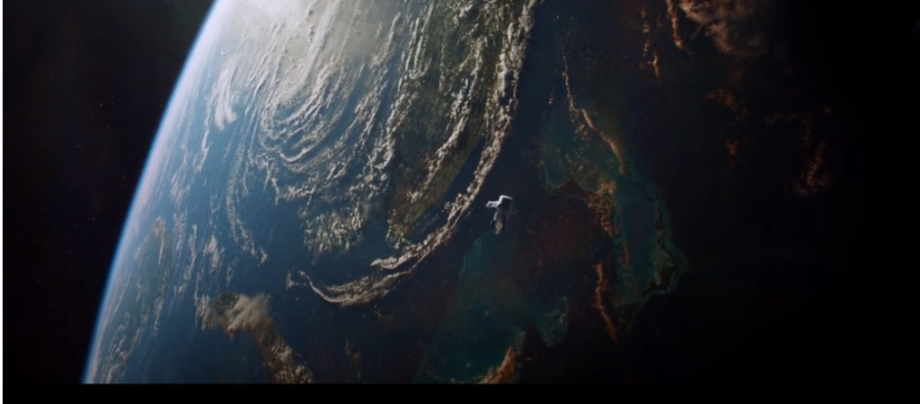
After detaching, the camera stops spinning. Rather than chaotically following Stone through the wreckage, we get this still long shot of Dr. Stone slowly moving away. The Earth, now behind the camera, is as far or as close as we can imagine. Yet, its exclusion from the shot makes us fear for her likelihood of survival as she is hurtled through space. The accompanying dialogue, Commander Kowalski repeating he has lost visual of her and needs a response, further fuels the stress the audience feels. However, this long shot makes the audience disconnect from Stone as a person since her face is now a small dot on the screen. Instead, she is just an “astronaut” who is flying through space. In the next scene, we are given a similar shot, this time with Earth in the background. This offers the audience the belief that she might still be able to be saved. However, we still do not gain an understanding of this fear until the next shot.
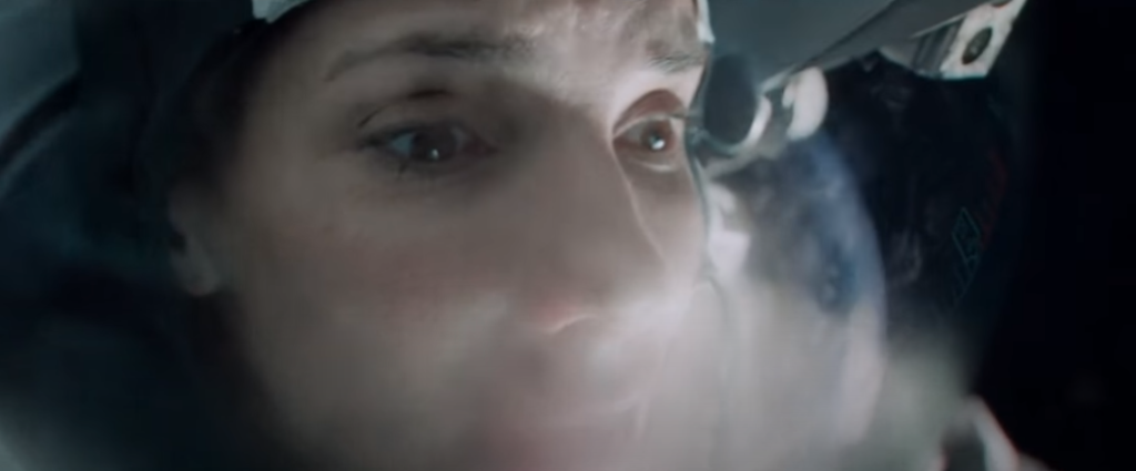
In the next shot, the camera now similarly follows the movement of Stone across the x, y, and z planes. First, the whole body of Stone is visible as she spins in circles, the Earth occasionally in the reflection of her helmet. However, the camera begins to slowly reframe and place Stone’s face in the center. This is what makes this close-up so impactful. It is one of the first returning shots to Stone, the character, rather than the “astronaut”, as the camera literally crosses into the camera helmet. What was an impersonal disaster now becomes intimate and real. The close shot of her breathing makes the audience conscious of their breath. Her darting eyes give the audience a panic unrivaled by previous scenes. We are now isolated with her, as she is flying through space alone with seemingly no help.
While there are plenty of amazing shots filmed throughout this movie, this one provides one of the coolest feelings that I’ve experienced during a film screening.
> . It is important to note the directions that the camera moves, changing x, y, and z levels, giving the audience a feel for how fast she is being thrown around (x and y) while also emphasizing the closer to the camera (farther away from Earth) she is traveling (z).
I agree with your insight into three dimensions being utilised to their full potential in this film. Both with the z axis as displaying her distance from Earth, as well as all three angles being used to show her spinning in circles, as mentioned later in the post. As you suggest, it would be incongruent with the film’s themes and in fact setting to maintain a consistent meaning to the x, y and z axes, as they are a meaningless concept when in a weightless three-dimensional void, and the film very much utilises this with a variety of total gyroscopic shots.
Your point regarding how “The Earth, now behind the camera, is as far or as close as we can imagine”, displays how this movie thoroughly utilises the out-of-frame component of framing, and how by very explicitly, in certain shots, placing the object of Stone’s attention behind the camera and out of frame, it doesn’t create curiosity or intrigue (as out-of-frame framing tends to do) but instead abject fear, as we cannot know Stone’s distance from the Earth.
I feel like it is a very keen observation on your part about the darkness of the space used as a tool to describe total hopelessness. I think space is perceived in two ways, one is a very dark and gloomy side, and the other is a very beautiful and magnificent part of it. When people talk about the beauty of space, they ten to think about the stars, nebulas, planets, etc. Whereas the scary part is often associated with the emptiness and darkness of space.
Director Alfonso Cuaron has made brilliant use of both these features. When the character loses all hope, they are surrounded by darkness and nothingness. This is supposed to signify hopelessness, and when the character is trying to survive they have shown the Earth side where people can experience hope. The reality of this is this is scientifically inaccurate. Space is covered with a million stars and there are no patches of complete darkness, there are shiny starts all around that cannot be hidden as there is nothing to hide those stars. I think the director here has used his artistic license to make us feel what the characters are feeling at a particular instant.
We can also note the part where Ryan’s helmet fogs up to show that he is breathing heavily. This also is scientifically inaccurate as astronaut helmets are designed in a particular fashion s that they do not fog up. The fogging up makes us feel more aware of the panic and mania that the character is going through. We can see that the director has used his liberty as an artist to give the viewers a solid understanding of what the characters feel and made us feel more in sync with the film, almost as if we are experiencing it ourselves.
I agree with the analysis of camera movement in “Gravity” as it illustrates how cinematography can be used to immerse the audience in a character’s emotional journey, turning an impersonal disaster into an intimate experience that lingers long after the film ends. The analysis of camera movement in Alfonso Cuarón’s “Gravity” emphasizes how important it is in determining how emotionally connected the audience feels to the characters. The conversation looks at a crucial sequence where Dr. Stone is struck by debris and thrown spinning into space. The camera’s dynamic movement during the collision effectively captures Dr. Stone’s confusion and danger, and the choice to concentrate on her own struggle increases the emotional impact. The use of still images and close-ups in the following scenes, especially when the camera is inside Dr. Stone’s helmet, forges an emotional bond between the viewer and her, elevating her from the status of “astronaut” to that of a real, relatable character. This examination emphasizes how effective cinematography is at evoking strong feelings and drawing viewers into the story. In “Gravity,” the camera plays a more active role than it usually does as a passive spectator, heightening tension and evoking strong feelings in the audience. Alfonso Cuarón’s clever use of camera movement serves as an example of the value of cinematography in filmmaking and shows how it may raise a story’s level of engagement with viewers.
I agree with your observation that the camera movement in “Gravity” effectively highlights how Alfonso Cuarón uses camera movement to convey the inner emotions and experiences of the characters, particularly Dr. Ryan Stone.
The changing directions of camera movement in the x, y, and z axes effectively communicate the disorientation and chaos of the situation. The shift from an establishing shot to a close-up of Dr. Stone highlights her panic and fear, drawing the audience into her emotional turmoil.
The analysis of the subsequent shot, where the camera follows Dr. Stone across the x, y, and z planes and gradually reframes to focus on her face, is yet another insightful observation. This shift from an impersonal disaster to an intimate and personal moment heightens the audience’s emotional connection with the character. The close-up of her breathing and darting eyes creates a visceral experience, allowing the audience to share in her panic and isolation.
Your interpretation demonstrates how the camera’s motion in “Gravity” functions as a potent narrative instrument, enriching the viewer’s emotional attachment to the characters and their trials in the harsh and relentless realm of space.
Absolutely, your insights into the camera movement in “Gravity” resonate with my own appreciation for how Alfonso Cuarón skillfully utilizes cinematography to convey the characters’ inner emotions. The dynamic camera perspectives across the x, y, and z axes brilliantly capture the disorientation and chaos of their predicament, but what strikes me most is how these movements mirror the emotional journey of the characters themselves. It’s as if the camera becomes a character, reacting to their experiences, and when it zooms in on Dr. Stone during moments of panic, it invites the audience to share in her emotional state. Moreover, the shift from an initial establishing shot to an intimate close-up of Dr. Stone signifies a turning point, transforming our perspective from viewing her as an ”astronaut” to connecting with her as a real and relatable person. What adds to the immersion is the sound design – the muffled sounds and eerie silence of space, juxtaposed with the harshness of breathing inside the helmet, further intensify the emotional experience. In essence, “Gravity” stands as a prime example of how the camera can be a powerful storytelling tool, immersing the audience in the characters’ emotional journeys in ways that are both innovative and deeply impactful.