When I watched Portrait of a Lady on Fire, I felt the film’s intensity, but I didn’t fully understand how Céline Sciamma managed to create so much tension with so “little” happening on the screen. Then I came across this video by lessons from the screenplay that breaks down one of the scenes, and it made me understand how every little detail was used to create this tension. The video essay argues that the power of the scene lies in the deliberate use of camera framing, blocking, pacing, and silence.
Initially, Marianne is framed as the observer, hiding behind her canvas, while Heloise sits exposed.
Sciamma makes a deliberate choice when Heloise challenges the dynamic, having Marianne go to hear in five steps, and in the director’s words, six steps would feel complete, but five steps feel as if there is still a question in the air, so the viewer is left wondering if the next step will be the kiss or not.
As Heloise challenges that dynamic, making Marianne understand that they are in the same place, Marianne flees the frame back to the safety behind her canvas. But now, the camera slowly pushes in on Heloise, enlarging her presence in the frame until she is framed as Marianne was at the start of the scene, and Marianne is reframed from Hélène’s point of view with an even wider frame, with their power dynamics completely reversed.
I appreciate how the video connects these techniques back to the film’s broader themes. The scene is more about than who has the upper hand, but dismantling the idea of power to dominate, instead creating equality between the two.
The only limitation I found is that the video focuses very narrowly on one scene, which does make the analysis for that scene very rich, but it doesn’t cover how the film’s overall painterly look and candlelit lighting contribute to the same themes. However, it further emphasized that Portrait of a Lady on Fire is not just a story of romance, but also of how cinematic choices can convey love, gaze, and equality, even without a score.
“A manifesto about the female gaze”that is how Director Céline Sciamma describes Portrait of a Lady on Fire. This theme was ever present throughout the entire movie and is so important for how we as viewer perceive the entire film and the characters within it. I believe to fully understand the power of having a movie be in the female gaze we first have to contrast it with a direct opposite. I want to contrast this movie for a second with a movie that I believe is “the male gaze” personified. The Wolf of Wall Street, in this movie women are merely props used to show the desires of men. They have no real purpose other than fulfilling fantasies teenage boys would have and it literally fails the Bechdel test, which if you don’t know is the criteria of having two named female characters speak to each other about something other than a man. The women are soulless, lacking depth in their characters as most of the time a woman is shown in this movie, they are either a hooker, stripper, or trophy wife. Of course, this movie was written and directed by 2 white men, that feeling that comes along with watching a movie where you can just feel that a woman had little to no input in the way women were portrayed in the film is overwhelming in this. It is the complete opposite of the beautiful, Portrait of a Lady on Fire.
Portrait of a Lady on Fire, takes us on a journey of gazing. From when Marianne first looked at Héloïse as her hood fell and she turned back to her posing for a portrait, to her being drawn while sleeping, to the very end when Héloïse called out for her to turn around and face her. This movie is all about how the artist views their subject, how a look can mean more than words can allow, and it feels like we are watching a subject, turn into a muse.
I watched this 12 minute breakdown video about “the gaze”within this film and this video creator quoted Jean Paul Sartre, a French philosopher, to help explain that she believes that the gaze always objectifies whatever we are looking at. Sartre said, “…we can not perceive the world and at the same time apprehend a look fastened upon us; it must be either one or the other. This is because to perceive is to look at, and to apprehend a look is not to apprehend a look-as-object in the world; it is the consciousness of being looked at.” In this movie, Marianne begins as just a painter, someone who is used to watching without really being seen herself. As her relationship with Héloïse progresses she strips Marianne of just being “the painter” she humanizes her. We learn about Marianne, we perceive her. One of my favorite scenes in this movie was when Héloïse asked her to come look from her perspective while she was posing, and it cemented our understanding that there is always 2 sides, as we look, we are also being looked at.
However, as we look at each other our predispositions, our stereotypes, our assumptions are being imposed onto whoever our subject is. Even if they are the complete opposite of who we initially think they are, we can’t help but to assume. As a woman, the female gaze in media has always seemed softer, more forgiving, more loving, more honest, more real. I watch movies made by men that have shallow interpretations of female characters, and maybe that’s how they view women. However, when I watch movies directed by women, they never strip the men of their depth and the women always feel more real, like someone you’ve met. I think this theme is ever present in this movie, because the women have life. They fall in love but they are more than just “love interests”, they have hobbies, passions, backstories, monologues, deep thoughts, they are themselves before they are lovers and I often think that movies made in the male gaze portray women as just props for love, sex, and heartbreak, as if all we can do in this life is be loved. Portrait of a Lady on Fire is important because it shows the female gaze so well. It shows the love, the empathy, and the understanding of one woman to another that is unspoken, yet perfectly understood. Along with this, we see women in a time period that is so restrictive, being free.
Our professor for this class said something about this movie that stuck with me throughout the entire screening, “this movie uses lighting in a way that is unique, the light looks like it’s coming from them, not at them.” I believe that is the female gaze in this movie, light coming from them, despite being in a oppressive time period, despite not being able to fully be in a relationship, despite knowing their fates, light comes from them, not at them. These 2 women (like all women) are incredible and resilient, deep and poetic, and fostered love in a circumstance that would normally breed anger and hate. That too, is the female gaze at work and it matters so much in media because women are more than just props for what men are going through. Women are multifaceted and they deserve to be shown on screen as such. This film is brilliant, I hope more directors use the female gaze, it is wonderful to see on screen!
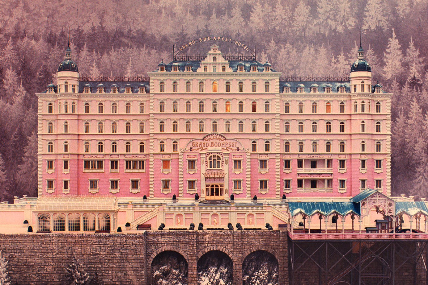
I found the video “How The Grand Budapest Hotel Uses Colour To Tell a Story” very interesting because it focuses on the colors highlighted in the film. It is embedded within the mise-en-scène’s elements through aspects such as setting, costume, and lighting.
The film has a structure of a frame narrative where multiple timelines are present. The film’s use of color and saturation shifts with each time period. The video highlights that in the 1930s, the golden age of the hotel, the film uses colors to establish a distinct mood. Specifically, vivid pinks, purples, and reds are used in the film to create a glamorous and romantic atmosphere. The significance of the era’s color reminded me of the prestige of the Grand Budapest Hotel in its prime throughout the film.
However, the post-war scenes (the 1960s) use calm beige, orange, and pastel blue tones to change the mood, emphasizing the Hotel’s decline and nostalgia for its former glory. The faded colors in the post-war scenes made me feel that the strong identity and prestige of the Grand Budapest Hotel had vanished.
The film uses more natural colors when the timeline is in the present, the 1980s. These color and saturation differences from each time period let the audience recognize how the film changes its narrative. The color itself is not an independent element of mise-en-scène; rather, it works together with setting, costume, and lighting. These aspects create an iconic style and atmosphere for each time period in the film.
The video also mentioned how the aspect ratio changed for each narrative frame. The film used a 1.37:1 ratio in the 1930s scenes, a 2.35:1 ratio in the 1960s, and a 1.85:1 ratio in the 1980s. It was fascinating that the film employed different aspect ratios for each time period, each reflecting the most common ratio of its time. These ratios highlight how mise-en-scène is not only decorative but also a narrative strategy that links the style with historical meaning.
While looking into how Wes Anderson made The Grand Budapest Hotel, I came across a 2014 YouTube interview with him (ScreenSlam). The interview provides important insights into Anderson’s cinematic approach and the artistic decisions used in the film. This new perspective will help us form new opinions on the film and gain more insight into the planning process that goes on behind every film.
Anderson starts the interview explaining that the movie is “partly inspired by Hollywood movies, maybe from the 30s that were set in places like Warsaw and Prague, and Budapest” (Anderson). This connection helps the audience feel a strong sense of nostalgia throughout the film through the use of vibrant colors and detailed set designs.
Hollywood films from the 1930s that were set in Central and Eastern European cities often reflected some political tension and a playful kind of storytelling. Directors such as Alfred Hitchcock and Frank Borzage created works that influenced Anderson (TIME). In the film Rear Window, Hitchcock had an elaborate setting that greatly influenced the story. Similarly, Anderson describes the hotel as a “character” that is essential to the film.
Anderson’s use of camera angles, color palettes, and framing makes the atmosphere of The Grand Budapest Hotel unique and magical. Additionally, Anderson notes the importance of collaboration with his actors, as they brought the film’s unique characters to life.
Although the interview provides an overview of Anderson’s artistic style and filmmaking process, it does not deeply explore the film’s themes (such as nostalgia) or broader cultural implications. Nonetheless, it helps us understand the hard work behind the film’s unique aesthetic.
Reading about mise-en-scene drastically changed my second viewing of The Grand Budapest Hotel. In the past, I brushed off Wes Anderson’s unique style as simply aesthetics, not completely understanding the importance of mise-en-scene. Now after a deeper look into what many consider Anderson’s magnum opus, I have learned about the essentiality of the coloring within these uniquely created movies. Specifically, the theming of nostalgia in The Grand Budapest Hotel, goes hand-in-hand with the coloring of the overall narrative. This idea of nostalgia and storytelling is explained explicitly in the video above. The video details the fact that the opening scene is gray and monotonous for a certain purpose…to mirror the actual universe of the viewer. It is only when reality get turned to stories and then to memories does more and more color get imbued. In the 1980s (the period that the intro scene takes place in) there is little color variety whatsoever, just focusing on the bland white, gray, and brown aspects of the scene.
The second layer of the story takes place in the 1960s, even though this era of the story is still largely depressing, color is imbued to the story through the morose orange in the hotel and yellow trees outside. This increase of color, as the video explains, can be attributed towards the theming of storytelling and nostalgia within The Grand Budapest Hotel. The original author that writes the book about the hotel is still recalling a story that he experienced over 20 years ago. It is simply human nature to romanticize and associate past memories in the positive, even if they weren’t.
This idea is even further supported with the 1930s version of the hotel, the third and final layer that is narrated to the viewer by Zero.
In just a 30-year timespan, the entire coloring of both the hotel and its surroundings have completely changed from a colorful and vibrant landscape to a dull, orange, and dying environment. Overall, I find a great argument from the video above regarding the theme of nostalgia and facades within The Grand Budapest Hotel. Instances of facades such as Gustave living through a false existence as a cultured savant, Zero hiding his traumatic past through acting as a silent lobby boy, or the film hiding its fascist subplot to focus on trivial matters like the painting “Boy with Apple” are all examples in accordance with the facade theming. The hotel and surrounding environment didn’t magically change in 30 years, it is a purposeful addition to the mise-en-scene to demonstrate the idea that we romanticize the past.
Throughout my viewing experience of The Grand Budapest Hotel, I was deeply conscious of the Film Art: Ch. 4:”The Shot: Mise-en-Scène” reading from the week. I tried to pay close attention to the intentional mise-en-scène aspects of each shot. However, after watching this video, I realized that I had mainly been paying attention to the lighting and camera angles in the movie. This quick analysis pointed out many other interesting details that I had missed.
The Youtube video highlights many subtle mise-en-scène moments going on throughout the film. One technique mentioned that really stood out to me was how the color scheme and aspect ratio of the film shift after the first scene that takes place in the 1980s. The colors in that scene are dull and realistic, demonstrating present day reality, and the scene’s aspect ratio is 1.85:1, which the speaker explains is the conventional aspect ratio of the modern era. Then, when the movie cuts to the story of the author, the aspect ratio shifts to 2.35:1, which was the conventional ratio of the 1960s. The colors also become slightly more vibrant. Shortly after, when Zero begins telling his story to the author and the audience gets transported into Zero’s story, there is another shift. The aspect ratio changes to 1.37:1, which was conventional sizing of the 30s, and the colors become even brighter and more unrealistic. This symbolizes Zero’s warped, nostalgic memories of the past, and the grandeur and fondness that he associates with his time spent at the hotel with M. Gustave. The vibrant and fantastical colors that fill the scenes suggest that Zero may be looking back at that time through rose colored glasses.
Another part of the video that stood out to me was the mention of Wes Anderson’s use of symmetry. Anderson is known for integrating symmetry frequently in scenes of his movies. However, this is frequently criticized, as people seem to think that the use of symmetry can put too much of a focus on how the shot is put together, rather than the emotional content of a scene. The video points out that in a comedy drama that is “veiled with satire and tragedy”, it goes perfectly with the way that Anderson is attempting to portray Zero’s memories. It is mentioned how the symmetry of the shots go right along with the overly romanticized version of the past that Zero is presenting. Symmetry represents the unattainable, as nothing in real life can ever look as perfect as a planned out, evenly staged film scene. It shows the perfection and cleanliness that Zero associates with the time. The symmetry and frequent use of wide shots in the hotel bring us directly into the inaccurate memories inside of Zero’s head.
Overall, I really enjoyed watching this analysis of The Grand Budapest Hotel. I thought that this was a concise, well-thought-out video that fit an impressive amount of content into just eleven minutes. I always like to look up book reviews and analysis’ after I finish reading a book to try and get as much out of it as I possibly can. I don’t do this very often with movies, and I appreciated hearing another perspective and getting some new insights on the film we watched.
During my further research into The Grand Budapest Hotel, I was most interested in a video analysis of the creation of the movie’s score. The video, posted by “Inside the Score” on YouTube, highlights the apparent challenge in creating music from an imaginary country. The soundtrack was constructed by Alexandre Desplat, a talented French composer who also collaborated on other Wes Anderson films, including Fantastic Mr. Fox, Isle of Dogs, French Dispatch, and Moonrise Kingdom. Desplat and Anderson situate the fictional country of Zubrowka on the easternmost border of the European continent. Desplat identifies the broader geographical area as “Mittleuropa”, or Middle Europe, stretching from Switzerland to Turkey.
In order to strengthen the authenticity of the fictional Zubrowka, Desplat utilizes traditional instruments from neighboring regions. For example, in the main theme music, he uses a cimbalom, a stringed instrument popular in Hungary and the alpine regions, thus giving the music a nostalgic and distinctly Central European tone. During winter scenes, he incorporates tubular bells, sleigh bells, and glockenspiel, creating a whimsical sound reminiscent of the Russian composer Tchaikovsky’s Nutcracker. In contrast, for dramatic scenes, the movie uses brass instruments that often mirror marching percussion, signaling the arrival of the fascist groups.
We can all admit that this Wes Anderson’s “The Grand Budapest Hotel” is a visually eye-catching film, almost to the point where you begin to question the intentions of the color scheme compared to the topic of the movie.
This video, made by StudioBinder on YouTube, does a great job of explaining why the movie’s choice of color is so peculiar while considering the circumstances of the movie, or more specifically, the characters’ stories.
Wes uses primary colors, high saturation, and brightness to portray a childlike perspective and maintain the whimsical feeling, though reality reflects the opposite. Specifically, he repeatedly reintroduces the color red into the film to reflect the childhood trauma they still carry into adolescence.
So why does he continue to use this color theory? StudioBinder says that it is an expression of dark humor and a play on the theme’s bipolar tones versus the visuals. I guess you simply cannot believe the emotion to be everything you see. It forces the audience to be engaged in the world and face the dark topics.
When the switch is made in the second train scene, it is apparent that the bipolar color vs. dialogue theory still reigns. Wes’s use of color becomes very telling when the colors become black and white at the time of tragedy. Zero says, “There are still faint glimmers of civilization in this barbaric slaughterhouse that was once known as humanity. He was one of them. What more is there to say?” In my opinion, it shows how quickly reality is turned back on, and hope in humanity was stolen when they killed Mr. Gustave, almost as if the color died with him.
If you are interested, I highly suggest watching and seeing if you also caught on to the same patterns!
To put it simply, I’ve never seen a Wes Anderson movie that wasn’t an absolute visual masterpiece; The Grand Budapest Hotel is certainly no exception. It is so aesthetically pleasing and unique, thanks to his creative use of color, filming techniques, and overall detail to the mise-en-scène of the movie.
As an aspiring director, I always find it very exciting to see the behind the scenes of how certain scenes were shot and how certain ideas came to life in front of the camera. The video that I have attached above shows a glimpse into that process. It shows a variety of moments during the filming where Wes was discussing his visions for specific shots, set design and how they pulled off certain scenes, and makeup and costume procedures. I was surprised to see just how much effort and manpower goes into scenes that at first may seem more simplistic. During even a basic walking scene there were 5-6 people behind the camera carrying lights, microphones, and other important things for it to come out as good as it does. Or during a sit down conversation in the movie where the camera had to be spun around in certain way. It made me appreciate the movie and all the beautiful parts of it even more, because there was so much thought and passion put into it that most of the time we don’t get to see. It’s much more effective to see it than read about it, but I do strongly suggest to watch it if you’re interested in that area of film.
In this interview on RogerEbert.com, the reporter Hank Sartin sits down with Wes Anderson to chat about his direction in “The Grand Budapest Hotel.” While reading the transcript of this interview, I found Wes Anderson’s insight into his inspiration as well as the collaboration of everyone on set extremely interesting. As many already know, Wes Anderson was heavily inspired by the author Stefan Zweig for the idea of a story-within-a-story. Although Anderson acknowledges that many other storytellers have done the same idea, he was especially inspired by Zweig’s use of this in “very psychological, more intimate stories.” They then chat about the actors, especially Ralph Fiennes’s performance as Mr. Gustave.
I found this particular interview more insightful than other interviews I watched and read, as the conversation between Sartin and Anderson felt more like a friendly chat, rather than an official interview. Sartin seemed very knowledgeable about many of the references that Anderson brought up. For example, I was not familiar with Zweig’s work, but Sartin was able to direct the conversation in a natural way that both gave insight into Zweig’s previous work as well as how Anderson related it to his own work. From this interview, I learned that Zweig was a famous author in the 20’s and 30’s, but mostly faded in popularity. Although “The Grand Budapest Hotel” is a comedy-drama with many lighthearted moments, Zweig’s stories had a more serious tone.
Another topic they discussed in depth about was the choice of Ralph Fiennes as Gustave. I was not familiar with Fiennes’s previous works, but Sartin directed the conversation in a way that Anderson was able to add his insight into why Fiennes was chosen, though his previous roles were mostly non-comedic. Anderson commented that he saw Fiennes in a play in France and he was very funny, and his demeanor in real life was also very polite, matching the character Gustave very well.
Overall, I found this interview with Anderson very revealing into some of the behind the scenes of “The Grand Budapest Hotel.” I appreciated that the interviewer didn’t ask many cliched questions, as well as added his own input into some of the movie’s aspects. This made the interview much more interesting to read with its casual tone, like two friends sitting down for coffee and discussing a movie rather than an interrogation for Anderson. It is obvious that the interviewer did his research before talking to Anderson, as he added in his past knowledge about details Anderson had shared in other interviews to avoid repetition and enable him to dive deeper into those details.