Blog

  • Behind the Scenes – Grand Budapest Hotel

    (39) Backstage for ” Grand Hotel Budapest” – YouTube

    While at first watch, the Grand Budapest Hotel looks like an almost fairy tale production, I came across this behind-the-scenes video that shows how resourceful Anderson’s team was during filming. The video reveals explicitly how the train sequences were staged, not with a complete train set, digital effects, or even a train cart, but instead with a simple hand-pushed trolley. With camera framing, later editing, and the seamless integration of different cuts, the filmmakers created the impression of a real moving train, despite the very minimal physical setup.

    What really blew my mind when I came across this was that it shows how budget limitations and stylistic choices can go hand in hand. I believe that Anderson spent $25 million on this film, and when you have these multi-million dollar films that love CGI, or a Christopher Nolan film where he crashes a real Boeing 747, Anderson somehow uses this innovative practical effect that not only saved money, but preserved his aesthetic, showing that sometimes “cheap” methods are actually the most artful.

    Sadly, the video does not analyse why Anderson prefers these practical solutions, and without content, it could seem like a random trick to save money. However, when paired with other readings that explore Anderson’s aesthetics and examine how he achieves such a distinct look by embracing miniatures, models, and old-school effects, this clip reinforces the team’s creative problem-solving and ingenuity.

    Adam Stockhausen on Creating the Vibrant World of The Grand Budapest Hotel

    It is not an isolated trick, and in an interview with KCRW, production designer Adam Stockhausen explains how the team consistently relied on practical thinking to build the fictional country. The hotel interior was an abandoned department store in Görlitz, Germany, for both the 1930s and 1960s versions. Stockhausen also mentioned that a lot of the backgrounds were painted skies or miniatures rather than digital effects, and the baker for Mendel’s pastry boxes was actually a local from Görlitz. When paired with the behind-the-scenes video of the train being nothing more than a hand-pushed trolley, Stockhausen’s interview not only further pushes the budget-conscious choices, but manages to give context that makes it almost inseparable from Anderson’s aesthetic, almost in a way that this fairy-tale world would not be as beautiful, unless approached from this way.

    It also made me appreciate the film even more when I started to understand its inner workings.

  • The Art of Mise-en-Scène: How Color Shapes The Grand Budapest Hotel

    I found the video “How The Grand Budapest Hotel Uses Colour To Tell a Story” very interesting because it focuses on the colors highlighted in the film. It is embedded within the mise-en-scène’s elements through aspects such as setting, costume, and lighting.

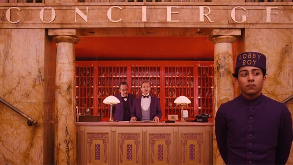
    The film has a structure of a frame narrative where multiple timelines are present. The film’s use of color and saturation shifts with each time period. The video highlights that in the 1930s, the golden age of the hotel, the film uses colors to establish a distinct mood. Specifically, vivid pinks, purples, and reds are used in the film to create a glamorous and romantic atmosphere. The significance of the era’s color reminded me of the prestige of the Grand Budapest Hotel in its prime throughout the film.

    https://pin.it/2ZH6PnwEQ

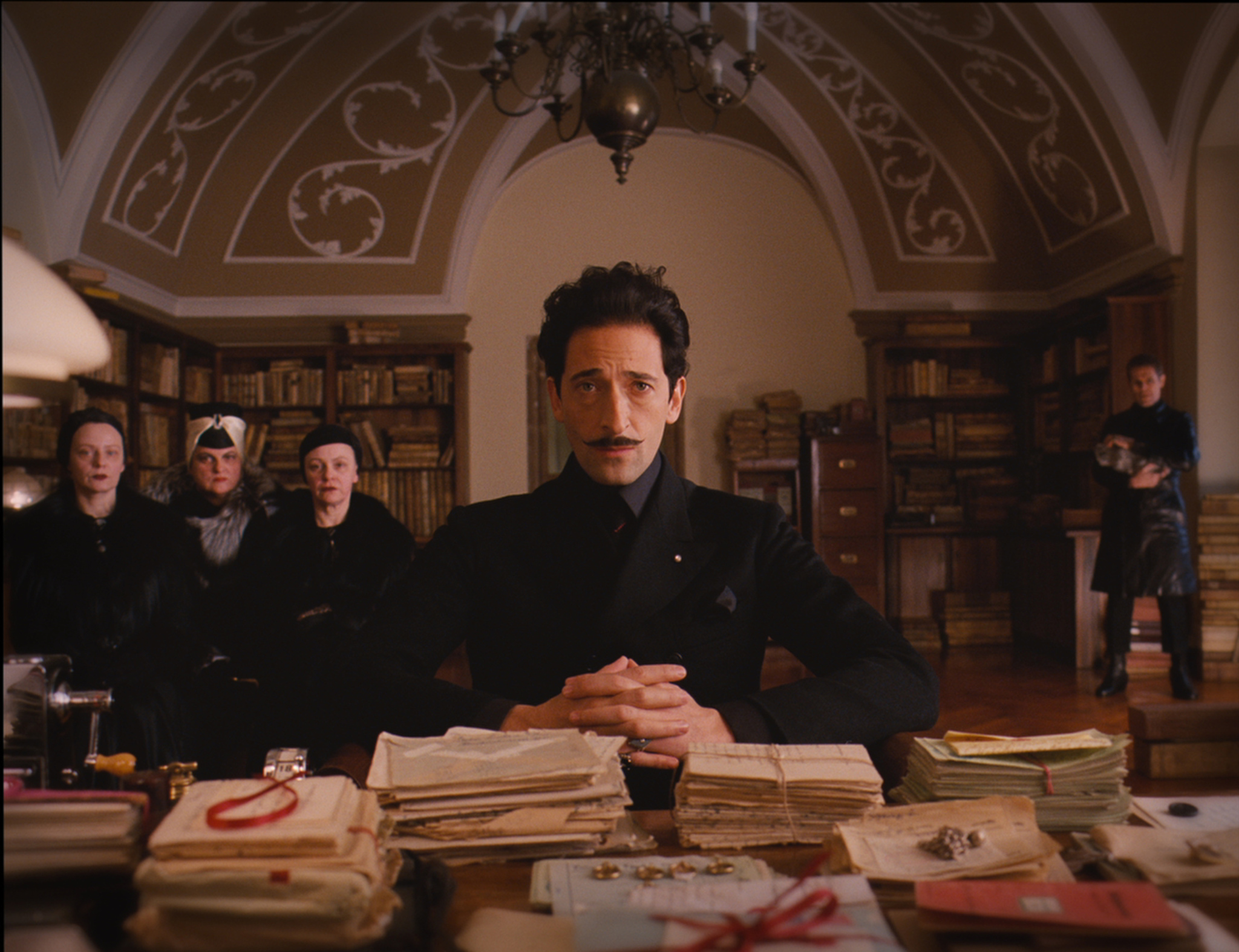
    However, the post-war scenes (the 1960s) use calm beige, orange, and pastel blue tones to change the mood, emphasizing the Hotel’s decline and nostalgia for its former glory. The faded colors in the post-war scenes made me feel that the strong identity and prestige of the Grand Budapest Hotel had vanished.

    https://share.google/images/qv05EROCU1AnLBgr7

    The film uses more natural colors when the timeline is in the present, the 1980s. These color and saturation differences from each time period let the audience recognize how the film changes its narrative. The color itself is not an independent element of mise-en-scène; rather, it works together with setting, costume, and lighting. These aspects create an iconic style and atmosphere for each time period in the film.

    The video also mentioned how the aspect ratio changed for each narrative frame. The film used a 1.37:1 ratio in the 1930s scenes, a 2.35:1 ratio in the 1960s, and a 1.85:1 ratio in the 1980s. It was fascinating that the film employed different aspect ratios for each time period, each reflecting the most common ratio of its time. These ratios highlight how mise-en-scène is not only decorative but also a narrative strategy that links the style with historical meaning.

    https://youtu.be/7sSWTK1rnqI?si=cgaFJmb6gGkGcx3D

    Overall, the use of colors and aspect ratios in the film creates a stunning visual experience, one that I highly recommend watching.

  • Creative instrument _ Cinematography

    This week’s reading on Chapter 5, “The Shot: Cinematography”, which is actually an exciting part for me since creative and effective cinematography can always shock me a lot and make me marvel at the powerful role of cinematography in shaping a film’s narrative and emotional expression.  The reading emphasizes how the camera is not just a recording device but a creative instrument that shapes meaning.

    I believe that this chapter mainly focuses on four elements of cinematography:

    ·  Photographic qualities: such as tonality, contrast, and exposure.

    ·  Depth of field and focus: which guide the audience’s attention through selective focus, deep focus, or rack focus.

    ·  Framing: such as camera distance, angle, and aspect ratio, which determine how space is perceived.

    ·  Camera movement: from pans and tilts to tracking shots and long takes, which create rhythm and continuity.

    Then, I’ d love to share some cinematography that I appreciate a lot, and I hope these examples can better explain the power of cinematography.
    |

    For example, in Life of Pi, the shots of the glowing ocean at night left a deep impression on me. (I watched this film when I was in elementary school, but it is still the top 3 movies in my hurt, and will always recommend to my friends watch it!) The strong contrast between the bright bioluminescence and the dark sky creates this dreamlike, almost spiritual mood. The framing often puts Pi small against the endless sea, making his struggle feel even more overwhelming.

    In The Shawshank Redemption, I always think of the moment when Andy escapes and raises his arms to the sky in the rain. The low camera angle looking up, combined with the crane movement that slowly lifts, makes us share his feeling of freedom. It’s simple, but so powerful.

    In The Wolf of Wall Street, the cinematography almost becomes part of the chaos itself. The restless tracking shots and sudden zooms mirror Belfort’s manic lifestyle, while the rapid cuts in the office scenes—where dozens of brokers shout into phones at once – intensify the sense of frenzy. Together, these choices capture not only the dizzying speed of the financial world but also its obsessive, almost pathological hunger for money.

    All of these examples made me realize just how much cinematography directs our attention and emotions. It doesn’t just record the story—it tells the story. And honestly, it makes me marvel at the powerful role cinematography plays in shaping both plot and emotion.

  • It’s the little things that count with Wes Anderson

    The Grand Budapest Hotel is an incredible example of what we read about mise-en-scène. The shapes and actions performed by the actors and set pieces contribute significantly to the film’s themes of culture, violence, and absurdism. I noticed great contrasts between costume and setting that made the experience of watching The Grand Budapest Hotel that much more engaging. The designers, in tandem with Wes Anderson’s directorial vision, created an incredible, avant-garde world that draws audiences in more and more with each frame.

    Watching this movie, I, much like every other viewer, was immediately drawn to the color schemes present in each shot. The titular Grand Budapest Hotel is filled with oranges of different shades, interspersed by hotel staff and Monsieur Gustave’s consistently purple clothing. The narrator outside of M. Gustave’s story wears a pale pink suit, himself. All of this shows vibrancy–and perhaps happiness or lightheartedness. As we progress through the film, we are introduced to a much more contrastive and brooding color palette. With the introduction of Dmitri in his home, the viewer is inundated with brown, black, and dark red, all of which denoting danger. Dmitri himself wears black, blending in with his surroundings while Gustave and Zero stick out wherever they go. The world of the film dips further into an ever-increasing fascist government as we see the beginning of the Lutz Blitz. By this point, the film is in black and white. It is reminiscent of the story of The Giver, both in the novel and the film adaptation. Both of these works depict the loss of ROY G. BIV colors as a loss of freedom, joy and individuality, being replaced by grayscale hues as conformity and evil dominate the world.

    I also noted the minuteness of action on-screen. I remember the particular act of creating the escape tunnel through the prison’s floor being so small by volume: none of the escapees wanted to be heard. Additionally, when Zero and M. Gustave reach Checkpoint 19 and they are met by a giant wall. Outside of the frame, we hear a guard whistling to them. The camera pans to his relatively microscopic body as he motions them through the once non-visible door.

    In directing this film, Anderson paid great attention to detail–particularly the tiny ones. It is through this work that films like The Grand Budapest Hotel captivate audiences. In watching this, the viewer, too, pays attention to even the smallest details.

  • I tried to pay attention to mise-en-scene in the Rocky Horror Picture Show (a story of failure)

    (Capture from “The Time Warp”).

    Last friday, I went to see the LDOD shadowcast production of The Rocky Horror Picture Show at the Plaza Theater. I’d seen this movie a few years ago, but that was back in pandemic times. I wanted to refresh my memory, and in browsing through the Plaza’s website I found my opportunity.

    For the uninitiated (“Rocky Horror Virgins”), RHPC is a “midnight movie”––it was terribly panned at release in 1975, but quickly gained an extreme cult following (largely through midnight showings). The movie is an incredibly cheesy sci-fi comedy musical with intense Queer themes (quite the shock for 1975), including crossdressing, bisexuality, lots of gay sex, trans and gender non-conforming characters, and more. It was also made on a budget of just over a million dollars and was shot in less than a month.

    Knowing details of the production in advance, I decided I’d try to pay attention to how the producers of RHPC scrimped with their costumes and production design; if Star Trek can put a horn on a dog and call it an alien, surely the good people of Rocky Horror can pull something off.

    (The aforementioned cone dog.)

    I was able to get in two observations before I mind fell into the time warp itself.

    1. They definitely blew the entire budget getting Tim Curry to agree to do this movie. There is none left for anything else. Observe this laser effect. Also the “laser” is the head of an actual pitchfork.

    2. These cheesy costumes and bad effects are somewhere in the realm of purposeful. Faced with a tiny budget and absurd production schedule, the filmmakers chose to lean-in to camp and cheese. These special effects are terrible––this is one frame, but as the camera shakes in the scene, the special effects stay static. They were clearly drawn on in a great rush. What’s stranger, though, is that it also doesn’t draw us out of the story. If you’re at all willing to believe in the absolutely absurd reality of this film, then an actor who forgot to smooth their contour or a group costume that is quite literally a pack of birthday hats won’t pull you out.

    You know what will? Dozens of people in the theater shouting at the screen. And shooting water guns at each other. And acting out the movie. And being incessantly horny.

    These shows are an absolute ton of fun. High art? Absolutely not. But a great blend of terrible cinema, live theater, and the power of fifty years of cult fandom? Absolutely.

    The Rocky Horror Picture Show runs every Friday at 11pm at the Plaza Theater. Tickets are about $18. Go see it.

    Also they have raffles and I won a set of the game Clue.

  • Wes Anderson’s Vision Behind The Grand Budapest Hotel

    While looking into how Wes Anderson made The Grand Budapest Hotel, I came across a 2014 YouTube interview with him (ScreenSlam). The interview provides important insights into Anderson’s cinematic approach and the artistic decisions used in the film. This new perspective will help us form new opinions on the film and gain more insight into the planning process that goes on behind every film.

    Anderson starts the interview explaining that the movie is “partly inspired by Hollywood movies, maybe from the 30s that were set in places like Warsaw and Prague, and Budapest” (Anderson). This connection helps the audience feel a strong sense of nostalgia throughout the film through the use of vibrant colors and detailed set designs.

    Hollywood films from the 1930s that were set in Central and Eastern European cities often reflected some political tension and a playful kind of storytelling. Directors such as Alfred Hitchcock and Frank Borzage created works that influenced Anderson (TIME). In the film Rear Window, Hitchcock had an elaborate setting that greatly influenced the story. Similarly, Anderson describes the hotel as a “character” that is essential to the film.

    Anderson’s use of camera angles, color palettes, and framing makes the atmosphere of The Grand Budapest Hotel unique and magical. Additionally, Anderson notes the importance of collaboration with his actors, as they brought the film’s unique characters to life.

    Although the interview provides an overview of Anderson’s artistic style and filmmaking process, it does not deeply explore the film’s themes (such as nostalgia) or broader cultural implications. Nonetheless, it helps us understand the hard work behind the film’s unique aesthetic.

  • Barry Lyndon: Why Does No One Ever Have Fun Playing Cards?

    I recently was able to see Barry Lyndon (1975, Stanley Kubrick) through the Emory Cinematheque. Riddled with powdered wigs, layers and layers of makeup, paintings that fill entire walls, and shots that actually resemble real paintings from the era, Barry Lyndon’s use of mise en scène transports us directly into the late 1700’s. However, that is not what I want to talk about in this blog post. Instead, I was intrigued by a certain recurring motif in the film: Playing Cards.

    The film as a whole is an argument between fate and self-determination, with Redmond Barry’s life-altering adventure seemingly starting from one lustful, impulsive decision. Playing Cards and Barry’s cheating habits act as a miniature representation of his own life, representing how one often has little control over their own destiny, yet must risk it all anyway. What confused me however is that every time anyone is seen playing cards in the film (which is quite a few times), they seem absolutely miserable. While it is not the happiest film of all time, there are many moments of comedy and smiles. None of these ever occur during a game of cards. I believe that this is probably to communicate how even though Barry tends to win at cards, they are a marker of inevitable doom and demonstrate the futility of trying to climb the social ladder of life. I would be curious to whether this is entirely purposeful by Kubrick or if it just shook out to be that way.

    I mean look how miserable they are.

  • The Grand Budapest Hotel: The Effect of Nostalgia

    (3558) How The Grand Budapest Hotel Uses Colour To Tell a Story – YouTube

    Reading about mise-en-scene drastically changed my second viewing of The Grand Budapest Hotel. In the past, I brushed off Wes Anderson’s unique style as simply aesthetics, not completely understanding the importance of mise-en-scene. Now after a deeper look into what many consider Anderson’s magnum opus, I have learned about the essentiality of the coloring within these uniquely created movies. Specifically, the theming of nostalgia in The Grand Budapest Hotel, goes hand-in-hand with the coloring of the overall narrative. This idea of nostalgia and storytelling is explained explicitly in the video above. The video details the fact that the opening scene is gray and monotonous for a certain purpose…to mirror the actual universe of the viewer. It is only when reality get turned to stories and then to memories does more and more color get imbued. In the 1980s (the period that the intro scene takes place in) there is little color variety whatsoever, just focusing on the bland white, gray, and brown aspects of the scene.

    The second layer of the story takes place in the 1960s, even though this era of the story is still largely depressing, color is imbued to the story through the morose orange in the hotel and yellow trees outside. This increase of color, as the video explains, can be attributed towards the theming of storytelling and nostalgia within The Grand Budapest Hotel. The original author that writes the book about the hotel is still recalling a story that he experienced over 20 years ago. It is simply human nature to romanticize and associate past memories in the positive, even if they weren’t.

    This idea is even further supported with the 1930s version of the hotel, the third and final layer that is narrated to the viewer by Zero.

    In just a 30-year timespan, the entire coloring of both the hotel and its surroundings have completely changed from a colorful and vibrant landscape to a dull, orange, and dying environment. Overall, I find a great argument from the video above regarding the theme of nostalgia and facades within The Grand Budapest Hotel. Instances of facades such as Gustave living through a false existence as a cultured savant, Zero hiding his traumatic past through acting as a silent lobby boy, or the film hiding its fascist subplot to focus on trivial matters like the painting “Boy with Apple” are all examples in accordance with the facade theming. The hotel and surrounding environment didn’t magically change in 30 years, it is a purposeful addition to the mise-en-scene to demonstrate the idea that we romanticize the past.

  • Barry Lyndon – It’s a Comedy?

    Today I watched Barry Lyndon by Stanley Kubrick as part of the 1975: A Year in Cinema program.

    Beforehand I looked up the movie to see what it is about and what genre it belongs to. On Google it is listed as “War/Adventure.” Right from the beginning I was surprised by how many comedic moments – both visual and in dialogue – Barry Lyndon has. The first half feels almost like a comedy: Barry acting childish by throwing a glass at Captain John Quin, Barry getting robbed, and Captain Quin’s facial expressions during his duel with Barry.

    The second half, however, is much more serious and features some very dramatic scenes. Here I noticed the use of the main theme as a kind of introduction to death. Each time the main theme is played, somebody dies.

    Another thing that stood out to me was Kubrick’s use of zoom shots. Was he a pioneer in popularizing this technique?

  • The Grand Budapest Hotel: A Cinematic Gem Dissected 

    Throughout my viewing experience of The Grand Budapest Hotel, I was deeply conscious of the Film Art: Ch. 4:”The Shot: Mise-en-Scène” reading from the week. I tried to pay close attention to the intentional mise-en-scène aspects of each shot. However, after watching this video, I realized that I had mainly been paying attention to the lighting and camera angles in the movie. This quick analysis pointed out many other interesting details that I had missed.

    The Youtube video highlights many subtle mise-en-scène moments going on throughout the film. One technique mentioned that really stood out to me was how the color scheme and aspect ratio of the film shift after the first scene that takes place in the 1980s. The colors in that scene are dull and realistic, demonstrating present day reality, and the scene’s aspect ratio is 1.85:1, which the speaker explains is the conventional aspect ratio of the modern era. Then, when the movie cuts to the story of the author, the aspect ratio shifts to 2.35:1, which was the conventional ratio of the 1960s. The colors also become slightly more vibrant. Shortly after, when Zero begins telling his story to the author and the audience gets transported into Zero’s story, there is another shift. The aspect ratio changes to 1.37:1, which was conventional sizing of the 30s, and the colors become even brighter and more unrealistic. This symbolizes Zero’s warped, nostalgic memories of the past, and the grandeur and fondness that he associates with his time spent at the hotel with M. Gustave. The vibrant and fantastical colors that fill the scenes suggest that Zero may be looking back at that time through rose colored glasses.

    Another part of the video that stood out to me was the mention of Wes Anderson’s use of symmetry. Anderson is known for integrating symmetry frequently in scenes of his movies. However, this is frequently criticized, as people seem to think that the use of symmetry can put too much of a focus on how the shot is put together, rather than the emotional content of a scene. The video points out that in a comedy drama that is “veiled with satire and tragedy”, it goes perfectly with the way that Anderson is attempting to portray Zero’s memories. It is mentioned how the symmetry of the shots go right along with the overly romanticized version of the past that Zero is presenting. Symmetry represents the unattainable, as nothing in real life can ever look as perfect as a planned out, evenly staged film scene. It shows the perfection and cleanliness that Zero associates with the time. The symmetry and frequent use of wide shots in the hotel bring us directly into the inaccurate memories inside of Zero’s head.

    Overall, I really enjoyed watching this analysis of The Grand Budapest Hotel. I thought that this was a concise, well-thought-out video that fit an impressive amount of content into just eleven minutes. I always like to look up book reviews and analysis’ after I finish reading a book to try and get as much out of it as I possibly can. I don’t do this very often with movies, and I appreciated hearing another perspective and getting some new insights on the film we watched.