During my further research into The Grand Budapest Hotel, I was most interested in a video analysis of the creation of the movie’s score. The video, posted by “Inside the Score” on YouTube, highlights the apparent challenge in creating music from an imaginary country. The soundtrack was constructed by Alexandre Desplat, a talented French composer who also collaborated on other Wes Anderson films, including Fantastic Mr. Fox, Isle of Dogs, French Dispatch, and Moonrise Kingdom. Desplat and Anderson situate the fictional country of Zubrowka on the easternmost border of the European continent. Desplat identifies the broader geographical area as “Mittleuropa”, or Middle Europe, stretching from Switzerland to Turkey.
In order to strengthen the authenticity of the fictional Zubrowka, Desplat utilizes traditional instruments from neighboring regions. For example, in the main theme music, he uses a cimbalom, a stringed instrument popular in Hungary and the alpine regions, thus giving the music a nostalgic and distinctly Central European tone. During winter scenes, he incorporates tubular bells, sleigh bells, and glockenspiel, creating a whimsical sound reminiscent of the Russian composer Tchaikovsky’s Nutcracker. In contrast, for dramatic scenes, the movie uses brass instruments that often mirror marching percussion, signaling the arrival of the fascist groups.
We can all admit that this Wes Anderson’s “The Grand Budapest Hotel” is a visually eye-catching film, almost to the point where you begin to question the intentions of the color scheme compared to the topic of the movie.
This video, made by StudioBinder on YouTube, does a great job of explaining why the movie’s choice of color is so peculiar while considering the circumstances of the movie, or more specifically, the characters’ stories.
Wes uses primary colors, high saturation, and brightness to portray a childlike perspective and maintain the whimsical feeling, though reality reflects the opposite. Specifically, he repeatedly reintroduces the color red into the film to reflect the childhood trauma they still carry into adolescence.
So why does he continue to use this color theory? StudioBinder says that it is an expression of dark humor and a play on the theme’s bipolar tones versus the visuals. I guess you simply cannot believe the emotion to be everything you see. It forces the audience to be engaged in the world and face the dark topics.
When the switch is made in the second train scene, it is apparent that the bipolar color vs. dialogue theory still reigns. Wes’s use of color becomes very telling when the colors become black and white at the time of tragedy. Zero says, “There are still faint glimmers of civilization in this barbaric slaughterhouse that was once known as humanity. He was one of them. What more is there to say?” In my opinion, it shows how quickly reality is turned back on, and hope in humanity was stolen when they killed Mr. Gustave, almost as if the color died with him.
If you are interested, I highly suggest watching and seeing if you also caught on to the same patterns!
To put it simply, I’ve never seen a Wes Anderson movie that wasn’t an absolute visual masterpiece; The Grand Budapest Hotel is certainly no exception. It is so aesthetically pleasing and unique, thanks to his creative use of color, filming techniques, and overall detail to the mise-en-scène of the movie.
As an aspiring director, I always find it very exciting to see the behind the scenes of how certain scenes were shot and how certain ideas came to life in front of the camera. The video that I have attached above shows a glimpse into that process. It shows a variety of moments during the filming where Wes was discussing his visions for specific shots, set design and how they pulled off certain scenes, and makeup and costume procedures. I was surprised to see just how much effort and manpower goes into scenes that at first may seem more simplistic. During even a basic walking scene there were 5-6 people behind the camera carrying lights, microphones, and other important things for it to come out as good as it does. Or during a sit down conversation in the movie where the camera had to be spun around in certain way. It made me appreciate the movie and all the beautiful parts of it even more, because there was so much thought and passion put into it that most of the time we don’t get to see. It’s much more effective to see it than read about it, but I do strongly suggest to watch it if you’re interested in that area of film.
In this interview on RogerEbert.com, the reporter Hank Sartin sits down with Wes Anderson to chat about his direction in “The Grand Budapest Hotel.” While reading the transcript of this interview, I found Wes Anderson’s insight into his inspiration as well as the collaboration of everyone on set extremely interesting. As many already know, Wes Anderson was heavily inspired by the author Stefan Zweig for the idea of a story-within-a-story. Although Anderson acknowledges that many other storytellers have done the same idea, he was especially inspired by Zweig’s use of this in “very psychological, more intimate stories.” They then chat about the actors, especially Ralph Fiennes’s performance as Mr. Gustave.
I found this particular interview more insightful than other interviews I watched and read, as the conversation between Sartin and Anderson felt more like a friendly chat, rather than an official interview. Sartin seemed very knowledgeable about many of the references that Anderson brought up. For example, I was not familiar with Zweig’s work, but Sartin was able to direct the conversation in a natural way that both gave insight into Zweig’s previous work as well as how Anderson related it to his own work. From this interview, I learned that Zweig was a famous author in the 20’s and 30’s, but mostly faded in popularity. Although “The Grand Budapest Hotel” is a comedy-drama with many lighthearted moments, Zweig’s stories had a more serious tone.
Another topic they discussed in depth about was the choice of Ralph Fiennes as Gustave. I was not familiar with Fiennes’s previous works, but Sartin directed the conversation in a way that Anderson was able to add his insight into why Fiennes was chosen, though his previous roles were mostly non-comedic. Anderson commented that he saw Fiennes in a play in France and he was very funny, and his demeanor in real life was also very polite, matching the character Gustave very well.
Overall, I found this interview with Anderson very revealing into some of the behind the scenes of “The Grand Budapest Hotel.” I appreciated that the interviewer didn’t ask many cliched questions, as well as added his own input into some of the movie’s aspects. This made the interview much more interesting to read with its casual tone, like two friends sitting down for coffee and discussing a movie rather than an interrogation for Anderson. It is obvious that the interviewer did his research before talking to Anderson, as he added in his past knowledge about details Anderson had shared in other interviews to avoid repetition and enable him to dive deeper into those details.
Before I say anything remotely analytical about this movie, I wanted to note that this is one of the most visually appealing films of all time. On par with some of my favorite movies to just look at like Under the Skin(2013), 2001: A Space Odyssey(1968), and Drive (2011), Wes Anderson’s use of painting-like imagery with the background compressed against the foreground makes this a simply stunning movie.
Throughout the movie, I feel like Wes Anderson was screaming at me that this film is about loyalty. But although there is the obvious loyal relationship between Zero and Gustave, the theme extends far past an individual’s loyalty for another. I think this film is really trying to communicate how as individuals, we tend to be ferociously loyal to the things that have always been; the constants in our lives. We see this every day in the United States. According to the Pew Research Center, 89% of teens from Democratic households also vote for Democratic candidates (81% for Republican households). I believe that this is not actually about the values of the child, but about an individual’s loyalty to their parent’s values, since that is all they have known since birth. Wes Anderson throws this theme in our face throughout Grand Budapest Hotel. Introduced early in the film, Zero is alone. When asked whether he has a family, he replies with ‘none’. Immediately, Gustave is a father figure. Whether he likes it or not, Gustave is in a position of instructional and literal power over Zero, causing Zero to latch on almost instantaneously. I don’t believe that this is because Zero respects Gustave (Gustave is a deeply flawed and sometimes ridiculous person), rather that Gustave and the values he stands for becomes literally the only thing in Zero’s life, and therefore the only thing he has to learn from.
However, this theme of loyalty extends past Zero’s relationship to Gustave. Gustave himself is a character literally defined by his loyalty. All we ever know about his character is his mastery of the concierge arts. For all the audience knows, this is all Gustave has been, and all he ever will be. His loyalty is not only to the women he takes care of and the young men he takes under his wing, but the literal act of being a concierge. In prison of all places, Gustave brings a cart around from cell to cell handing out soup. He won’t ever stop being a concierge because he literally can’t. Like Zero’s relationship to him, Gustave can’t give up being a concierge because it is actually the only thing he knows. Again, towards the end, when the hotel is crawling with policemen looking for him and a psycho killer trying to take his life, Gustave enters the Grand Budapest Hotel disguised as a bakery delivery man. It is possible to look at this from the perspective of his loyalty to Zero and Zero’s relationship to Agatha, but I think Wes Anderson intended this to be a representation of Gustave’s inability to part with the hotel. The hotel is his life, and he would rather die than be apart from the only thing he has ever known.
This is not a film about love or belonging, but instead about humans’ loyalty and almost obsession with retaining constants in our lives. Zero, even in his old age and the Grand Budapest’s failure, is fiercely loyal to it and Gustave. My one question about this film is: Does Wes Anderson hate Zero and Gustave for being so loyal, eventually killing one of them and dooming the other to eternal loneliness? Or does he actually respect and value their obsessions?
The use of mise-en-scène refers to the arrangement of everything within the camera frame. Through this week’s lectures, readings, and screenings, we’ve come to learn that mise-en-scène consists of many aspects: the setting, costuming/makeup, lighting/color, and staging. As I’ve thought over how these different parts work together to compose a scene, I’ve found myself reflecting on movies that I enjoyed in the past, and how the films’ mise-en-scène could have enhanced my enjoyment. Two films especially jumped out at me, being Akira Kurosawa’s High and Low and Jacques Tati’s Playtime.
In High and Low, Kingo Gondo, a business executive, faces a moral dilemma when his driver’s son is mistaken for his own and kidnapped. In the particular scene shown above, the police (left) are attempting to help Gondo in identifying the kidnapper, while his wife (right) and driver (back left) beg him to pay the ransom money that has been demanded. It’s worth noting that Gondo himself is reluctant to pay the ransom, as it will cause him to go bankrupt if he does so. Minor spoiler warning.
The thing that stands out to me in this movie is how Kurosawa places his actors within a frame. In the image above, each character has its own space within the frame. None are imposing on each other, and each character is doing something to draw your attention. The police have their heads bowed, unsure of what to do. Gondo’s mentee looks toward him, expecting him to come up with a plan. Gondo’s wife cries in the corner of the frame, the weight of the situation too much for her to handle. The driver looks away, partially obstructed by the police, positioned behind the policemen as if he were merely a lingering afterthought for the executive. My favorite part of this shot, though, is Gondo himself. As he decides to not pay the ransom money (though he is later convinced to), he separates himself from everyone else in the frame, who all believe paying the ransom is the right thing to do. There is a visible blank area around him, alienating him from all other characters.
In one small shot, Kurosawa can show each character’s emotion, while also portraying the metaphorical (and literal) distance between Gendo and the rest of the cast.
Though Tati’s Playtime is still a masterpiece in terms of actor blocking, I’d like to talk about the mise-en-scène aspects of color/set design and costuming.
Playtime follows the Frenchman Hulot as he finds himself exploring an increasingly modern Paris. It’s an extremely enjoyable and funny film, and I highly recommend you all give it a watch.
For a film set in Paris, you’d expect to see the city’s ornate and charming buildings. But in Playtime, those beautiful buildings are overshadowed by drab office buildings, which serve as the setting for the film. There’s even a scene where a character enters an airport, just to see all the classic landmarks on travel posters blocked by office buildings. In both set design and costuming, Tati opts to use muted colors like beige and grey as the main color palette for the film. In fact, most sets are completely bland (in a charming way).
Character costumes are the same. Hulot, in his grey raincoat, begins to blend in with the sea of ordinary suits and coats. The only way of distinguishing him from the extras in the frame is from the way he moves: The others know their place and move robotically, while Hulot roams and explores the frame, lost. When I watched the movie, I recognized him through the long umbrella he always carried by his side.
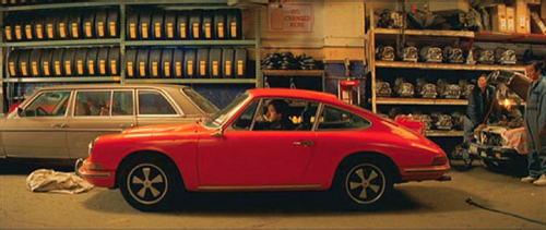
Though Tati doesn’t use any striking and attention-seeking colors, this film is still one of the visually strongest films I’ve seen. Its sets and costumes could also be seen as a critique of urbanization and modernity – a world with too many pointless buildings and gadgets. But in this drab world, there are still signs of life. As Hulot begins to interact with the Parisians and take part in their nightlife and morning routines, the settings he finds himself in become increasingly colorful. It could be as subtle as the pink flowers in a woman’s hair or as eye-catching as a bright red car.
All in all, both films are absolute gems in showing the power of mise-en-scène. High and Low shows the power of blocking, in both fitting all actors in the frame and also adding narrative significance to their positioning. Playtime employs neutral colors to critique modern styles and also increase our appreciation for color.
If this blog convinced any of you to watch either of these movies, please let me know in a comment! I’d love to hear what you all think about these movies and the aspects of mise-en-scène they employ.
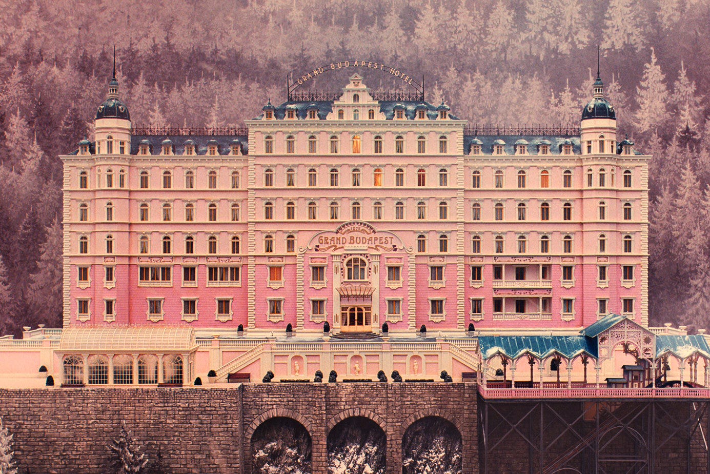
In the Grand Budapest Hotel, as I searched the background of its creation, the film’s director Wes Anderson was partly inspired by the novels and memoirs of Austrian writer Stefan Zweig, whose work often talks about the disappearance of old European culture. I believe it influences the tone of the film and its focus on the decline of an era. Also, the film style especially emphasize symmetry, and the camera is almost always positioned directly from the front, side or back. Shots taken from an oblique angle is almost not exist, which always create a sense of precision and this strict formalism gives audience the feeling that the film is almost like a painting or a stage.
Also, another detail I noticed while watching is that Anderson uses three distinct aspect ratios in the film to visually separate the timelines. The first two parts use 1.85:1(1980s), the third part adopts the widescreen format of 2.35:1(1960s), and the most important final part uses the classic industrial standard of old films, 1.37:1(1930s).(https://b23.tv/JTTba6Q, 拉片实验室,2020)
Screenshot
In the end, I think one of the most striking scenes for me is the train inspection. In the first inspection, the inspection is conducted by local policemen who still remain some sense of civility, wearing classical uniforms, and Gustave is able to resolve the situation through his personal connections. However, in the second inspection, Zubrowka is no longer an independent state, and the temporary pass that previously was issued by Norton is not working. The policemen are now armed soldiers in identical uniforms. I believe Anderson was using costume, this element of Mise-en-scène to strengthen the contrast. In the end, the film shift to black-and-white imagery which I may consider as a metaphor for Nazi Germany.
My question is: How does Anderson’s stylized filming approach, which are his symmetry, colors, and changing aspect ratios affect the way we understand this film’s themes-cultural decline?
The use of Mise-en-Scene in The Grand Budapest Hotel
Hello classmates, it was great to watch this interesting movie with you all this afternoon. I don’t know how you felt about this movie, but personally speaking, I loved it. The plots are so tight, and I got fully immersed in it! Besides the fantastic storytelling, I believe that this movie effectively shows the power of Mise-en-Scene. The smart uses of setting, costume and makeup, lighting, and staging not only help the audience engage better, but also gives us more space to explain the film further and taste it deeper.
In this post, I’d love to share with you some of my findings while watching and also share initial questions I have, so we can further discuss them.
Insights:
In the scene of reading Madame D.’s will, Gustave and Zero are standing at the door of the entire room, on the opposite side, wearing purple suits, while almost all of the other people in the same scene were in black. By contrasting standing position and clothes’ color, I think that the director is trying to emphasize the contrast of their personalities: Gustave and Zero embody individuality, elegance, visually marked by their purple uniforms. The others dressed uniformly in black represent conformity, rigidity, and the coldness of aristocratic tradition. (Costume & Makeup + Staging)
Jopling: This ruthless killer is depicted by using a combination of costume and lighting techniques. If I remember correctly, he is always dressed in black throughout the entire movie, often wearing black sunglasses or having shadowed eyes due to the lighting effect. For example, in the snow mountain scene, he chases after Zero and Agatha on a sled after Gustave and Zero escape. The stark white snow, contrasted with Jopling’s dark figure, strengthens his dark side and ruthless personality. (Costume + Llighting)
In the prison escape tunnel, light becomes symbolic: the small window glows brightly while everything else is engulfed in darkness. This stark contrast emphasizes freedom as a distant possibility, a fragile opening amid confinement. (Lighting + Setting)
Questions:
Why does Anderson begin the film in a cemetery filled with crosses? How does this opening frame set the tone of memory and loss? (Setting)
What’s the implication of the children with weapons in the second scene? Is Anderson suggesting that violence disrupts innocence and order? (Staging + Setting)
How does Anderson’s pastel palette (pink hotel exterior, purple uniforms, candy-colored props) evoke nostalgia? Does it make the story feel like a memory or a fairy tale? (Costume & Makeup + Setting)
What are the symbolic meanings of the painting Boy with Apple? Why did Anderson choose this painting instead of others? (Props/Costume & Makeup)
Why does Anderson often isolate characters in their own shots during dialogue (like Gustave and Zero on the train), instead of framing them together? (Staging)
Hope we can discuss further in the comment area or in class!
Even if you have never watched The Lion King (1994), given the image above, one could guess that the character depicted possesses evil qualities simply by analyzing the visual elements in this particular scene. This power lies in the technique of mise-en-scène: the visual orchestration of setting, lighting, costume, and performance (Bordwell 113).
This week’s reading took a deep dive into exploring the technique of mise-en-scène. Mise-en-scène is introduced as the arrangement of everything that appears in the frame of a film, including elements such as setting, lighting, costume and makeup, and staging and performance. As discussed in Chapter 4, mise-en-scène represents the director’s control over the visual elements of a film and plays an important role in shaping how audiences perceive characters, themes, and tone.
After reading, I found myself thinking about how mise-en-scène operates. The chapter emphasizes that mise-en-scène offers filmmakers four general areas of creative control: setting, costume and makeup, lighting, and staging/performance. These elements, when combined, allow directors to guide the viewer’s response and understanding of the story. For example, the reading discussed how lighting can influence the way a character is perceived. Casting shadows can create a sense of mystery, while bright lighting may convey warmth. Recently, I rewatched The Lion King (1994) and noticed how mise-en-scène is at play even in animated films. Take, for example, the following scene(s).
In early scenes of the film, Pride Rock and the surrounding lands under Mufasa’s rule are depicted using a lively, earthy color palette, such as browns and lush greens. This use of color suggests prosperity and balance. However, when Scar takes over, the entire landscape becomes a desaturated monochromatic color design of grays and blacks. This dramatic shift in color and the use of monochromatic color designs is a clear example of how mise-en-scène is used to visually convey messages. Here, the audience is shown, through setting and color, that Scar’s rule is bad.
In another scene, the filmmakers use the element of lighting to emphasize character transformation. When Mufasa’s spirit appears in the sky to speak to Simba, a beam of top lighting shines down on Simba, creating a “glow” that covers him. This moment uses top lighting to visually mark a turning point in Simba’s journey. Here, Simba begins to reclaim his rightful place as king, and the mise-en-scène enhances the storytelling.
These examples helped me better understand how filmmakers use mise-en-scène to execute ideas and tones in a film. What I found interesting is how many of these visual elements operate on a subconscious level. Most viewers may not actively notice the shift in lighting during a film, but they still feel the significance of this choice. Personally, I know the first time I watched The Lion King (1194), I did not actively notice the mise-en-scène at play. This raises an important question for me: how much of mise-en-scène do viewers consciously register, and how much simply influences us emotionally in the background? Additionally, I also wonder if societal norms/cultural context affect how these visual elements are interpreted. For example, does the “halo glow effect” of top lighting rely on cultural/societal assumptions that may not be the same universally?
Using Barbie (2023) as an example, I know that the use of bright, saturated colors was used to convey artificiality. In the Barbie (2023) movie, bright colors were used to give the set a toy-ish wonderland feel. However, viewing it from a different perspective, I wonder if the use of bright, saturated colors could be interpreted as something else, given that bright colors could be the “norm” for settings similar to that of Barbie (2023).
Given this, I question how someone from a different cultural/societal background would interpret the same lighting and color design I picked up in The Lion King (1994)?
Sources: Bordwell, David, et al. Film Art: An Introduction. 13th ed., McGraw-Hill, 2024.
I’ll start with this: I promise I usually watch “good” media. I like quality television. I also love Suits, a fairly trashy legal drama from the late aughts. Suits is, in my film-student view, terrible. But Suits isn’t always empty collars and ties. The show has some incredible moments of Mise-en-Scene (“what is in a scene”): the combination of it’s lighting, setting, blocking, costume, and action.
In trying to understand why I love this show, and as application and practice of my understanding of this week’s Film Art reading, I’m going to examine the mise-en-scéne (setting, lighting, costumes, blocking, composition) of the first forty seconds of the pilot of Suits––and maybe, in the process, prove its brilliance.
Suits opens with a shot of the Manhattan Bridge. Not it’s famous cousin (the almighty Brooklyn Bridge), but it’s functional, steel sister. The lights are bright enough to see the cars, but it’s still dark. Here, Suits has set the aesthetic tone: this is going to be professional, dark. We see cars drive over the bridge, then hard cut to the Chrysler Building. Now we immediately know the setting––no narration or title card required. Even if you don’t recognize the Manhattan Bridge, you know the Chrysler. We’re in New York City, we’re in Manhattan.
The third shot is the most telling. We cut again to an empty wall, then pan down. We’re looking at a skyscraper (Citigroup Center, for all interested), and somewhere around the fiftieth floor, we see men in suits dancing. They’re centered and bathed in an orange light, a sharp contrast to the blues and blacks of the previous shots. This, the show says, is what you should pay attention to. These people are different.
So, within literally sixteen seconds, just based on what is physically in the shots, we know where we are (NYC), what type of people we’re going to be watching (Rich People), their status (High), and what we’re going to be watching––not the most beautiful, polished conduct (not the Brooklyn Bridge)––but the functional, real, beautiful-and-terrible lives of these people.
We cut in to the office floor and see that they aren’t dancing, but arguing. Every character in the titular suits, all chatting excessively––except one. Even in the chaos of this scene, again without a single word, we know who to focus on. The camera settles on the non-arguing man, waiting patiently in the corner. His body language is sharp, he stands tall. He is our focal point, and we know it.
The frame at 0:36 (above) is, to me, a work of art. Our focal character is the only one lit with low-key contrast; it’s so far from the soft, relaxed light of every other character that we could infer his mixed emotions based only on the lighting. On the scale of importance, he sits at the very top, further highlighted by a silhouette comprising the entire left half of the frame. And, with such a shallow space, our focal man becomes the entire background. The actor’s highly individualized (but not overly-stylized) performance stands out too––he fits in, mostly, but he is clearly different from the rest of his cohort. His hands are laced together. His head is tilted down, almost a slight Kubrick Stare. He’s wearing the costume of everyone else in the room, but he isn’t with them. He’s not like them. We linger on him, confirming with time: he is unique. He’s worth paying attention to.
Each element of mise-en-scene: setting, costume, lighting, staging, spacing/composition, and time; they are all done perfectly here. We know this man. We know his attitude. We know his world. All this, without a single word––just by what’s in the shot.
So, in light of all this, is it okay for me to like Suits? Is this an over-read of fairly obvious filmmaking, or a brief glance at a masterclass in mise-en-scene?