I have always been a huge fan of Matt Reeves’s Planet of the Apes films, so over Thanksgiving break I finally sat down with the original. I expected something slower and older, but the world pulled me in almost immediately. The makeup and the physicality of the ape characters create a full society that feels lived in. I found myself paying more attention to how their faces moved than the plot in the first few scenes because the design gives them so much presence.
What surprised me most is how the makeup does more than provide surface realism. It shapes the entire meaning of the film. The ape hierarchy becomes believable because the design signals power and status before the characters even speak. The world works because it looks consistent. The costumes, the sets, and the prosthetics link together and guide the viewer to read this world as a mirror of our own.
The makeup also affects how the story hits at the end. When the film reveals what happened to Earth, the ape world suddenly feels like a warning. I already believed in it because of the design, so the twist lands with more weight. It turns the apes into a reflection of human failures, not a random sci-fi civilization. Watching it now, after growing up with the new trilogy, made me appreciate how much world-building shapes the message rather than just the visuals.
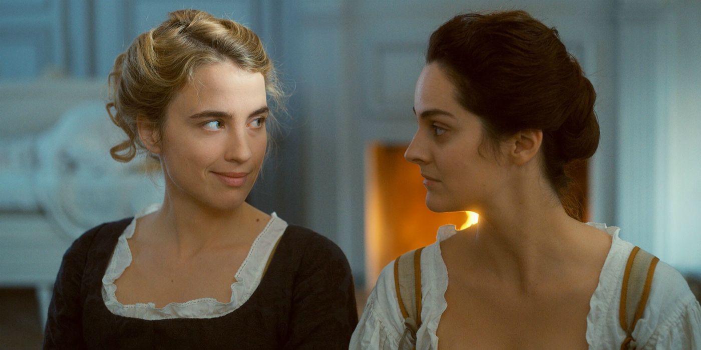
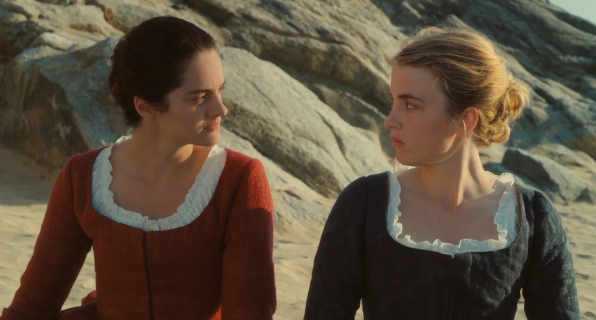
Portrait of a Lady on Fire (2019), directed by Céline Sciamma, is a wonderfully beautiful film, capturing the longing and searching looks shared between the two main characters, Marianne and Héloïse. The film has long takes that give the story room to breathe and establish a quiet, poignant atmosphere. The framing of the shots is usually focused on the two women and their shifts in facial expression and emotion. In the scenes where Marianne and Héloïse are playing the harpsichord and playing a card game, the framing is deliberate, only showing their faces in medium close ups and close ups.
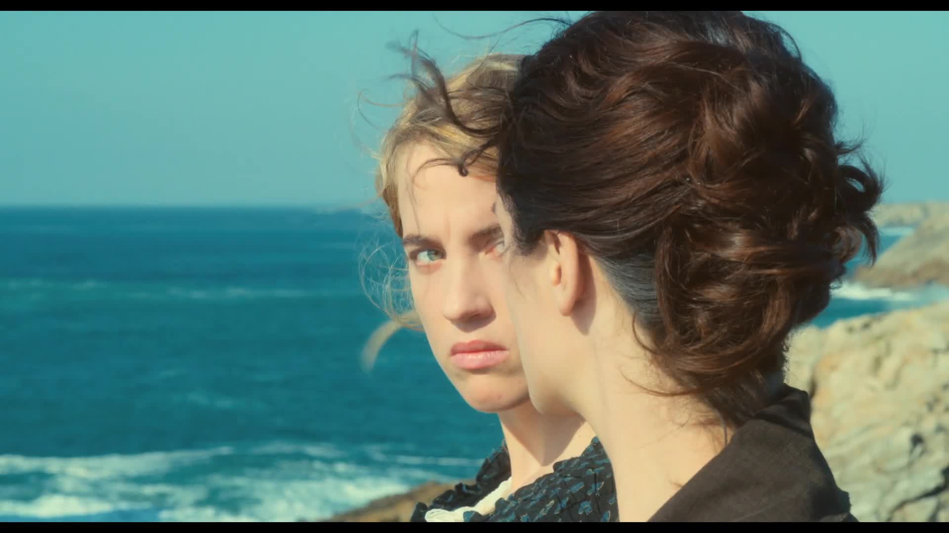
The intentional framing drives the narrative by showing the viewers the emotional journey of the characters. In one scene by the coastline, Marianne and Héloïse are standing side by side. Marianne’s face is covering Héloïse’s face in the frame but reveals Héloïse’s face every time she turns her head to look at her. I thought this was a genius use of framing because it cues the audience in on Marianne’s inner thoughts and her curiosity about Héloïse. We glimpse Héloïse as Marianne does, quick and fleeting.
The long shots throughout Portrait of a Lady on Fire are broken up by a generous helping of close ups, most notably used to emphasize important props. One example is the insert shot on the vase of flowers the maid is using as a subject for her needle work. An earlier shot shows the flowers blooming and flourishing with vibrant colors, but towards the end of the film, the flowers are shown in another shot as dead and withering.
We can take the flowers and extend their physical status to the relationship status of Marianne and Héloïse. Mise-en-scene and cinematography are working in tandem to enforce the mood and themes presented. It’s also worth noting that Marianne is in red throughout the duration of the film, indicating her as the object of desire for Héloïse.
The distinct lack of non-diegetic sound emphasizes the current action and brings the viewer into the fold of the setting. When there is music, however, the emotional effect is greatly increased and has a greater symbolic meaning when taken in the context of the relationship between the two women. The bonfire scene is an emotional moment for both women, and the fire acts as a metaphor for their attraction and desire.
The ending of the film was especially interesting because Marianne and Héloïse were both at the same orchestra concert listening to a piece that held emotional significance during their relationship. Héloïse was lost in the beauty of the orchestra, oblivious to Marianne sitting on the other side of the room. The camera moves in, and we see tears roll down Héloïse’s face.
While talking with several people about this scene, they mentioned being thinking Héloïse would look over and see Marianne or acknowledge the audience in some way. It was an interesting take, especially if you take the story of Orpheus and Eurydice, as told earlier in the film, as a metaphor for the affair.
Was Héloïse truly ignorant to Marianne or was she instead choosing to keep the memory of Marianne that she created? How does the cinematography cater to the feminine gaze? What do you think of how the cinematography impacted the pacing of the film?
The use of mise-en-scène refers to the arrangement of everything within the camera frame. Through this week’s lectures, readings, and screenings, we’ve come to learn that mise-en-scène consists of many aspects: the setting, costuming/makeup, lighting/color, and staging. As I’ve thought over how these different parts work together to compose a scene, I’ve found myself reflecting on movies that I enjoyed in the past, and how the films’ mise-en-scène could have enhanced my enjoyment. Two films especially jumped out at me, being Akira Kurosawa’s High and Low and Jacques Tati’s Playtime.
In High and Low, Kingo Gondo, a business executive, faces a moral dilemma when his driver’s son is mistaken for his own and kidnapped. In the particular scene shown above, the police (left) are attempting to help Gondo in identifying the kidnapper, while his wife (right) and driver (back left) beg him to pay the ransom money that has been demanded. It’s worth noting that Gondo himself is reluctant to pay the ransom, as it will cause him to go bankrupt if he does so. Minor spoiler warning.
The thing that stands out to me in this movie is how Kurosawa places his actors within a frame. In the image above, each character has its own space within the frame. None are imposing on each other, and each character is doing something to draw your attention. The police have their heads bowed, unsure of what to do. Gondo’s mentee looks toward him, expecting him to come up with a plan. Gondo’s wife cries in the corner of the frame, the weight of the situation too much for her to handle. The driver looks away, partially obstructed by the police, positioned behind the policemen as if he were merely a lingering afterthought for the executive. My favorite part of this shot, though, is Gondo himself. As he decides to not pay the ransom money (though he is later convinced to), he separates himself from everyone else in the frame, who all believe paying the ransom is the right thing to do. There is a visible blank area around him, alienating him from all other characters.
In one small shot, Kurosawa can show each character’s emotion, while also portraying the metaphorical (and literal) distance between Gendo and the rest of the cast.
Though Tati’s Playtime is still a masterpiece in terms of actor blocking, I’d like to talk about the mise-en-scène aspects of color/set design and costuming.
Playtime follows the Frenchman Hulot as he finds himself exploring an increasingly modern Paris. It’s an extremely enjoyable and funny film, and I highly recommend you all give it a watch.
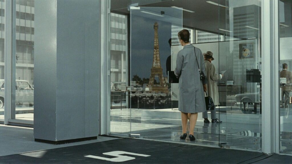
For a film set in Paris, you’d expect to see the city’s ornate and charming buildings. But in Playtime, those beautiful buildings are overshadowed by drab office buildings, which serve as the setting for the film. There’s even a scene where a character enters an airport, just to see all the classic landmarks on travel posters blocked by office buildings. In both set design and costuming, Tati opts to use muted colors like beige and grey as the main color palette for the film. In fact, most sets are completely bland (in a charming way).
Character costumes are the same. Hulot, in his grey raincoat, begins to blend in with the sea of ordinary suits and coats. The only way of distinguishing him from the extras in the frame is from the way he moves: The others know their place and move robotically, while Hulot roams and explores the frame, lost. When I watched the movie, I recognized him through the long umbrella he always carried by his side.
Though Tati doesn’t use any striking and attention-seeking colors, this film is still one of the visually strongest films I’ve seen. Its sets and costumes could also be seen as a critique of urbanization and modernity – a world with too many pointless buildings and gadgets. But in this drab world, there are still signs of life. As Hulot begins to interact with the Parisians and take part in their nightlife and morning routines, the settings he finds himself in become increasingly colorful. It could be as subtle as the pink flowers in a woman’s hair or as eye-catching as a bright red car.
All in all, both films are absolute gems in showing the power of mise-en-scène. High and Low shows the power of blocking, in both fitting all actors in the frame and also adding narrative significance to their positioning. Playtime employs neutral colors to critique modern styles and also increase our appreciation for color.
If this blog convinced any of you to watch either of these movies, please let me know in a comment! I’d love to hear what you all think about these movies and the aspects of mise-en-scène they employ.
In the Grand Budapest Hotel, as I searched the background of its creation, the film’s director Wes Anderson was partly inspired by the novels and memoirs of Austrian writer Stefan Zweig, whose work often talks about the disappearance of old European culture. I believe it influences the tone of the film and its focus on the decline of an era. Also, the film style especially emphasize symmetry, and the camera is almost always positioned directly from the front, side or back. Shots taken from an oblique angle is almost not exist, which always create a sense of precision and this strict formalism gives audience the feeling that the film is almost like a painting or a stage.
Also, another detail I noticed while watching is that Anderson uses three distinct aspect ratios in the film to visually separate the timelines. The first two parts use 1.85:1(1980s), the third part adopts the widescreen format of 2.35:1(1960s), and the most important final part uses the classic industrial standard of old films, 1.37:1(1930s).(https://b23.tv/JTTba6Q, 拉片实验室,2020)
Screenshot
In the end, I think one of the most striking scenes for me is the train inspection. In the first inspection, the inspection is conducted by local policemen who still remain some sense of civility, wearing classical uniforms, and Gustave is able to resolve the situation through his personal connections. However, in the second inspection, Zubrowka is no longer an independent state, and the temporary pass that previously was issued by Norton is not working. The policemen are now armed soldiers in identical uniforms. I believe Anderson was using costume, this element of Mise-en-scène to strengthen the contrast. In the end, the film shift to black-and-white imagery which I may consider as a metaphor for Nazi Germany.
My question is: How does Anderson’s stylized filming approach, which are his symmetry, colors, and changing aspect ratios affect the way we understand this film’s themes-cultural decline?
Mise-en-scène, literally “putting into the scene,” drives the narrative of a film. Through the director’s arrangement of lighting, costume, makeup, and staging, filmmakers construct not just an image but a framework of meaning. This arrangement guides the viewer’s interpretations, often hinting at thematic shifts that words alone cannot. Mise-en-scène serves a dual purpose: it makes the film’s world feel real and familiar, while also shaping it into a visual language that expresses more than everyday reality.
Jean-Pierre Jeunet’s Amélie (2001) exemplifies this idea. The film’s vivid colors, filled with rich reds and greens, make Paris feel less like a real city and more like a reflection of Amélie’s imagination. While many of the Montmartre street scenes are filmed in real locations rather than constructed sets, the color palette is carefully manipulated: saturated reds, greens, and golds heighten the quirkiness and whimsical tone, turning ordinary streets, cafés, and alleyways into an expressive, almost dreamlike environment.
Even the photo booth, for example, is used as a strategic prop; the discarded photo strips serving as both narrative clues and visual motifs that reinforce secrecy, playfulness, and the possibility of intimacy.
Costume and makeup further enhance this visual storytelling. Amélie’s striking black bob, paired with her pale skin and subtle makeup, emphasizes her whimsical nature. The hairstyle draws attention to her expressions, making her reactions central to the narrative and reinforcing her sense of individuality within the stylized Parisian world.
By placing such an emphasis on visual style, Jeunet stretches the expressive power of cinema, showing that meaning can emerge as much from images as from words or action. Yet this stylization also comes with complications: does the film’s look tell its own story, separate from the plot and dialogue? When a movie is so carefully constructed visually, do we find ourselves paying more attention to the images than to the characters inhabiting them?
Mise-en-scène – the art of presenting a scene to the audience. There are five components that make up mise-en-scène: lighting, composition, costumes, setting, makeup, and staging. There are hundreds of individual ways to illuminate your stage and therefore evoke certain emotions. It consists of quality, direction, and source, and color also plays a big role when shaping the atmosphere. When reading chapter 4, I was amazed by the focus put on lighting. And as the text states: “No component of mise-en-scène is more important than what Sternberg called ‘the drama and adventure of light’” (p. 132). But is light really the most essential aspect of mise-en-scène? Isn’t every element of great importance? Perhaps sometimes more weight is placed on lighting, in another case on staging, and in yet another on framing.
As an example of how mise-en-scène can create fear and unease, I want to look at a scene from my favorite movie – Stanley Kubrick’s The Shining. In this sequence, we follow Danny riding his bike through the corridors of the Overlook Hotel. After riding for a while, he suddenly stops after turning a corner and sees two girls standing at the other end of the corridor, staring at him.
For the setting, we have the long and symmetrical hallway. The camera is centered behind Danny, focusing on the motionless twins at the far end of the corridor, who are staring at both Danny and the camera. Furthermore, the emphasis on the girls is enhanced by all the vanishing lines leading to them – our eyes are naturally drawn to this point. This setting evokes an uncomfortable and claustrophobic atmosphere.
The two girls are both wearing old-fashioned dresses, making them appear ghostly and implying that they belong to another time and should not be in this hotel. Additionally, the light-blue color of their dresses match the darker blue carpet and the white/light-blue walls. This suggests that the girls are, in fact, part of the Overlook Hotel (which they are, if you haven’t seen the movie or read the book) and therefore personify the horrors that have happened in the past. Through the color scheme, they visually merge with the hotel. In contrast to them, Danny is wearing a bright red sweater.
The top lighting, the source of which is part of the set design, also contributes to making the scene frightening. It comes straight from above, is harsh and cold, and creates an unpleasant feeling.
I would argue that the composition, setting, and choice of costumes are the most impactful aspects of mise-en-scène that make this scene terrifying. Of course, lighting also supports this feeling, but I can imagine many different lighting arrangements that wouldn’t diminish the sense of unease created here.
Do you agree with me, or do you think I underestimate the impact of lighting in this scene?
Nowadays when we watch a film in a theater, or on Netflix or any other media published for public access, they are likely a finalized, polished version that could not have existed without the efforts of a team of talented filmmakers. We are fully immersed in some actors’ emotional expressions, certainly aware of some of its music, and are constantly being driven by our own expectations towards what will happen next. However, we might not have fully appreciated how the actors’ clothing and makeup aided their expressions, how computer technology adjusted the color scheme of the film, or the dozens of lighting that might have been used for the effects of a single shot. What is all that happened behind the scenes that eventually enabled us such wonderful, enjoyable viewing experience?
The answer to this question lies in mise-en-scène, which, originated in French, means “putting into the scene.” This includes all the elements that work towards the harmonized end result that aligns with the director’s vision and is powerful enough to resonate the audience. 4 main pillars describe mise-en-scène: setting, costumes & makeup, lighting, and staging.
La La Land Photo: Dale Robinette
Do digital technologies in film production encourage bolder mise-en-scène? Or does it risk contradicting with the physical principles of reality? In each fundamental element of mise-en-scène, we seem to find evidence of technology, such as simulated lighting, CGI’s (computer-generated imagery) motion capture, and color grading, etc. Indeed, their usage greatly improved film qualities, but would it happen to be that more and more productions treat raw footages less importantly because “we’ll fix it later on computer”? It potentially could be the case, but for filmmakers treating their works seriously and dedicated to perfection, technologies should not at all be harmful.
A major part of technology use in mise-en-scène is accounted by lighting, which is also a major aspect of film that a lot of people would under-appreciate, probably because it is so intricate and natural that it becomes a neglected part of an image. However, the truth is that lighting is crucial to every scene we see in a film, contributing to character features, emotional delivery, and contrasts with surrounding objects.
The most basic arrangement of lighting could be the traditional three-point lighting, which includes at least a key light, a fill light, and a backlight. Key lights are usually placed directly in front of the actor, functioning as the primary light source that enables us to see their features. A fill light, which is an assisting light source that weakens the shadows created by the key light while softening the actor’s features would possibly be placed at a position near the camera, directed diagonally against the actor. Lastly a backlight would come from behind and above the actor, to lighten up the setting and surrounding features.
Visual by visual education.comWarner Bros.
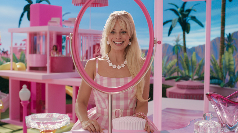
For example, in Greta Gerwig’s Barbie (2023), we see the use of three-point lighting in the fictional, idealized Barbie Land. The “sun” functions as the backlight, as evidenced by the glowing edges of Barbie’s hair. Yet, we still see Barbie’s face softly because of the fill light, and eventually bounces off her bedroom and other vibrant set pieces. Such lighting creates an overall bright, cheerful, and shadowless environment, which demonstrates the concept of high-key lighting. High-key lighting uses fill light and back light to create relatively low contrast between brighter and darker areas.
Apart from lighting, setting, costumes & makeup, and staging are also involved with technology in today’s film production. Softwares are able to add features to characters’ faces. For instance, in Dave Gibbons’s Watchmen (2009), a digital simulation of ink that flows through the superhero Rorschach’s face was imposed during postproduction.
Dave Gibbons’ Watchmen (2009)
The existence of such technology expands the possibility of film, and somehow changes the goal from appealing to realism into allowing for fantasy and fictional elements. When the technology strengthens lighting, rehearses blocking, and emphasizes coherent prop motifs, it expands what a filmmaker can stage. However, if it tempts a “we’ll fix it later” mentality, it’s probably getting in the way, despite it is true that a lot of productions were limited on budget and time such that technology becomes a convenient method to reach towards the ideal effects.


![Portrait of a Lady on Fire – [FILMGRAB]](https://film-grab.com/wp-content/uploads/photo-gallery/Portrait_of_a_Lady_on_Fire_065.jpg?bwg=1601292400)


![Three-Point Lighting Ideas for Portraits [with Lighting Diagrams] | Visual Education](https://cdn-bjpdk.nitrocdn.com/dyjDRTumiVVFLKEpXMADzKdEUUbypNrL/assets/images/optimized/rev-142a2bb/visualeducation.com/wp-content/uploads/2019/06/Three-Light-High-key-flash.jpg)