Tag: # The Grand Budapest Hotel

  • The Grand Budapest Hotel: Creating a Fictional World Through Sound

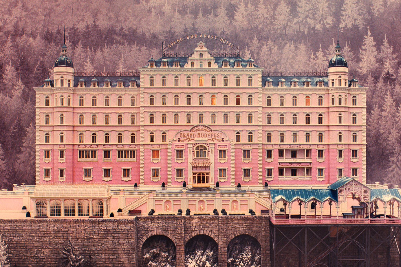
    During my further research into The Grand Budapest Hotel, I was most interested in a video analysis of the creation of the movie’s score. The video, posted by “Inside the Score” on YouTube, highlights the apparent challenge in creating music from an imaginary country. The soundtrack was constructed by Alexandre Desplat, a talented French composer who also collaborated on other Wes Anderson films, including Fantastic Mr. Fox, Isle of Dogs, French Dispatch, and Moonrise Kingdom. Desplat and Anderson situate the fictional country of Zubrowka on the easternmost border of the European continent. Desplat identifies the broader geographical area as “Mittleuropa”, or Middle Europe, stretching from Switzerland to Turkey.

    In order to strengthen the authenticity of the fictional Zubrowka, Desplat utilizes traditional instruments from neighboring regions. For example, in the main theme music, he uses a cimbalom, a stringed instrument popular in Hungary and the alpine regions, thus giving the music a nostalgic and distinctly Central European tone. During winter scenes, he incorporates tubular bells, sleigh bells, and glockenspiel, creating a whimsical sound reminiscent of the Russian composer Tchaikovsky’s Nutcracker. In contrast, for dramatic scenes, the movie uses brass instruments that often mirror marching percussion, signaling the arrival of the fascist groups.

  • Wes Anderson’s Wretched Whimsical World

    We can all admit that this Wes Anderson’s “The Grand Budapest Hotel” is a visually eye-catching film, almost to the point where you begin to question the intentions of the color scheme compared to the topic of the movie.

    This video, made by StudioBinder on YouTube, does a great job of explaining why the movie’s choice of color is so peculiar while considering the circumstances of the movie, or more specifically, the characters’ stories.

    The Grand Budapest Hotel - by Gina Wurtz
    The Grand Budapest Hotel – film review

    Wes uses primary colors, high saturation, and brightness to portray a childlike perspective and maintain the whimsical feeling, though reality reflects the opposite. Specifically, he repeatedly reintroduces the color red into the film to reflect the childhood trauma they still carry into adolescence.

    Film Clip: 'The Grand Budapest Hotel'
    Grand Budapest Hotel | Mick Ricereto Interior + Product Design

    So why does he continue to use this color theory? StudioBinder says that it is an expression of dark humor and a play on the theme’s bipolar tones versus the visuals. I guess you simply cannot believe the emotion to be everything you see. It forces the audience to be engaged in the world and face the dark topics.

    The Grand Budapest Hotel Color Palette Analysis | Wes Anderson - Pixflow  Blog

    When the switch is made in the second train scene, it is apparent that the bipolar color vs. dialogue theory still reigns. Wes’s use of color becomes very telling when the colors become black and white at the time of tragedy. Zero says, “There are still faint glimmers of civilization in this barbaric slaughterhouse that was once known as humanity. He was one of them. What more is there to say?” In my opinion, it shows how quickly reality is turned back on, and hope in humanity was stolen when they killed Mr. Gustave, almost as if the color died with him.

    If you are interested, I highly suggest watching and seeing if you also caught on to the same patterns!

  • How does Anderson’s filming approach affect the way we understand this film’s theme?

    In the Grand Budapest Hotel, as I searched the background of its creation, the film’s director Wes Anderson was partly inspired by the novels and memoirs of Austrian writer Stefan Zweig, whose work often talks about the disappearance of old European culture. I believe it influences the tone of the film and its focus on the decline of an era. Also, the film style especially emphasize symmetry, and the camera is almost always positioned directly from the front, side or back. Shots taken from an oblique angle is almost not exist, which always create a sense of precision and this strict formalism gives audience the feeling that the film is almost like a painting or a stage.


    Also, another detail I noticed while watching is that Anderson uses three distinct aspect ratios in the film to visually separate the timelines. The first two parts use 1.85:1(1980s), the third part adopts the widescreen format of 2.35:1(1960s), and the most important final part uses the classic industrial standard of old films, 1.37:1(1930s).(https://b23.tv/JTTba6Q, 拉片实验室,2020)

    Screenshot

    In the end, I think one of the most striking scenes for me is the train inspection. In the first inspection, the inspection is conducted by local policemen who still remain some sense of civility, wearing classical uniforms, and Gustave is able to resolve the situation through his personal connections. However, in the second inspection, Zubrowka is no longer an independent state, and the temporary pass that previously was issued by Norton is not working. The policemen are now armed soldiers in identical uniforms. I believe Anderson was using costume, this element of Mise-en-scène to strengthen the contrast. In the end, the film shift to black-and-white imagery which I may consider as a metaphor for Nazi Germany.


    My question is: How does Anderson’s stylized filming approach, which are his symmetry, colors, and changing aspect ratios affect the way we understand this film’s themes-cultural decline?

  • The Grand Budapest Hotel_ Viewer’s Comment

    The use of Mise-en-Scene in The Grand Budapest Hotel


    Hello classmates, it was great to watch this interesting movie with you all this afternoon. I don’t know how you felt about this movie, but personally speaking, I loved it. The plots are so tight, and I got fully immersed in it! Besides the fantastic storytelling, I believe that this movie effectively shows the power of Mise-en-Scene. The smart uses of setting, costume and makeup, lighting, and staging not only help the audience engage better, but also gives us more space to explain the film further and taste it deeper.

    In this post, I’d love to share with you some of my findings while watching and also share initial questions I have, so we can further discuss them.

    Insights:

    1. In the scene of reading Madame D.’s will, Gustave and Zero are standing at the door of the entire room, on the opposite side, wearing purple suits, while almost all of the other people in the same scene were in black. By contrasting standing position and clothes’ color, I think that the director is trying to emphasize the contrast of their personalities: Gustave and Zero embody individuality, elegance, visually marked by their purple uniforms. The others dressed uniformly in black represent conformity, rigidity, and the coldness of aristocratic tradition. (Costume & Makeup + Staging)
    2. Jopling: This ruthless killer is depicted by using a combination of costume and lighting techniques. If I remember correctly, he is always dressed in black throughout the entire movie, often wearing black sunglasses or having shadowed eyes due to the lighting effect. For example, in the snow mountain scene, he chases after Zero and Agatha on a sled after Gustave and Zero escape. The stark white snow, contrasted with Jopling’s dark figure, strengthens his dark side and ruthless personality. (Costume + Llighting)
    3. In the prison escape tunnel, light becomes symbolic: the small window glows brightly while everything else is engulfed in darkness. This stark contrast emphasizes freedom as a distant possibility, a fragile opening amid confinement. (Lighting + Setting)


    Questions:

    1. Why does Anderson begin the film in a cemetery filled with crosses? How does this opening frame set the tone of memory and loss? (Setting)
    2. What’s the implication of the children with weapons in the second scene? Is Anderson suggesting that violence disrupts innocence and order? (Staging + Setting)
    3. How does Anderson’s pastel palette (pink hotel exterior, purple uniforms, candy-colored props) evoke nostalgia? Does it make the story feel like a memory or a fairy tale? (Costume & Makeup + Setting)
    4. What are the symbolic meanings of the painting Boy with Apple? Why did Anderson choose this painting instead of others? (Props/Costume & Makeup)
    5. Why does Anderson often isolate characters in their own shots during dialogue (like Gustave and Zero on the train), instead of framing them together? (Staging)

    Hope we can discuss further in the comment area or in class!