In a previous post I suggested that historians should use quantitative methods less to answer existing questions than to pose new ones. Such a digital humanities (DH) approach would be the reverse of the older social science history approach, in which social science tools were use to “answer” definitively longstanding questions. This post offers another example of how data visualization can suggest new questions, and how social science and humanistic methods can be complementary in unexpected ways.
One way to conceptualize this complementarity is John Tukey’s observation that “data = smooth + rough,” or, in more common parlance, quantitative analysis seeks to separate patterns and outliers. In a traditional social science perspective, the focus is on the “smooth,” or the formal model, and the corresponding ability to make broad generalizations. Historians, by contrast, often write acclaimed books and articles on the “rough,” single exceptional cases. These approaches are superficially opposite, but there is an underlying symbiosis: we need to find the pattern before we can find the outliers.

To highlight this complementarity, I pulled data on traffic on the French highway system from a blog on econometric methods. The data is clearly periodic, and for the blogger, Arthur Charpentier, the key question is how to model that periodicity. An autoregressive (AR) model? A moving average (MA) model? Autoregressive integrative moving average model (ARIMA)? Or maybe we should use spectral analysis to decompose the series into a collection of sine waves? These technical questions are important, and non-economists encounter these issues, if unwittingly on a daily basis when we read about “seasonally adjusted” inflation or unemployment.
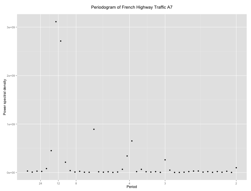
My quantitative/econometric chops are just good enough to enjoy experimenting with these methods, and while the details are complex, the core ideas are not. The graph below, a periodogram, shows that the traffic data has a strong “pulse” around the twelve-month mark and much smaller pulses around the four and three-month marks. There is a strong annual rhythm to the data, with several weaker seasonal pulses.
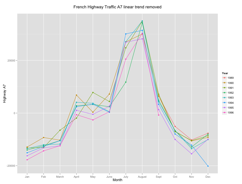
Now it’s great fun to play with sine waves, but as a DH historian, I would parse the data in different fashion. The periodogram, ironically, obscures the cultural aspects of periodicity. When exactly does traffic peak? Remapping the data confirms some conventional wisdom about France. Highway traffic peaks each year in July and August, as everyone heads to the forest or the beach. Yes, that’s why it seems like the only people in Paris in August are tourists.
We can also visualize this annual cycle using polar coordinates, mapping the twelve months of the year as though they were hours on a clock, and visualize traffic volume with a heatmap, using darker colors for higher volumes of traffic. Kosara and Andrew Gelman had a valuable exchange on the merits of such visualizations, Kosara arguing in favor of polar coordinates and spirals, but Gelman noting the power of a conventional x-axis. It’s too rich for a quick summary—read their ideas!

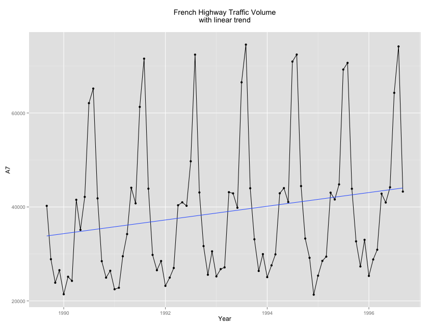
But from a DH perspective the most interesting thing about the data is not the trend, but the outlier. Look at the traffic for July 1992. It’s markedly below expectations. But then traffic was higher than average for August. What’s going on?
I let my freshman seminar students loose on the question and they quickly came back with an answer. The 1992 outlier corresponds to a massive truckers’ strike, sparked by a new system of penalties for traffic violations. Truckers blocked major highways for days and the French government deployed the army, which used tanks to clear the roads. The strike had an impact across the French economy and occupancy in vacation resorts dropped below 50%

It is here that social science and humanistic paradigms tend to part ways. For an economist, the discovery of the strike explains the outlier. She can delete that observation, or include a “dummy” variable and move on, satisfied that the model now better fits the data. There is more “smooth” and less “rough.” For a labor historian, this “rough” can become a research question. Why, of all the labor actions in the 1990s, was 1992 strike so striking in its impact? Was this a high water mark for French labor mobilization? Or did it inspire further actions? Did its impact on vacationers sour the general public on labor? And did the government back down on its regulations? For a historian, explaining this single outlier can be more important than understand any trend. The paradox is that the magnitude of outliers becomes clearer once we’ve modeled the trend, either visually or mathematically. The “drop” in traffic in July 1992 exists only relative to an expected surge in traffic. Thus, as I suggested in a previous post, historians need to build models and throw them away.
Nice article. Well explained.