Just discovered a great blog post on “data illustration” versus “data visualization” at Information for Humans. AIS argues that data illustration is “for advancing theories” and “for journalism or story-telling.” By contrast data visualization “generate[s] discovery and greater perspective.” I love this distinction, although I’m not sure I like the specific language. Tukey famously argued that data visualization was for developing new theories. Drawing on Tukey, I would use the phrase “exploratory visualization” for techniques that allow us to poke around the data, searching for trends and patterns. Tableau is the great commercial product and Mondrian by Martin Theus is a wonderful freeware application. By contrast, once we have a thesis, we need to convince our audience. That’s “expository data visualization” and it calls for different tools. The R package ggplot2 (http://www.ggplot2.org) is my choice. The terms “expository” versus “exploratory” resonate with freshman comp more that standard data analysis, but that’s the point. After all, this is a DH blog.
Build great models . . . throw them away
The rise of digital humanities suggests the need to rethink some basic questions in quantitative history. Why, for example, should historians use regression analysis? The conventional answer is simple: regression analysis is a social science tool, and historians should use it to do social science history. But that is a limited and constraining answer. If the digital humanities can use quantitative tools such as LDA to complement the close reading of texts, shouldn’t we also have the humanistic use of regression analysis?
What I would like to suggest is idea of model building as a complementary tool in humanistic history, enhancing rather than replacing conventional forms of research. Such an approach rejects what we might call the Time on the Cross paradigm. That approach holds that econometric models are superior to other forms of analysis, and that while qualitative sources might be used to pose questions, on quantitative sources can be used to answer questions. But what if the opposite is true? What if model building can be used to raise questions, which are then answered through texts, or even through archival research?
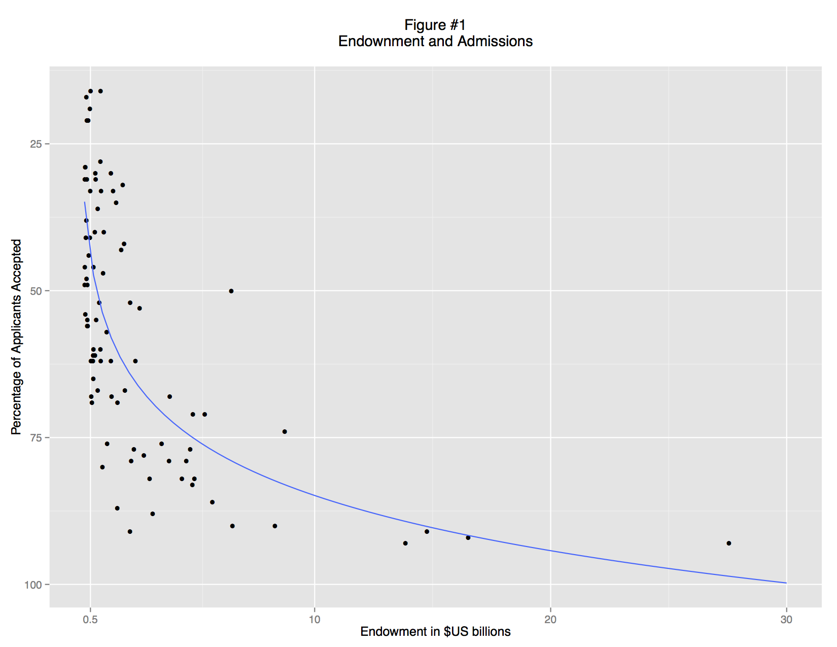
Let me anchor these ideas in an example: an analysis of the 2012 US News and World report data for college admissions and endowments. Now in a classical social-science history approach, we would first need to posit an explicit hypothesis such as “selective admissions are a linear function of university endowments.” Ideally the hypothesis will involve a causal model, arguing, for example, that undergraduates apply to colleges based on perceived excellence, and that excellence is a result of wealth. Or we might cynically argue that students simply apply to famous schools, and that large endowments increase the applicant pool without any relationship to educational excellence. But humanistic inquiry is better served by an exploratory approach. In exploratory data analysis (EDA) we can start without any formal hypothesis. Instead, we can “get to know the data” and see whether interesting patterns emerge. Rather than proving or disproving a theory, we can treat quantitative data as we would another any other text, searching both for regularities, irregularities, and anomalies.
A basic scatterplot shows an apparent relationship between endowment and the admittance rate: richer schools accept a smaller percentage of their applicants (Figure 1). But the trend is non-linear: there is no limit to endowment, but schools cannot accept less than 0% of their applicants. This non-linearity is simply an artifact of convention. We can understand the data better if we re-express the acceptance rate as ratio of students rejected to students accepted and use a logarithmic scale (Figure 2). There is now a fairly clear trend relating large endowments and high undergraduate admittance rate: the data points track in a broad band from bottom left to top right. But there are also some clear outliers, and examining these leads to interesting insights.
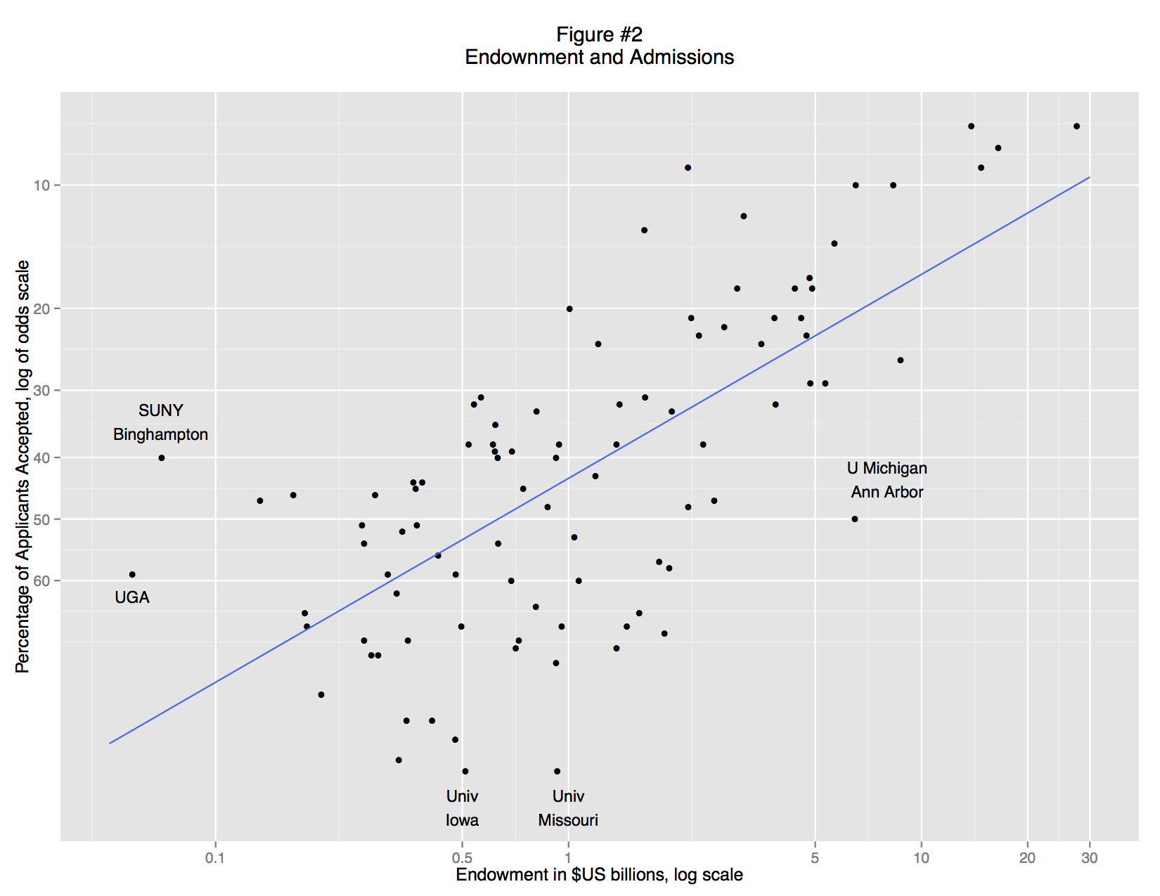
On the left, for example, we find three schools that are markedly more selective than other schools with similar endowments: SUNY College of Environmental Science and Forestry, the University of Georgia, and SUNY Binghamton. On the right is University of Michigan, Ann Arbor. At the bottom are the University of Missouri and University of Iowa. What do these schools have in common? They are all public institutions.
When we separate the private and public schools (Figures 3 and 4) it becomes clear that there is no general relationship between endowment and admittance rate. Instead, there is a strong association for private colleges, but almost none for public colleges. These associations are visual apparent: private school fall close to the trend line (a standard OLS regression line), but for public schools the data points form a random cloud. Why? Perhaps the mandate of many state schools is to serve a large number of instate students and that excessively restrictive admissions standards would violate that mandate. Perhaps the quality of undergraduate education is more closely linked to endowment at private schools, so applicants are making a rational decision. Or perhaps, private schools are simply more inclined to game their admittance rate statistics, using promotional materials to attract large numbers of applicants.
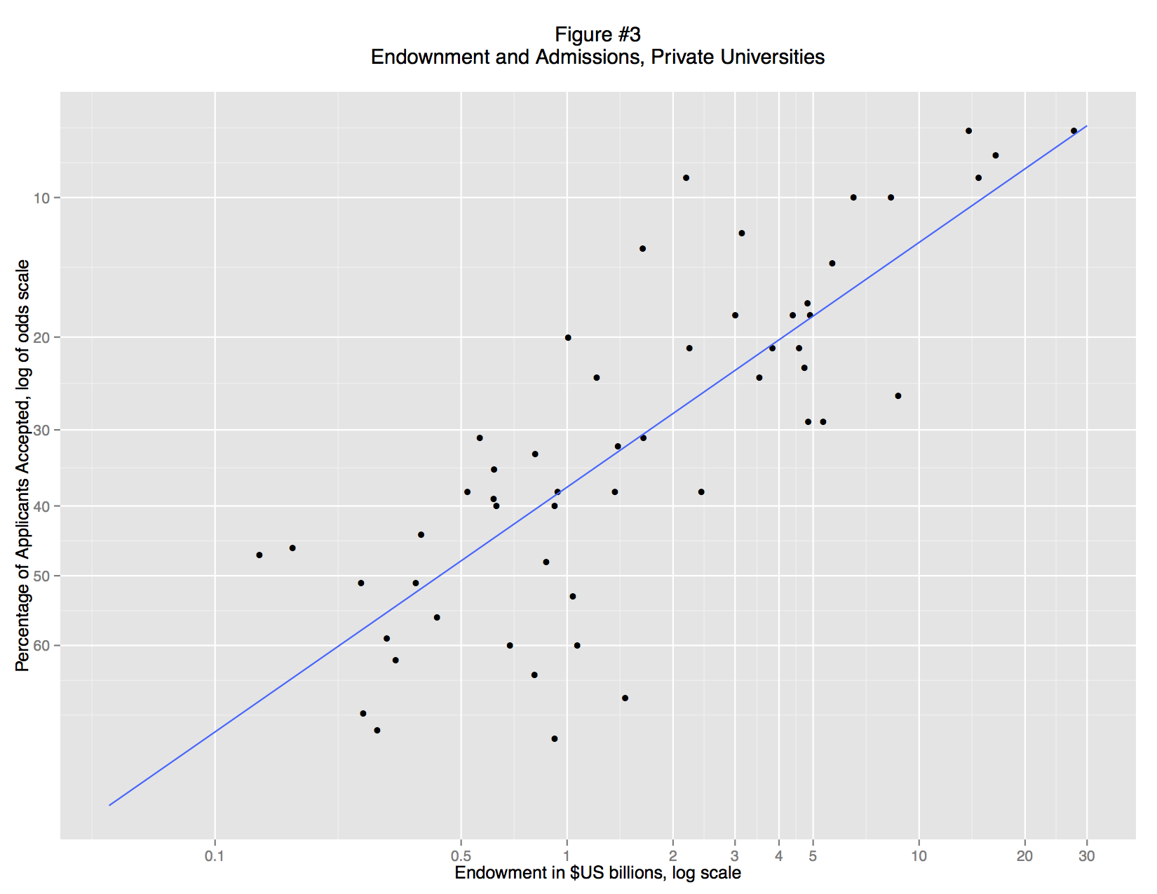
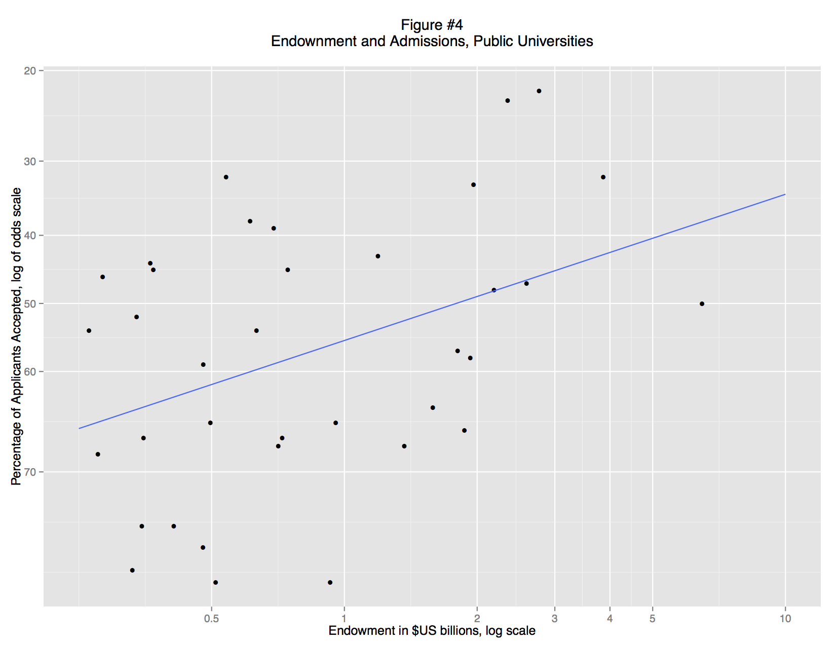
What’s striking here is that we no longer need the regression model. The distinction between public and private universities exists as a matter of law. The evidence supporting that distinction is massive and textual. Although we “discovered” this distinction through regression analysis, the details of the model are unnecessary to explain the research finding. In fact, the regression model is vastly underspecified, but that doesn’t matter. It was good enough to reveal that there are two types of university. In fact, the most important regression is the “failure”: the lack of a correlation between endowment and selectivity in public colleges.
So let us image a post-apocalyptic world in which the US university system has been destroyed by for-profit MOOCs and global warming: Harvard, Stanford, and Princeton are underwater both physically and financially, while Michigan Ann Arbor and UI Champaign-Urbana are software products from the media conglomerate Amazon-Fox-MSNBC-Google-Bertelsmann. An intrepid researcher runs a basic regression and discovers that there were once private and public universities. This is a major insight into the lost world of the early twenty-first century. But the research can responsibly present these results without any reference to regression, merely by citing the charters of the school. She might also note that the names of schools themselves are clues to their public-private status. Regression analysis does not supplant close reading, but merely leads our researcher to do close reading in new places.
What’s important here is that these models are, by social science standards, completely inadequate. If we were to seriously engage the question of how endowment drives selectivity we would need to take account of mutual causation: rich schools become selective, but selective schools become rich. That would require combining panel and time series data with some sort of structural model. But we actually don’t need anything that complicated if we are posing questions with models and answering them with qualitative data. In short, we can build a model, then throw it away.
Back to Basics
Aaron at Plan Space from Outer Nine has a valuable insight about how standard statistics textbooks often favor technique over understanding. I think we could extend approach this from “central tendency” to the broader question of “association.” We tend to view various measures of association (for example, Chi-square χ2, Spearman’s rho ρ, Pearson r, R2, etc.) as completely different measurements. But the underlying question is the same: do certain types of values of x tend to coincide with certain values of y? That’s the core question behind most descriptive statistics. The way we measure the association depends on the type of data, but the core question is the same. In data visualization, we can think of mosaic plots and scatterplots as similarly related. How can we see associations in the data? We could use a scatterplot, even for nominal data, but a large coincidence would just result in lots of overplotting. That’s why we use a mosaic plot: association becomes a big box. In short, there is great virtue in returning to first principles
Political economy in Tokugawa Japan: are tozama and fudai meaningful categories?
Regional lords (daimyō) in early-modern Japan were grouped into several categories based on their relationship with the shogunal Tokugawa house. The two largest categories of daimyo were fudai and tozama. Lords whose ancestors had proven their loyalty to the Tokugawa before 1600 were commonly known as fudai, while lords with more suspect allegiances were known as tozama, literally “outsiders.” This relationship between sixteenth-century lords and Tokugawa Ieyasu is well understood. Less clear is whether the terms tozama and fudai are meaningful for understanding political economy in later centuries. Many historians have observed constrasts in the investitures of tozama and fudai, although they describe this in different ways. The Kodansha Encyclopedia of Japan notes simply that “tozama generally held higher rank and larger domains than fudai” and that “fudai daimyō had smaller domains than tozama.” W.G. Beasley observed that tozama “predominated in the southwest and northeast of the country and included more of the very large domains than did the fudai” (Beasley 1960, 256). Jansen offered a fine-grained explanation. “Of the sixteen largest daimyo holdings, all but five were tozama. . . . in contrast to this, was the prevalence of petty, postage-stamp sized domains among the fudai. . . . most of them were without even a castle town and were close to the definitional limit for daimyo of 10,000 koku assessed productivity” (Jansen 2000, 42). Testuo Najita offered a more nuanced distinction, noting that some fudai were “assigned small- and medium-sized domains without significant military responsibilities,” but others were given “large strategic domains in regions with security responsibilities” (Najita 1974, 20). Harold Bolitho, by contrast, argued that by the 1800s there were few important differences tozama and fudai (Bolitho 1974).
Data visualization and exploratory data analysis can help us to a clearer understanding of the tozama/fudai distinction. The analysis below relies on data from the early 1870s, compiled by the Meiji government as part of its replacement of domains with prefectures (for details see Ravina 1999). Figure 1 uses violin plots to compare the two types of domains by kusadaka, the annual harvest yield of the domains measured in koku of rice. The tozama distribution reveals a long tail, which skews the mean well above the median and the mode, but the lower halves of the tozama and fudai distributions are similar.
Figure 1
Annual harvest yields of domains (kusadaka) by domain type

Red diamonds mark the mean and blue circles mark the median. Kusadaka is an estimate of the annual harvest yield, using rice as currency of account. A koku is approximately 5 bushels or about 280 liters.
Figure 2 uses an annotated box plot to detail the outliers (extreme values). Notably, the four major domains active in the overthrow of the shogunate (Satsuma, Chōshū, Tosa, and Saga) all appear as tozama outliers, while the most dogged defender of the shogunate, Aizu, appears as a fudai outlier.1
Figure 2
Annual harvest yields of domains (kusadaka) by domain type

Red diamonds mark the mean and blue circles mark the median. Kusadaka is an estimate of the annual harvest yield, using rice as currency of account. A koku is approximately 5 bushels or about 280 liters.
What conclusions can we draw from these visualizations? The first is that the long tails skew not only mean values but our understanding of the distinction between tozama and fudai. The average kusadaka of a tozama domain was roughly 127,000 koku, more than double the size of the average fudai holding of 49,000 koku. But this difference was due to primarily to the presence of extremely large tozama domains, such as Kaga, Satsuma, Kumamoto, etc., with holdings over 500,000 koku. By contrast, there were no fudai with holdings that large. The medians of the two groups are thus quite close (approx 32,000 koku for fudai, and 38,000 for tozama) and the violin plot bulge are around the same points (estimated modes). Thus, large daimyo were overwhelmingly tozama, but those long tails tell us little about the vast majority of domains. Below 500,000 koku the distributions for tozama and fudai look extremely similar, and in both cases, most daimyo held less than 40,000 koku. Thus while we can assume a very large domain was tozama we cannot assume that a tozama domain was large. By extension, very large tozama domains were decisive in overthrowing the shogunate, but that tells us little about tozama in general.
The converse holds for distinquishing features of fudai. Some fudai holdings consisted of many small, scattered parcels, and the most fragmented holdings were all fudai investitutes, but the vast majority of all domains consisted of one contiguous holding.
Such seeming paradoxes are common. US Senators and NASCAR drivers are overwheingly white men, but the vast majority of white men are neither NASCAR drivers nor senators. Simple data visualizations, such as boxplots and violin plots, make it easy to avoid such inferential confusion.
Notes
1. Because the Meiji government dissolved Aizu han, replacing it with Wakamatsu prefecture, those data are prefectural data. View or download data
Violin plots use width to mark the number of observations at each level. The thickest part of the plot is the most common value, while thin sections mark less common values. Technically, violin plots combine a box plot with a kernel density plot.
Boxplots display a distribution using a “box” and “whiskers.” The box marks the middle 50% of the data, from the 25th percentile to the 75th percentile, a range called the interquartile range (IQ). The “whiskers” are dashed lines extending out from the box. They extend to the most extreme data point which is no more than 1.5 times the IQ (length of the box) away from the box. Points beyond the whiskers are outliers, and are marked with circles.
Selected bibliography
Beasley, W.G. 1960. “Feudal Revenue in Japan at the Time of the Meiji Restoration.” Journal of Asian Studies 19 (3 May): 255-72.
Bolitho, Harold. 1974. Treasures Among Men: The Fudai Daimyo in Tokugawa Japan. New Haven: Yale University Press.
Frigge, Michael, David C. Hoaglin, and Boris Iglewicz (1989). “Some Implementations of the Boxplot.” The American Statistician 43 (1): 50-54.
Jansen, Marius B. 2000. The making of modern Japan. Cambridge, Mass.: Belknap Press of Harvard University Press.
McGill, Robert, John W. Tukey, and Wayne A. Larsen (1978). “Variations of Box Plots.” The American Statistician 32 (1): 12-16.
Najita, Tetsuo. 1974. Japan. Englewood Cliffs, N.J.: Prentice-Hall.
Ravina, Mark. 1999. Land and Lordship in Early Modern Japan. Stanford, Calif.: Stanford University Press.
In praise of “Shock and Awe”
Why graph? And why, in particular, use innovative and unfamiliar graphing techniques? I started this blog without addressing these questions, but a recent blog post by Adam Crymble, critical of “shock and awe” graphs made me realize the need to explain EDA (Exploratory Data Analysis) and data visualization. Crymble wisely challenged data visualization practitioners to ask themselves the following questions: “Is this Good for Scholarship? Or am I just trying to overwhelm my reviewers and my audience?” This is sound advice, and Crymble’s concerns strike me as genuine. But, upon reflection, his post led me to think that “shock and awe” are evitable parts of any bold scholarly intervention. Feminist scholarship provoked genuine anger when it asserted that academic conventions were rife with sexist assumptions. The linguistic turn alarmed traditional scholars with its new understandings of literary production. Certainly these interventions produced (and continue to produce) needlessly complex, derivative prattle. But can anyone seriously argue that the humanities are not richer for these intellectual challenges?
What follows, therefore, is a defense of “shock and awe”: a justification for data visualizations that are unfamiliar, challenging, and demand news ways of thinking.
Why graph instead of just showing the numbers?
By just “show the numbers,” humanities researchers often refer to tables. The problem with this preference for tables it that is assumes that tables are somehow more transparent and accessible than graphs. In fact, the opposite is true. A list of data values is like a phone directory: a wonderful way to look up individual data points, but a terrible means of discerning or discovering patterns. (Kastellec and Leoni 2007; Gelman, Pasarica, and Dodhia 2002) Alternately, a table of individual data points is analogous to collection of primary text sources: it’s the raw material of research, not research. Further most published tables are not transparent, “raw” data. On the contrary, tables in most research consolidate observations into groups, listing, for example, average wages for “skilled craftsman in Flanders 1830-35,” or “Osaka dyers 1740-80.” But why those years ranges and those occupational categories? Why 1830-35 instead of 1830-1840? Why Osaka dyers and not the broader category of Osaka textile workers? Those groupings may be conceptually valid, but they are interpretative and preclude other interpretations. Certainly we can lie with graphs, but we can also lie with tables. And since a good graph is better than the best table, DH researchers need to use good graphs.
Why these novel, unfamiliar graphs?
The data visualization movement has certainly produced some bad graphs —obfuscating rather than illuminating. But it is impossible to argue that newer graph forms are more misleading than the status quo. The pie chart, for example, is easy to misuse and the many variants supported by Excel are simply awful. With a 3D exploding pie chart, even a novice can make 5% look larger than 10% or even 15%. Can you correctly guess the absolute and relative sizes of the slices in this graph? 
(See answers below). Since pie charts are familiar, they are accessible, but that simply makes them easier to misuse. Are conventional bad graphs such as pie charts “better” than newer chart forms because they provide easier access to faulty conclusions? Is “schlock” worse that “shock”?
My survey of graphing techniques in history journals tuned up an alarming result. Historians rely primarily on graphing techniques developed over 200 years ago: the pie chart, bar chart, and line chart. It is hard not to shock the academy with strange graphs, when “strange” means anything developed in the past two centuries. Many new graphing techniques, such as parallel coordinate plots, are still controversial, difficult to use, and difficult to interpret. But many others are readily accessible and widely used, except in the humanities, The boxplot, developed in 1977 by John Tukey, is now recommended for middle school instruction by The National Council of Teachers of Mathematics. The intellectual pedigree of the boxplot is beyond question: Tukey, a professor of statistics at Princeton and researcher at Bell Labs, is widely considered a giant in 20th century statistics. So, what to do when humanities researchers are flummoxed by a boxplot? I now append a description of how to read a boxplot, but isn’t it an obligation of quantitative DH to push the boundaries of professional knowledge? And shouldn’t humanities Ph.D.’s have the quantitative literacy of clever eighth graders? In short, since our baseline of graphing skills in the humanities is so outdated and rudimentary, there is no avoiding some “shock and awe.”
A graph in seven-dimensions? What are you talking about? You must be trying to trick me!
Certainly “seven dimensions” sounds like a conceit designed to confuse the audience, or intimidate them into acquiescence. But a “dimension” in data visualization is simply a variable, a measurement. Decades ago Tufte showed how an elegant visualization, Menard’s graph of Napoleon’s invasion of Russia, could show six dimension on a 2D page: the position of the army (latitude and longitude), size of the army, structure of the Russian army, direction of movement, date, and temperature. Hans Rosling’s gapminder graphs use motion to represent time, thereby freeing up the x-axis. By adding size, color and text, Rosling famously fit six dimensions on a flat screen: country name, region, date, per capita GDP, life expectancy, and total population. These are celebrated and influential data visualizations, the graphic equivalents of famously compelling, yet succinct prose. While Crymble assumes that needlessly complex graphics stems from bad faith (a desire to intimidate and deceive), I am more inclined to assume that the researcher was reaching for Menard or Rosling but failed.
“How do you know there hasn’t been a dramatic mistake in the way the information was put on the graph? How do you know the data are even real? You can’t. You don’t.”
This concern strikes me as overwrought and dangerous. Liars will lie. They will quote non-existent archival documents, forge lab results, and delete inconvenient data points. When do we discover this type of deceit? When someone tries to replicate the research: combing through the archives, running a similar experiment, or trying to replicate a graph. How are complex graphics more suspect, or more prone for misuse than any other form of scholarly communication? Is there any reason to be more suspicious of complex graphs than any other research form?
I can optimistically read Crymble’s challenge as a sort of graphic counterpart of Orwell’s rules for writers. But Crymble seems to view data viz as uniquely suspect. To me this resembles the petulant grousing that greeted Foucault, Derrida, Lyotard, Lacan, etc some three decades ago – “what is this impenetrable French crap!” “You’re just talking nonsense!” Certainly many of those texts are needlessly opaque. But much of it was difficult because the ideas were new and challenging. The academy benefitted from being shocked and awed. Data visualization can and should have the same impact. The academy needs to be shocked — that how change works.
Gelman, Andrew, Cristian Pasarica, and Rahul Dodhia. 2002. “Let’s Practice What We Preach: Turning Tables into Graphs.” The American Statistician 56 (2): 121-30.
Kastellec, Jonathan P., and Eduardo L. Leoni. 2007. “Using Graphs Instead of Tables in Political Science.” Perspectives on Politics 5 (4): 755-71.
The pie chart:
| Apple | 10 |
| Borscht | 17 |
| Cement | 13 |
| Donut | 20 |
| Elephant | 25 |
| Filth | 15 |
Where the monks are(n’t)
After reviewing a book on religion in 19th century Japan, I became curious about the quantitative dimension of religious practice, particularly the persecution of Buddhism. My initial visualizations turned into a exploration of how to visual spatial variation.

The 1871 census data reported two types of religious practitioners (monks and priests) totaled by either domain or prefecture. The data show a striking regional trend. The boxplot below shows the percentage of religious practitioners described as monks. In the Kinai, the median was about 80%. At the periphery, however, the percentage of monks was much lower: in Kyūshū, Chūgoku, Shikoku and Tōhoku the median was about 50%. The highest values for Kyūshū and Chūgoku are still below the median for the Kinai. Chūbu shows the most striking range, Naegi reporting 0% monk and Katsuyama 99%
The map below plots the extreme values for religious affiliation: domains with more 80% monks are marked as red, while less than 50% are marked in blue. Here again, we can see the same pattern – lot’s of monks around Kyoto and Nara, but fewer in Kyushu and the northeast. Two domains famous for their persecution of Buddhism, Mito and Kagoshima, are both in red, but so are nearby domains. What explains this regional trend in religious practice?

Welcome to clioviz
What is clioviz? A blog devoted to data visualization in history and the humanities. What’s data visualization? An interdisciplinary approach to graphics that seeks to make trends and patterns in quantitative data visually apparent. In a well-designed data viz, patterns jump out at the viewer/reader, and results are obvious without the use of descriptive statistics. This blog grew out of an Emory graduate seminar (HIST 582 Quantitative Methods) and the initial posts come from those seminar papers. But we’ll be adding later work too, and linking to other sites/blogs in data viz and digital humanities.
Most of the viz’s here were produced in R, the language and environment for statistical computing and graphics