This research project centered around the question of how gentrification was reflected in the semiotic landscape and how the semiotic landscape produced gentrification. What started as a survey of what non-English languages would be present on signage around the Buckhead Village shopping center morphed into a study on how wealth and class are channeled in storefront signage. This project was guided by the work of Shonna Trinch and Edward Snajdr in their 2017 study, “What the Signs Say: Gentrification and the Disappearance of Capitalism without Distinction in Brooklyn,” where they examine how gentrification has reshaped how signs are made around lower Brooklyn. They derived their own classification system for the old and new signs that I applied to the Buckhead storefronts in this survey. Alongside this, I examined other trends that resulted from this survey of signage regarding content of signs or sign form (font, size, location) in relation to class conveyance. The framework between “Old School Vernacular” signs and the gentrified “Distinction” signs provided by Trinch and Snajdr (2017) formed the crux of this semiotic analysis. “Old School Vernacular” signs are defined by
“• ancillary signs;
• large typefaces;
• store names that refer to location, surnames, type of business and/or
products or services;
• reiterations;
• non-standard written English forms;
• languages other than English in Roman transliteration and/or non-
Roman scripts;
• complementary symbols or pictures;
• sincere references to religion, ethnicity, national origin, race and class” (70).
And “Distinction” signs are defined by
- “one word or a short phrase written in a reduced font-size;
- polysemic or cryptic names;
- languages other than English that index sophistication and worldliness;
- (sometimes erudite) historical and literary references;
- all lowercase letters.” (75)
Methods of Survey
I took pictures of every storefront around the Buckhead Village area, a shopping area completed in 2014 in the heart of the Buckhead, one of the more affluent neighborhoods in the city of Atlanta. I avoided taking pictures of signs that indexed where stores were located as I tried to gauge what the stores themselves were trying to convey with their signs. I tried to stick to the main Buckhead Village center as it was the most gentrified compared to surrounding areas I captured. I spent a couple hours walking around taking pictures of each storefront sign I came across. Here is a link to a Google Drive folder with all the photos taken.
https://drive.google.com/drive/folders/1P_s-LHPuLGB_7gf5i0YuN6qwgVL4hPXA?usp=share_link.
Results
89 applicable photos were analyzed from 93 total.
6 were deemed to be “Old School” style
49 were deemed to be “Distinctive”
34 had aspects from both
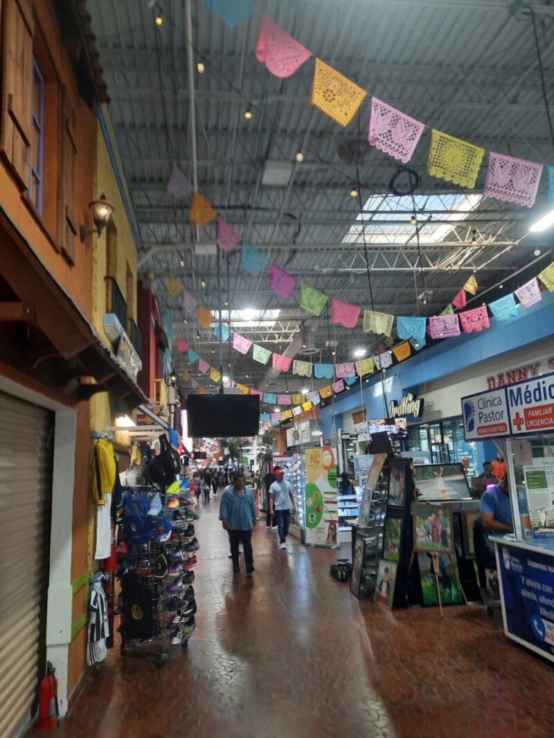
While the center of Buckhead Village mostly consisted of distinctive signs for major brands that index affluence, some storefronts still opted to indicate at least some features from Old School signs such as referring to the product/service in the signage. The core of distinctive signage within the main commercial area reflects what is referred to by Trinch and Snajdr (2017) as “‘low semiotic intrusion.’ This language ideology governs and constitutes an environment where elegance and sophistication are projected through the absence of dense public textual displays” (79). As the aura of affluence radiates from this distinctive core, surrounding signs seem to have incorporated this upper-class style to some fashion. Most signs from distinctive style used either a sans-serif font to indicate modernity or serif font to indicate a rustic style. No pictures are involved in any of the distinctive signs. European languages would be used in some signage (French, Italian, Greek, Gaelic, Latin). One sign in Gaelic explained that it was an Irish pub, an odd clash in messages. This issue of obscurity was also addressed by Trinch and Snajdr (2017), who explained that lack of clarity about what the storefront sells/provides creates a barrier or filter for potential clientele.

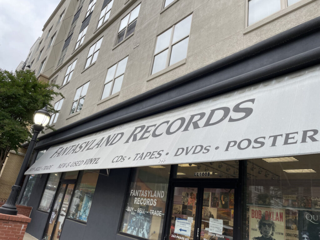
Like the record store photo earlier, other “Old School” signs, found mostly on restaurants, a smoke shop, and an animal hospital, broadcasted what they were providing in bold bright signage compared to the muted palette of distinctive signs. Moreover, the “Old School” signs were found on the fringes of the main island, reflecting the “Distinctive” semiotic intrusion kicking out more noisy signage.
Discussion
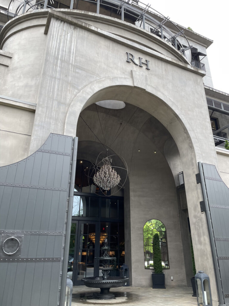
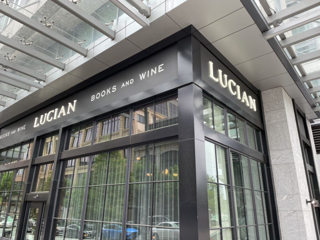
Looking at how the current class structure communicates its status through commercialized properties will let us find opportunities to see how they index meaning. “Old School” style signage indexes a callback to an older urban age of the city. Its signs rely on practical use rather than strict aesthetic taste to attract consumers. If one were to look for LP records, they would rather go to a store titled “Fantasyland Records” which details what can be bought there upfront rather than, say, a store called “Vinylyard” or “Vinyle.” But as income levels rise, the need to differentiate between all the other boutiques and restaurants becomes more apparent. There becomes an intellectual cost of needing a way to decipher what “RH” means or what exactly “Lucian” provides besides “Books and Wine.” What the difference in signage indicates is the competition for customers that each type of business faces. Higher-end brand-name boutiques that rely on associations with other places like Rag and Bone New York or any reference to Paris must compete against each other for the upper-class consumer that does not need to worry about cost as much as status. While stores that use “Old School” signage rely on the practical use of signs to efficiently communicate what they offer to a large, diverse audience, distinctive signage fight for the same homogenized cluster of consumers. As restaurants use QR codes for menus, modern signage does not need to communicate as directly about what they offer but what they are. Moving forward, a comparison study with signs from a lower income area might warrant more prudent results in examining how signs are evolving. I would also like to examine what a hybridization of these styles might show in the shifting landscape of taste and marketing depending on the region.
Trinch, S., & Snajdr, E. (2017). What the signs say: Gentrification and the disappearance of capitalism without distinction in Brooklyn. Journal of Sociolinguistics, 21(1), 64–89. http://dx.doi.org/10.1111/josl.12212.