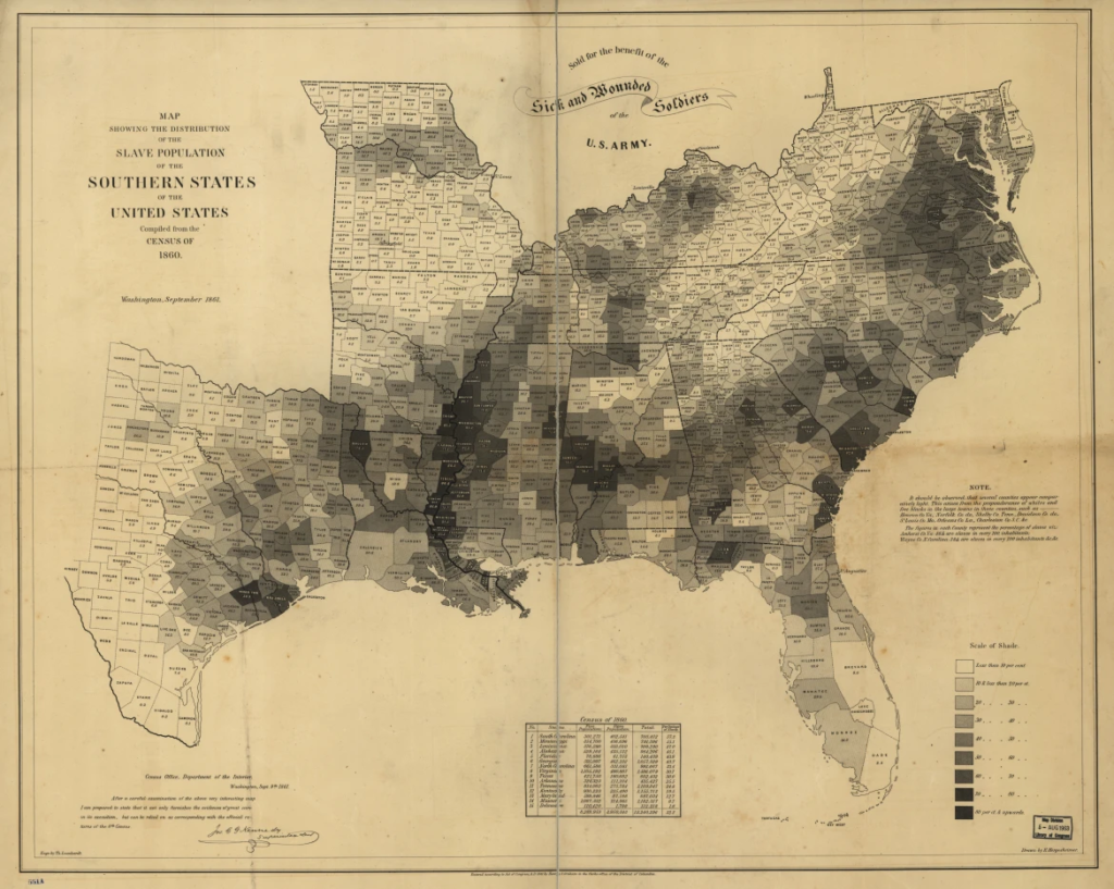
In his discussion, Dr. Gonsalves showed maps of social geography that demonstrated how political determinants of health contribute to discrepancies in public health. His example visually demonstrated how counties with lower life expectancies correlate with the counties where there were the most slaves present (through the “black belt”). I have always been attracted to maps as a form of learning about the world. I loved geography growing up and was obsessed with memorizing all the states, countries, capitals, seas, etc on the globe. Fast forward to my time in college at Emory, and I have been shown maps in very new perspectives. As an anthropology student, I see how boundaries marking state and country borders are arbitrary and invented rather than indisputably natural. However, as a public health student, I see how these abstract lines are extremely powerful in dictating why some people experience different health outcomes than others.
Here is another set of maps:
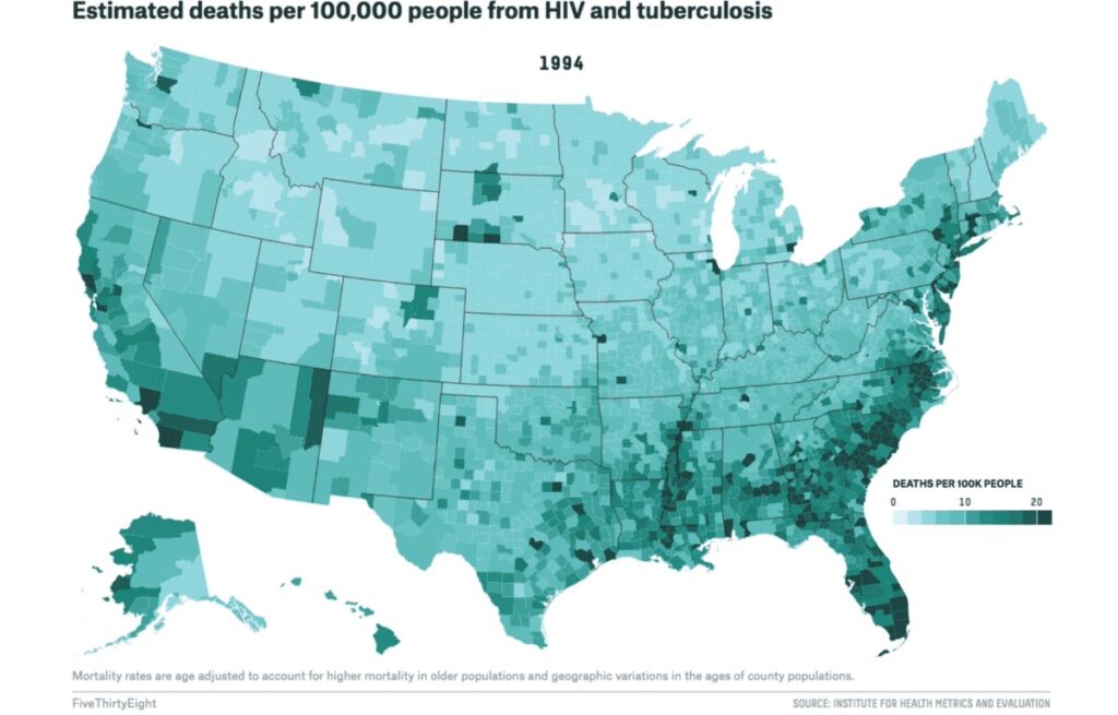
They also show how the black belt corresponds to heightened public issues – in this case, greater rates of deaths from HIV and tuberculosis (in 1994).
Health geography is an important and powerful tool in visualizing how place, environment, and politics can directly impact one’s resources and outcomes related to health. However, it is also important to note the limitations that maps present: they can be heavily biased, and they can contribute towards the reduction of public health issues to stats and numbers rather than impacts on individuals.
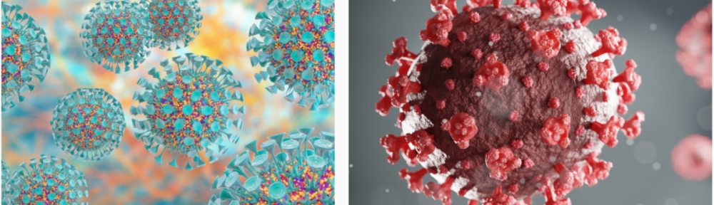
You bring up some good points here. Maps can provide insight into where certain infections are most prevalent and fatal. By seeing which communities need most help, private and public institutions will ideally apportion their resources to mach those needs. Additionally, as we have seen in class, maps are also useful as a study tool. As you point out, however, there can also be biased and misleading. For example, we looked at some different CDC maps throughout the COVID-19 pandemic. Just looking at colors, different maps could create vastly different conclusions from the public about which areas were most impacted by the virus. This could lead to an inefficient apportionment of resources.
Emily, this was a really interesting point to make. Whenever I see maps that show obvious patterns of disparity like the ones Dr. Gonsalves presented or the ones that you posted, I find myself surprised and then quickly wondering: did I really expect something different? It is fascinating how these arbitrary lines humans drew hundreds (or thousands) of years ago still have such an impact on present issues.
Emily, I too think maps can tell a powerful story. But I also agree that is can be hard because the data that is informing those maps can be skewed. I think about how now COVID numbers look low in Georgia if you look at say the New York Times maps, but we know that most people are not testing and if they are, they are using home tests. So we don’t really have any sense of what the numbers are in Georgia other than who is hospitalized or dies from COVID.