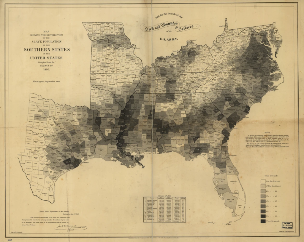
In his discussion, Dr. Gonsalves showed maps of social geography that demonstrated how political determinants of health contribute to discrepancies in public health. His example visually demonstrated how counties with lower life expectancies correlate with the counties where there were the most slaves present (through the “black belt”). I have always been attracted to maps as a form of learning about the world. I loved geography growing up and was obsessed with memorizing all the states, countries, capitals, seas, etc on the globe. Fast forward to my time in college at Emory, and I have been shown maps in very new perspectives. As an anthropology student, I see how boundaries marking state and country borders are arbitrary and invented rather than indisputably natural. However, as a public health student, I see how these abstract lines are extremely powerful in dictating why some people experience different health outcomes than others.
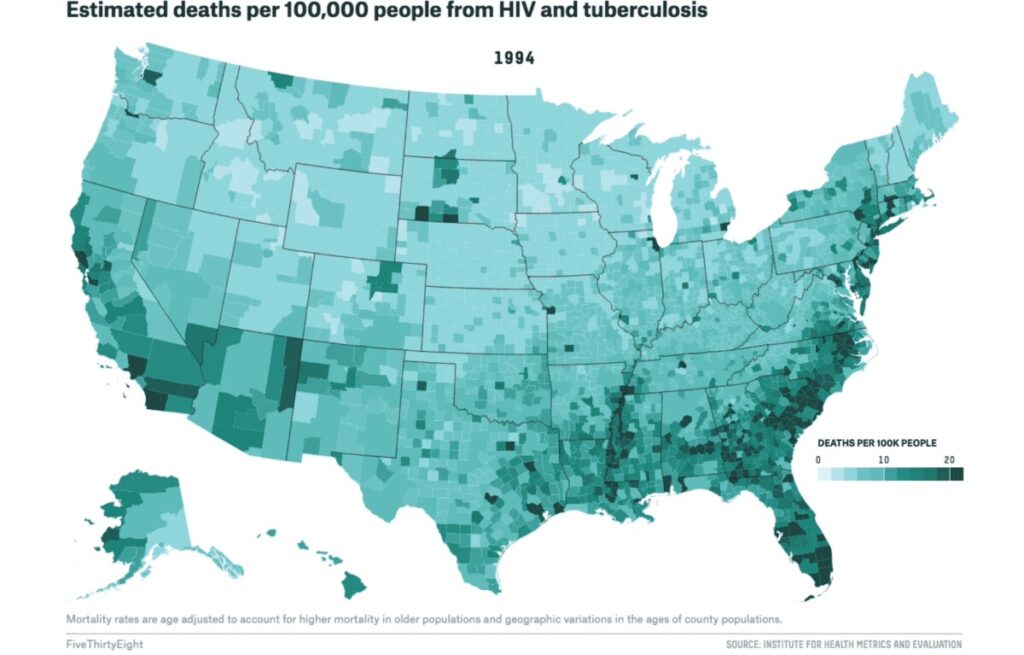
Here is another set of maps:


They also show how the black belt corresponds to heightened public issues – in this case, greater rates of deaths from HIV and tuberculosis (in 1994).
Health geography is an important and powerful tool in visualizing how place, environment, and politics can directly impact one’s resources and outcomes related to health. However, it is also important to note the limitations that maps present: they can be heavily biased, and they can contribute towards the reduction of public health issues to stats and numbers rather than impacts on individuals.
