Critique: USA for UNHCR Infographic
In early January, 2015, I gave $20 to USA for UNHCR, a decision I made after reading a friend’s Facebook post describing the frigid winter weather and low supplies at various Syrian refugee camps. I wanted to contribute in any way I could—to help provide blankets, food, and other necessities to those who needed them most.
After donating back in January 2015, for the past two years I have consistently received monthly fundraising mailers from USA for UNHCR which provide information about the migrant crisis and request additional funds to help. The most recent mailers (July 2017 and August 2017), contain an awareness and fundraising effort that merits discussion and critique.
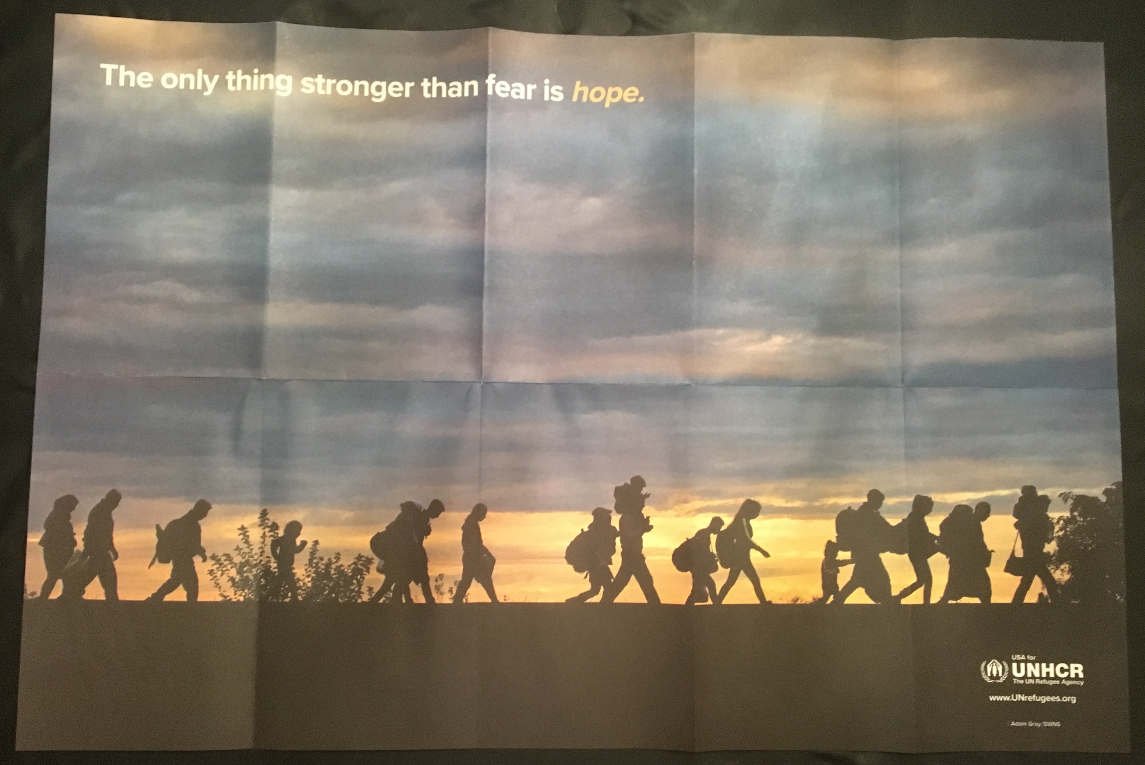
While perhaps not immediately perceived as a “creative work” to be critiqued, the past two fundraising mailers I received contain a 3’ by 1.5’ poster which contains both images and text relating to the global migration crisis. On one side of the poster are the words “The only thing stronger than fear is hope” overlaid on the image of silhouetted figures appearing to be migrants—children, women, men, elderly— only distinguishable through size, hair, attire and posture. The migrants walk in a single direction, across a landscape that is lighted only by faint sunlight at the horizon.

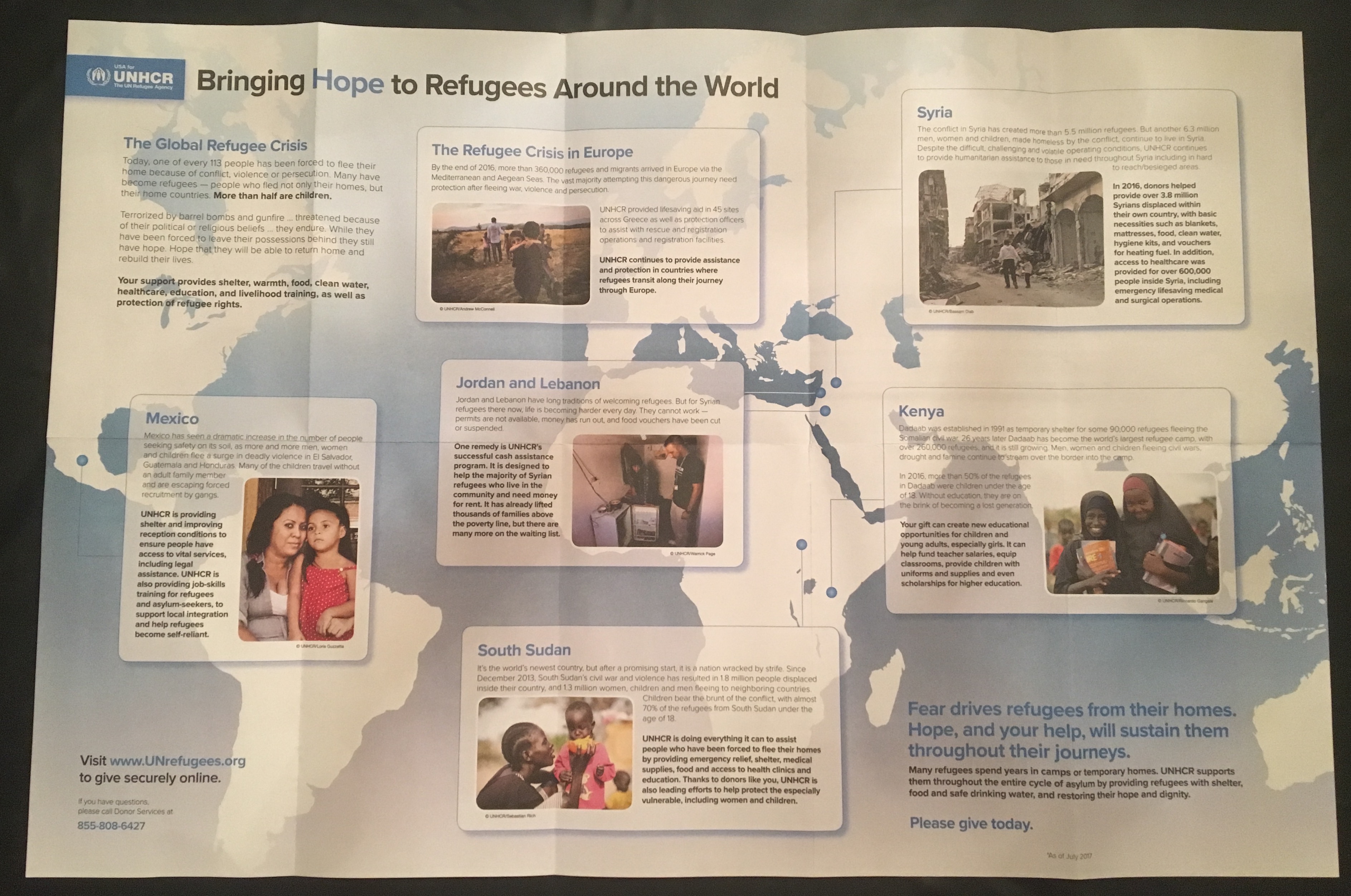
The reverse side of the poster contains an infographic of sorts—location specific text overlaid on a map of select spots—highlighting the global nature of the migration crisis. At the top of the poster is the USA for UNHCR logo, with the words “Bringing Hope to Refugees Around the World.”
Taking a look at the pictures on the infographic side of the poster, one thing is striking—the only faces of migrants that are shown are those of women and children. While there are two images that include the backsides of what are ostensibly male migrants, both images also include young children as a focal point. One additional picture captures a (perhaps migrant) woman standing next to a man wearing an UNHCR shirt and a lanyard—the male appears to be an aid worker, not a migrant. Yet among the other three photos that include only women and children, their faces are the center of the picture and the component that immediately draws the attention of the viewer’s eyes.

I find this incredibly important to discuss and critique for a few reasons. First, one would think that if the purpose of the infographic is to promote an accurate representation of the migrant crisis, the pictures and text would be representative of true demographics. While it can be difficult to find accurate demographics considering the complex and unofficial nature of migration, reviewing the Pew Research Center demographic statistics of global asylum seekers reveals that about 42% of asylum seekers are males between 18-34 years old, with all adult males representing over half, 54%, of asylum seekers. Additionally, the UN 2015 migration report states that among all international migrants, less than half, 48%, are female.
Because the images are not representative of demographic statistics, this suggests that the purpose of the infographic is not to necessarily depict accurate representations of the migrant crisis, but to present information for fundraising purposes—that is, to present information and images that would primarily attract funders. Indeed, this poster is distributed by USA for UNHCR, which as their website articulates, “exists purely as a fundraising office”—rather than functioning as a component of the UNHCR that assists in resettlement or asylum provision for migrants, USA for UNHCR’s central purpose is to raise funds for the parent organization.
Yet if the infographic is used purely for fundraising efforts, this creates a web of interconnected problems that are related to perception, representation and reality. If the materials distributed by a fundraising branch of the UNHCR—the organization that grants refugee status—misleadingly presents “true refugees” as mostly women and children, how does this impact the “ingrained prejudices” that Alexander discusses, which can “easily seep into the decision-making process” for determining a migrant’s refugee status? Indeed, it appears that there exists a self-perpetuating cycle, whereby statically inaccurate yet ingrained perceptions of “true refugees” are both created and reinforced by the systems that actually grant refugee status.
This is the most important reason to critique this infographic promotional material for USA for UNHCR. While it is undeniable that UNHCR is involved in crucial work, providing necessary aid and services to millions of people globally, the organization is not perfect. As it contributes to false representations of migrants, influencing and perpetuating limited representations of the “vulnerable,” the UNHCR also contributes to the unjust systems that determine refugee status based largely on perception rather than determinable fact.
In my research I could not find any critiques that were specific to this mailer infographic, but I did find some criticisms of USA for UNHCR as an organization, largely related to its finances and spending. As an organization, USA for UNHCR spends 22.6% of its annual budget (nearly a quarter!) on fundraising efforts. While fundraising is undeniably necessary to the UNHCR, one critic argues that USA for UNHCR is simply a middle-man that creates additional organizational costs, thereby taking money that could otherwise be used to directly help refugees. Yet as some commenters wrote, because the UNHCR receives nearly all (97%) of its funding from voluntary contributions, it becomes necessary to create a non-profit that is “funding funnel” for UNHCR efforts.
Recent Comments