In this day and age, the way homes, work spaces, and other buildings appear on the inside can be very reflective of the environment we are walking into, or at least this is what our brains cause us to believe. The colors involved in interior design can bring out different emotions in people without us even realizing. In fact, my sister and I started redesigning my bedroom at the beginning of quarantine, and the first thing that I had to decide on was the color of the room. I wanted it to feel clean and simple, so I decided on a color somewhere between white and taupe. After the room was painted, I really liked it because it made the room feel organized and put together. At the same time though, it felt a little cold in a sense, so I added more color to the room with furniture and decorations in order to make it feel more welcoming. This is just one example that shows how interior design can bring about different emotions depending on the colors associated with a room. But, why does this happen?
In one study, people looked at different living rooms through an online 3D model. The rooms had all of the same living room essentials, but each of the models had different wallpaper colors, including red, green, blue, and gray. The emotions that were caused by the colors red, green, and blue were each separately compared to those of the color gray. Each participant was then surveyed to see how each room made them feel. The emotions that they were asked about were anger, disgust, neutral, surprise, happiness, fear, and sadness.
First, red was proven to have caused disgust more than any other emotion, with 35%. Happiness followed closely behind at 33.3%, neutral was at 15%, and surprise at 6.7%. Compared to red, gray was found to lead to even more disgust (36.7%), neutral feelings (33.3%), and sadness (23.3%).
Next, green was found to be related to neutral feelings (36.7%), happiness (33.3%), and disgust (20%). Gray, on the other hand, had 38.3% of participants say it brought them disgust. Neutral was shown to be at 30% and sadness at 28.3%.
Finally, blue was shown to be neutral to 41.7% of participants. Disgust and happiness were tied for 13.3%. Comparatively, gray also led in the percentage of people that found it to be neutral, which was 38.3%. Next, sadness had 33.3% and disgust had 25%.
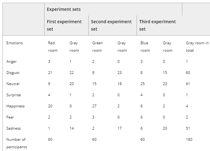
There are several different things we can conclude from these results. First, this study shows that a single color can cause people to have different emotions when it is used in the same space as other colors. For instance, the color gray caused 13.3% more of people to feel disgust when it was paired with the color green than when it was paired with the color blue. Therefore, interior designers or anyone designing a space would know what pairs of colors are good to use and which cause people to feel negative emotions. The results of the study also tell us that colors can make people feel both good and bad. One example of this is when almost the same amount of people felt disgust after seeing a red room as people who said they felt happy when seeing it. Therefore, we can conclude that it is important to look at how a color affects several different types of emotions, just like the study did.
Our brain is able to connect these colors to emotion when our eyes transmit the wavelengths of the light, which we visualize as color, to our brains. Interestingly enough, researchers believe that what our brains associate with each color comes from our personal experiences. In some countries such as the U.S., white is typically viewed as fresh, clean, and pure. In other countries though, white is a color of mourning and therefore, people would not have the same emotional reactions that I did when I painted my room a white color. These findings are very significant because the way we feel can affect a lot of different aspects of our lives, and if the colors used in interior design affect our emotions, we should know which ones are positive and negative. For instance, a work environment should use colors that are proven to not cause stress because we all know working causes enough stress in itself. By simply having the right colors, it could potentially boast employees’ emotions and lead to higher productivity and better mood.
Overall, the results of the study prove that we do associate certain emotions to certain colors. I love the white/taupe color that I painted my room. It makes me feel organized and clean when I walk into it. However, because our personal experience plays a role in the associations we have with colors, there is no possibility to be able to choose a color to paint a room that everyone will love, but the results show that some are definitely better than others. While working with interior design, color and its emotional association is definitely an important aspect to keep in mind!
Citations
Ertem , Ayben. “Psychology and Color .” The Effect of Color in Psychology . Renk Etkisi, renketkisi.com/en/psychology-and-color.html
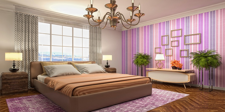
Tungnguyen0905. Interior Design Bedroom 3d Mockup Interior Room.
Ulusoy B, Olguntürk N, Aslanoğlu R. Colour semantics in residential interior architecture on different interior types. 2020;45(5):941–952.