Is “Reiwa” 令和 Authoritarian?

The new Japanese reign name of Reiwa 令和 was released on April 1, and the compound immediately provoked consternation. What exactly does “reiwa” mean? Japanese government officials have focused on the second character, meaning “harmony.” PM Abe Shinzō, for example, explained that “Culture is nurtured when people bring their hearts together in a beautiful way. ‘Reiwa’ has such meaning.” (https://www3.nhk.or.jp/nhkworld/en/news/20190401_36/) The government also explained that reign name draws on a passage in the ancient Japanese poetry anthology, the Manyōshū.

But on the internet, cynics noted that the compound has an authoritarian sound. (https://www.asahi.com/articles/ASM416X59M41UTIL07Y.html)

So is “reiwa” a classical reference to harmony or an authoritarian code word? Here’s a quick text mining analysis of the semantic plurality of “reiwa.”

The first character in the compound “rei” is commonly used as the second character in terms involving command and authority, such as 司令 shirei meaning “commander,” 命令 meirei meaning “order,” and 法令 hōrei meaning “law, ordinance.” The chart below uses the English definitions (from EDICT) of terms ending in “rei”. There is a notable prevalence of phrases involving command and authority.

On the other hand, “rei” has different connotations when used as the leading character in character compounds. The term “reibun” 聞, for example, means an illustrious reputation. In the compound “reitei” 弟,  meaning “your younger brother,” rei is an honorific modifying tei (younger brother).  That honorific sense of “your” is the most frequent term in English language definitions of words starting with 令

So why does “reiwa” sound authoritarian? Largely because the use of 令 as a leading character meaning “good” or “honorable” is now rare. How to judge rarity? One metric is the frequency of terms in Japanese Wikipedia pages. Remarkably, only one compound starting with 令appears in the top 20,000 terms: 令嬢 “reijō,” meaning “your daughter,” appears at 18,604. By contrast, “authoritarian” terms beginning with 令 are more common. “Commander” (司令 shirei) is 781 and “order/edict” (命令 meirei) is 1,234.

What does this all mean? Non-authoritarian meanings of “rei” survive, but only as relatively obscure linguistic fossils. By contrast, the association of “rei” with “command” is common. Federico Marcon has argued that using “rei” in the archaic sense of of “good” and “noble,” while ignoring its authoritarian aura, is akin to using “fascio” to mean “bundle,” while claiming ignorance of the term’s powerful links to fascism. That argument might be extreme, but popular unease with the new reign name can be grounded in the text mining of common usage.

Sentiment Analysis and The “Black Lives Matter” Movement

This post continues a dialogue between Mark Ravina and TJ Greer on text mining and the recent student protest movement. In this entry we examine the potential for sentiment analysis.

Sentiment

Mark: I’m somewhat cynical about sentiment analysis. How much of the emotional valence of a document can really be captured by counting adjectives? But I was intrigued by the “polarity” function in the qdap package, which actually looks at nearby words to see if the meaning of adjective is intensified or negated. For example, “not” before “sad” switches the meaning, but “very” intensifies it. According to the qdap package, Duke is the most negative student document while UVA is the most positive. I wonder if those scores aren’t triggered largely by the frequent use of the word “hate” as “hate speech” by the Duke students. On the other hand, the UVA documents uses “should” a great deal, and just has a gentler tone. What do you think?

TJ: To me the qdap sentiment analysis does capture the general tone of the documents. But what’s equally interesting is how the student activists tend towards -1 (negative), while the administrations tend toward 1 (positive). Though there is only one administration document, the University of Kansas, that tends towards -1, there are a multitude student activists documents that tend toward 1. I made a similar observation about the scatter plots in our previous post. In the word frequency scatter plots, just in this sentiment analysis, student activists were rather diverse in their language patterns. Although student activists used some of the same words as administrators, there were also many terms used solely by students. There was much greater diversity in student activists’ documents, as compared to the administration documents. Here we see this again in regard to sentiment. Though a number of student activists documents have a positive sentiment, administrations almost never have a negative sentiment in the figure. However, I must note that “negative” sentiment in this context has a very different implication than how we intuitively view polarity in documents. In this context, administrations that are more “negative” are actually being responsive to the students concerns and appear to be practicing a form of active listening via the written word, regurgitating student activists’ expression of pain, frustration, and anger and then presenting their respective administration’s perspective on the student activists’ concerns.

Mark: OK, you prompted me to do some number crunching, and your impression are correct. By every standard measure, the sentiment scores are more varied for student demands than for administration responses.

Sentiment scores students administrations
SD (standard deviation) 20.27 15.16
IQR 32.00 18.25
range (max-min) 2.55 2.25

And I became curious about lexical diversity. But the standard metrics there are less helpful. The students demands use roughly 5785 unique words, in contrast to 2516 for the administrations. But standard measures of lexical diversity divide by the total number of words: in our sample 15508 for the administrations and 56650 for the students. So the Type-Token Ratio (TTR) is actually lower for the students at 0.1, compared to 0.16 for the administrations. Of course, that’s probably a reason to distrust TTR.

Mining the Movement: Some DH perspectives on student activism

This is the first of a series of blog post applying text mining and other DH techniques to the evolving student protest movement demanding racial equality. What can DH techniques tell use about student demands and administration responses? Are faculty and students talking to each other or at each other? This project is a collaborative effort between Mark Ravina, a professor of history at Emory University, and TJ Greer, a soon-to-be Emory College graduate and history major.

The project emerged organically and fortuitously. In Spring 2015, TJ took Mark’s junior/senior colloquium on text mining, and then proposed a senior project focusing on the 2016 presidential primaries. Mark agreed, but after learning that TJ was active in the student protest movement, suggested a text mining project focusing on student protest petitions instead. TJ eagerly agreed, but suggested adding administration responses. TJ and Mark then scraped the data: the student demands are from www.thedemands.org/ but TJ supplemented these with administration responses. The current data set is 90 documents: 67 student demands and 23 administration responses

This collaboration has been exciting and productive, but has also raised multiple questions. As the protest movement continues to unfold, how can DH tools inform the movement, and how the protests can inform DH? Reflecting on our own subject positions, how should a fifty-something white professor ally and an African-American student activist work together, combining advocacy and analysis? Our goal, in these posts, is to toggle between these political and methodological concerns, including technical questions of text mining.

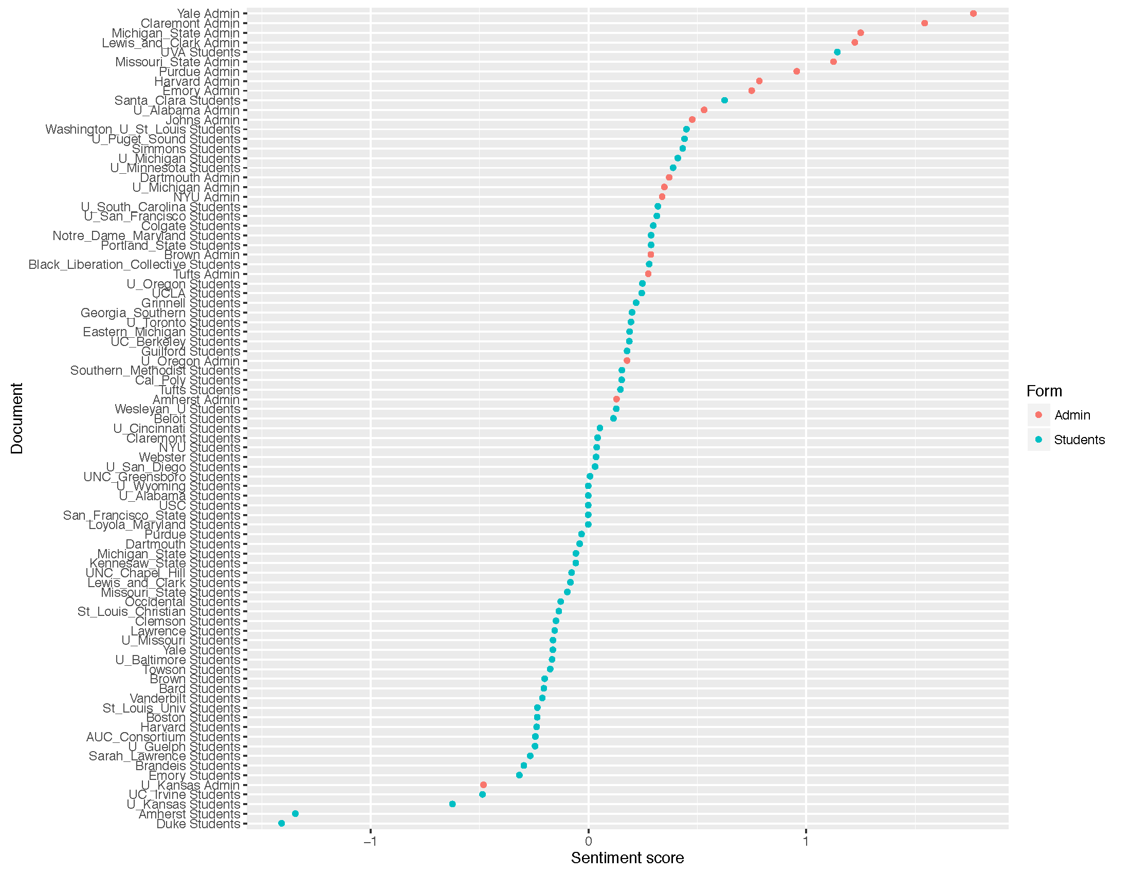
This first blog reflects our first preliminary results, but even at this early stage we feel comfortable with two declarations: one empirical and one political. The empirical observation is that university administrations are largely talking past students, employing a radically different vocabulary than that of student demands. Our political observation is that universities need to address student demands seriously and directly, even if that means admitting that some problems are deeply structural and that solutions will require decades rather than months or years.

One basic measure of the disconnect between students demands and administration responses is lack of overlap between the most common words for each type of document. (Used the stopword list from the R package lsa and also removed proper nouns, such as school and building names). Comparing the 30 most frequent words in student and administration documents (using a standard stopword list), only 13 words appear in both lists. Eight of those 13 words lack a strong political valence: “students,”  “university,”  “student,” “faculty,” “campus,” “staff,” “college,” and “president.”  Only five truly address the nature of student demands: “diversity,” “support,” “inclusion,” “multicultural,” “community.” Notably, even the usage of these five shared terms varies sharply. “Inclusion” is the eighth most common term in administration documents, but ranks 26th in student demands.

Rank Students Administration Common (student rank / administration rank)
1 students students students (1/1)
2 demand university university (3/2)
3 university community student (5/9)
4 black diversity faculty (6/6)
5 student campus diversity (7/4)
6 faculty faculty campus (8/5)
7 diversity staff staff (10/7)
8 campus inclusion community (13/3)
9 color student college (15/16)
10 staff issues president (17/11)
11 increase president support (18/12)
12 center support inclusion (26/8)
13 community programs multicultural (27/26)
14 studies respect
15 college plan
16 demands college
17 president commitment
18 support inclusive
19 cultural free
20 academic diverse
21 office shared
22 training time
23 program forward
24 american ideas
25 administration speech
26 inclusion multicultural
27 multicultural race
28 people action
29 funding freedom
30 department values

The disconnect between students demands and administration responses is revealed starkly in the usage of a few semantically rich terms, such as “color”, “demand”, “increase,” “respect”, “inclusion”, “community.” The first three are used frequently by students but relatively rarely by administration. The latter three are used frequently by administrations but relatively rarely by students.

We decide to explore this disconnect further by developing interactive scatter plot, to turn the differences in word frequency into physical distance. The “dialogue” that follows is an edited version of a series of exchanges, exploring 2D and 3D scatter plots. It is NOT a direct transcript, but reflects the essence of our in-office and email exchanges.

Mark: On the 2D scatter, I’m struck by the contrast between “increase” (x) versus “respect” (y). The student demands run up along the x-axis, with few uses of “respect” relative to “increase.” The administration responses run at a 90 degree angle along the y-axis, focusing on “respect” rather than “increase.” Huge areas of the plot are empty, because few texts use both the terms “respect” and “increase.” A close reading of the texts reveals that, indeed, students demands calls for “increases” in funding and administration responses call for mutual “respect.”  The paucity of points in the center of the graph reflects the paucity of common ground. But what’s remarkable is how “respect” seems to have become a term of the establishment. Demands for “respect” were once a part of student activism. Not anymore.

TJ: There’s something roughly parallel in the 3D scatters for “inclusion,” “community,” and “respect.” The administrative responses (ARs) are disbursed throughout the 3D space, while most of the student demands (SDs) remain in a cluster near the 0,0,0 origin. The terms “inclusion” and community” are much more common SDs than the term “respect.” However, the ARs as a whole use all three of the terms at a higher rate than the SDs. There’s an intriguing outlier, The University of Oregon AR. It does not include “inclusion,” “community” or “respect” and remains tucked away in the corner of the 3D space, at the 0,0,0 point, clustered with the students and away from the other ARs data points. (You may need to rotate to graph to see it). Interestingly, the University of Oregon AR opens with the following: “We have an opportunity to move forward as a campus that embraces diversity, encourages equity, celebrates our differences, and stands up to racism.” This is direct and informative. The documents actually affirms the values of “inclusion,” “community”and “respect” without using those terms. On the other hand, Lewis & Clark’s AR includes the selected terms with the highest frequency amongst the ARs. This AR opens with the following: “In light of heightened concerns on our campus and other campuses around the country, I am writing to reaffirm our commitment to respect and inclusion for everyone in our community.” This is strikingly vague and reveals very little about the true nature of the conversation or the events that motivated the conversation. Although the document uses the terms “inclusion,” “community” and “respect” there is no mention of a target demographic, what their concerns are, or any detailed description of what the University will do to address those concerns. As I engaged in a close-readings of many of these many of ARs and immediately found that it is often impossible to even know what issue is of concern as there is absolutely no details or historical context.

Mark: That’s a great example of the need to toggle between “distant reading” and “close reading.” Word counts and data visualization are great for finding outliers. They are less helpful for understanding texts. How about the student demands? Any outliers? I was stuck by the range in frequency of “black.” It’s not just that ARs don’t use the term. SDs use it at remarkably different rates. It’s over 15% for the Black Liberation Collective and almost 10% for UCLA, but less than 1% for Duke and Brown. The huge number for the BLC is partly an artifact of the document size: it’s only 54 words, and after removing stop words it’s only 31. But that’s not the case with UCLA. What do you think is going on?

TJ: I don’t believe that the low frequency with which university administrations use “Black” (an information-rich, demographic-identifying term) is unique. For instance, the administrations also rarely use specific, topic-appropriate and necessary terms like “color,” “race,” and “racism”. Furthermore, student activists and administrators use the term “Black” as an adjective, modifying various nouns in the demands and responses.  “Black students” or “Black organizations” are more specific phrases than “students” and “organizations.” We are more likely to see the latter, broad terms in the administration responses. While in the student demands, we are more likely to see the use of words like “Black” that let readers know the specific demographic at the center of the wave of student activism.

Mark: That’s a great point. I wonder if that lack of specificity is simply a product of “administration speak.” We can assume that most of the university responses were reviewed and edited by multiple contributors, possibly including a “communications office” and some lawyers. That process may have denuded the documents of some original specificity. Or maybe administrators were drawing on some “respond to students” boilerplate?

TJ: Yes, I think a metaphor would be helpful in our understanding of the differences in the word choice of the administrations and student activists. If there was a horrible tornado that ripped through East Washington community in East Point, Georgia and those affected residents wrote letters to the city council describing the effects the storm, we would expect to see the residents use words like “tornado,” “destruction,” “horrible,” “East Washington,” etc. What if the city council responded with broad words and phrases like “weather-related incident” and “our city?” What if the city council never mentioned the East Washington community, the tornado, or the damages? What if the city council only described the initiatives they had already taken to prepare the city of weather-related incidents or merely praised East Point’s new weather task force and commitment to safety. Thus, I feel like the administrations’ avoidance of the word “Black” is very similar to the city council’s lack of using a phrase like “horrible tornado.” This type of indirectness is pervasive in the administrations’ responses. However, when we look at a institution like the University of Oregon, which does not follow the language patterns of most of the other administrations, we see that the “gap” in word usage between the students and administrations is simply one of details. Documents with specific, topic-related terms use words at a similar rate. Documents with nonspecific, dodgy and fluffy language are clustered together. This is likely why Oregon is such an outlier in the scatter plots. We can this in word clouds. I’ll post the word cloud study later, but they also reveal vagueness in administrations’ responses. Word clouds of the student demands are filled with detailed language, while administration responses appear “political correct” and limited in the diversity of words, particularly race-related adjectives and phrases.

It’s not a debate between “Black” or “people of color” or “underrepresented minorities.” It’s a matter of directness versus indirectness. Vagueness versus details.

Mark: Another great point. I makes me wonder how we might measure “vague” versus “specificity.” But there is certainly a boldness in the student language that’s lacking in the administration responses. For example, some of the demands use neologisms such as “latinx” and “latin@” as gender-netural alternative to Latino/Latina. I put “latinx” in the pulldown menus because it was new to me and intriguing. Those terms never appear in administration responses. The example of “latinx” and “latin@” has made me question conventional computational linguistic techniques such as stemming, since that would probably reduce Latino, Latina and Latinx to the root “Latin-.” In our case that technique would denude the texts of their political meaning. The term “latin@” confounds basic text parsing methods because the ampersand is read as punctuation and “cleaned” out of the texts. In fact, even ignoring case seems problematic: there’s certainly a difference between “Black” and “black,” but basic text mining shifts everything to lower case. This project has actually made me leery of using basic text mining packages, or at least the standard methods of “cleaning-up” texts. History is dirty. So where to next?

TJ: How about continuing our work on sentiment analysis?

Mark: Yes, let’s find compare algorithms see what we’ve got in out next post.

Smooth and Rough on the Highways of France

In a previous post I suggested that historians should use quantitative methods less to answer existing questions than to pose new ones. Such a digital humanities (DH) approach would be the reverse of the older social science history approach, in which social science tools were use to “answer” definitively longstanding questions. This post offers another example of how data visualization can suggest new questions, and how social science and humanistic methods can be complementary in unexpected ways.

One way to conceptualize this complementarity is John Tukey’s observation that “data = smooth + rough,” or, in more common parlance, quantitative analysis seeks to separate patterns and outliers. In a traditional social science perspective, the focus is on the “smooth,” or the formal model, and the corresponding ability to make broad generalizations. Historians, by contrast, often write acclaimed books and articles on the “rough,” single exceptional cases. These approaches are superficially opposite, but there is an underlying symbiosis: we need to find the pattern before we can find the outliers.
two

two

To highlight this complementarity, I pulled data on traffic on the French highway system from a blog on econometric methods. The data is clearly periodic, and for the blogger, Arthur Charpentier, the key question is how to model that periodicity. An autoregressive (AR) model? A moving average (MA) model? Autoregressive integrative moving average model (ARIMA)? Or maybe we should use spectral analysis to decompose the series into a collection of sine waves? These technical questions are important, and non-economists encounter these issues, if unwittingly on a daily basis when we read about “seasonally adjusted” inflation or unemployment.


My quantitative/econometric chops are just good enough to enjoy experimenting with these methods, and while the details are complex, the core ideas are not. The graph below, a periodogram, shows that the traffic data has a strong “pulse” around the twelve-month mark and much smaller pulses around the four and three-month marks. There is a strong annual rhythm to the data, with several weaker seasonal pulses.

five

Now it’s great fun to play with sine waves, but as a DH historian, I would parse the data in different fashion. The periodogram, ironically, obscures the cultural aspects of periodicity. When exactly does traffic peak? Remapping the data confirms some conventional wisdom about France. Highway traffic peaks each year in July and August, as everyone heads to the forest or the beach. Yes, that’s why it seems like the only people in Paris in August are tourists.

ten

We can also visualize this annual cycle using polar coordinates, mapping the twelve months of the year as though they were hours on a clock, and visualize traffic volume with a heatmap, using darker colors for higher volumes of traffic. Kosara and Andrew Gelman had a valuable exchange on the merits of such visualizations, Kosara arguing in favor of polar coordinates and spirals, but Gelman noting the power of a conventional x-axis. It’s too rich for a quick summary—read their ideas!

five

But from a DH perspective the most interesting thing about the data is not the trend, but the outlier. Look at the traffic for July 1992. It’s markedly below expectations. But then traffic was higher than average for August. What’s going on?

I let my freshman seminar students loose on the question and they quickly came back with an answer. The 1992 outlier corresponds to a massive truckers’ strike, sparked by a new system of penalties for traffic violations. Truckers blocked major highways for days and the French government deployed the army, which used tanks to clear the roads. The strike had an impact across the French economy and occupancy in vacation resorts dropped below 50%

ec-9-1-300x225

It is here that social science and humanistic paradigms tend to part ways. For an economist, the discovery of the strike explains the outlier. She can delete that observation, or include a “dummy” variable and move on, satisfied that the model now better fits the data. There is more “smooth” and less “rough.” For a labor historian, this “rough” can become a research question. Why, of all the labor actions in the 1990s, was 1992 strike so striking in its impact? Was this a high water mark for French labor mobilization? Or did it inspire further actions? Did its impact on vacationers sour the general public on labor? And did the government back down on its regulations? For a historian, explaining this single outlier can be more important than understand any trend. The paradox is that the magnitude of outliers becomes clearer once we’ve modeled the trend, either visually or mathematically. The “drop” in traffic in July 1992 exists only relative to an expected surge in traffic. Thus, as I suggested in a previous post, historians need to build models and throw them away.

Leon Wieseltier writing about DH is like Maureen Dowd writing about hash brownies

What’s most striking about Leon Wieseltier’s essay in the New York Times Book review is how it confirms almost every cliché about the humanities as technophobic, insular, and reactionary. Not to mention some stereotypes about grouchy old men. Now I should confess at the outset to being a longtime Wieseltier cynic. His misreadings of popular culture always seemed mildly ridiculous. But what’s striking about the NYT piece is his vast ignorance of the subject. Wieseltier writing about digital humanities is like Maureen Dowd writing about hash brownies . Note to New York Times editorial writers: show a remote understand of the subject. Your ignorance is not a cultural crisis.

This line in particular, caught my eye: “Soon all the collections in all the libraries and all the archives in the world will be available to everyone with a screen.” Really? On what planet? Perhaps Wieseltier was thinking of this 1999 Qwest commercial for internet service?

Now I’m a specialist in Japanese history, and I’m certain that the millions of pages of handwritten early-modern documents in archives across Japan will not be all online “soon.” But even assuming that for Wieseltier “all the libraries” might mean modern publications in English, French and Hebrew, this is just nonsense. Has Wieseltier noted the metadata problems on Google Books? Or would understanding the limits to digitization be too much to ask?

What’s tragic about Wieseltier’s mindless opposition of the humanities versus technology it that it precludes exactly what we should be teaching: how to employ critical thinking when using technology. Dan Edlestein has a marvelous essay exploring how to search for the concept of “the Enlightenment.” His piece shows how, first, one can’t do a search without a basic understanding of the history of the Enlightenment itself, second, that quirky results are more than “mistakes.” Parsing weird and unstable search results can inform our understanding both of digital technologies and the history of ideas. The need for critical thinking in database searches actually proves the ongoing relevance of humanities in the internet age.

Of course, at the heart of Wieseltier’s panic is the “decline of the humanities.” Too bad Wieseltier doesn’t read the Atlantic. The humanities aren’t in decline. “The same percentage of men (7 percent) major in the humanities today as in the 1950s.” The overall drop over that period came from women, who began to pursue careers in the sciences because of the end of institutional gender bias. But that analysis came from the great digital humanities researcher Ben Schmidt. And understanding it would require taking both numbers and gender seriously. Which apparently is something great humanistic minds need not do.

Baseball, Football, Moneyball

In fall 2014 I taught a freshman seminar on data visualization entitled “Charts, Maps, and Graphs.” Over the course of the semester I worked with the students to create vizs that passed Tukey’s “intra-ocular trauma” test: the results should hit you between the eyes. Over the coming months I’ll be blogging based on their final projects.

Today’s post is based on the work of Jeffrey You, who used US professional sports data, comparing baseball and football. As Jeffrey noted, the vizs highlight two key differences between the sports. First, the shorter football season (16 vs. 162 games per season) means that many football teams finish with the same record. The NFL scatterplot is therefore striated, and the winning percentage looks like a discrete variable. In fact there are limited outcomes for both baseball and football, but 162 possibilities looks continuous while 16 does not.

BaseballFootball

The other contrast is relative importance of total payroll in baseball. In neither case is there a strong correlation, but football is astonishingly low: r= 0.07 for the NFL compared to r=0.37 for MLB. What’s going on? Jeffrey suspected that injuries might play a greater role in the NFL, so a high payroll might pay for less actual playing time. He noted as well, the greater importance of single player. Tom Brady, he noted, was a 199th draft pick with a starting salary of “only” $375,000.

The graphs also highlight the greater payroll range in MLB compared to the NFL. The regression line for MLB suggests that increasing a win-loss record by one game costs about $8 million. But the payroll spread in MLB so large that it can become a dominant factor. Jeffrey noted that for 2002-2012 the average payroll for the Yankees was $162 million while that of the Pirates was merely $41 million. For that same period, the Yankees have never won less than 50% of their games while the Pirates never won more than 50%. There is no comparable phenomenon for football. The standard deviation for MLB payrolls is about $35 million but for the NFL it’s less than $20 million.

Total

NB: Technically, one should use the log of the odds rather than use winning percentage as the dependent variable, but in this case the substantive results are the same. For MLB the values range from 25% to 75%, in the more linear range of a logit relations. For NFL, there’s no appreciable correlation in either a linear or a logit model.

Gender bias . . . across the galaxy

In TV and movies men talk more than women, and women talk mostly about men. Hence the Bechdel test. But I thought I’d do a dataviz for this phenomenon using Ben Schmidt’s implementation of Bookworm. His data scraper uses the Open Subtitles database of closed captioned subtitles for hundreds of TV shows. While it can’t measure who’s talking it can measure who’s being talked about. Not surprisingly, the pronoun “he” is substantially more common than “she” for all TV shows. The only exception is 1951 (at the far left), where the sample is small a skewed by a few episodes of “I Love Lucy.”

All TV

As you might expect, shows about women feature “she” more often, although even “Gilmore Girls” has a lot of “he.” But compare that to the dominance of “he” in a testosterone-fueled drama like “24”

Gilmore Grils24

But how about Star Trek as a controlled experiment? The Star Trek spin-off “Voyager” featured Kate Mulgrew as Capt. Kathryn Janeway, in contrast to the male commanders on “The Next Generation” and “Deep Space Nine.” Again, no big surprise: more “she” with a woman in charge, although in only a few episodes does “she” actually exceed “he.”

Star Trek Voyager

Star Trek TNG


chart (2)In an upcoming post, I’ll grab the raw data and post some “he/she” ratios, but this was too much fun not to share.


Fearbola, Ebola and the Web

My nasty “cold” has been diagnosed as Influenza A, so it’s bed rest for 48 hours. And, of course, blogging about why Ebola gets all the news but not good ‘ol killers like influenza. I got CDC figures for deaths and then ran Google searches for the related terms, totaling the number of hits. I was surprised at first. The number of hits seemed to roughly correspond to the death rate. Ebola was way off, massively over reported, but the general trend seemed right. However . . . .

Big_ebola
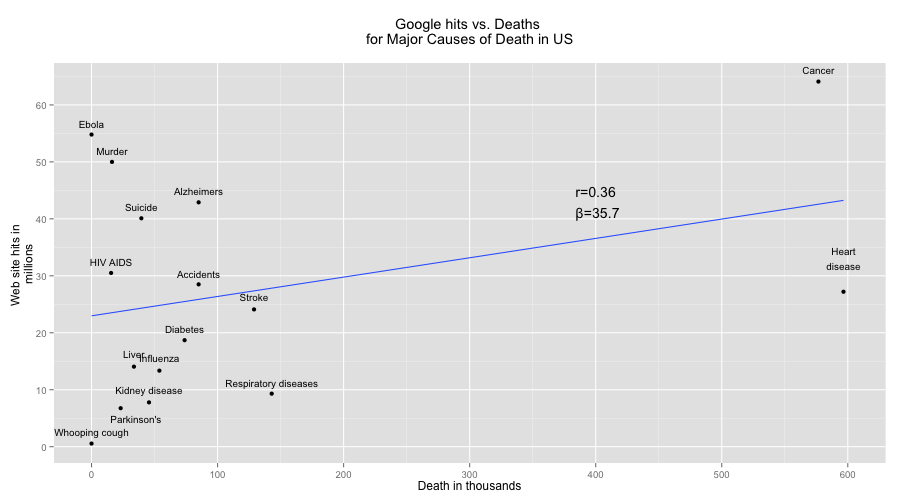
But that’s just an artifact of cancer and heart disease, which kill four times as many Americans as the “runner up,” respiratory diseases.

Small_ebola

Once we remove these two, the data shows what I was looking for: presence on the web and mortality have no discernable relationship. In fact, the weak correlation is negative. Respiratory diseases are the number one killer after the cancer and heart disease, but they are not, it seems, web savvy. Same for kidney disease. Anyone have a t-shirt from the “Nephrotic syndrome 5K and Fun Run”? Didn’t think so. And don’t get me started on the flu, the Rodney Dangerfield of infectious diseases. In some cases, the abundance of websites makes sense. HIV AIDS transmission has plummeted becasue of public education. But why is Alzheimer’s a web sensation, whereas stroke is ho-hum? And, in some cases, these mismatches point to dangerous pubic confusion about risk. Heart attacks are considered a “man’s problem” but it’s a major cause of death for women. The relatively weak web presence of heart disease probably flags this gendered misperception, which then leads to the under-diagnosis and under-treatment of women.

Name Web hits Deaths Web search term CDC term
Ebola 54,800,000 1 Ebola deaths US Ebola
Whooping cough 549,000 7 Whooping cough deaths US Whooping cough
HIV AIDS 30,500,000 15,529 HIV AIDS deaths US Human immunodeficiency virus (HIV) disease
Murder 50,000,000 16,238 Murder deaths US Assault (homicide)
Parkinson’s disease 6,760,000 23,111 Parkinson’s disease deaths US Parkinson’s disease
Liver disease 14,050,000 33,642 Liver disease deaths US Chronic liver disease and cirrhosis
Suicide 40,100,000 39,518 Suicide deaths US Intentional self-harm (suicide)
Kidney disease 7,780,000 45,591 Kidney disease deaths US Nephritis, nephrotic syndrome, and nephrosis
Influenza Pnuemonia 13,350,000 53,826 Influenza deaths US PLUS Pnuemonia deaths US Influenza and Pneumonia
Diabetes 18,700,000 73,831 Diabetes deaths US Diabetes
Accidents 28,500,000 84,974 Accidents deaths US Accidents (unintentional injuries)
Alzheimers 42,900,000 84,974 Alzheimer’s deaths US Alzheimer’s disease
Stroke 24,100,000 128,932 Stroke deaths US Stroke (cerebrovascular diseases)
Respiratory diseases 9,310,000 142,943 Respiratory disease deaths US Chronic lower respiratory diseases
Cancer 64,100,000 576,691 Cancer deaths US Cancer
Heart disease 27,200,000 596,577 Heart disease deaths US Heart disease


Visualizing Ebola

The Guardian recently posted a dataviz comparing Ebola to other infectious diseases. It’s from a forthcoming book entitled Knowledge is Beautiful and it is indeed beautiful. Unfortunately, it’s a really bad viz. Below is my alternative viz (using the Guardian’s data), along with a critique.

The basic issue is evolution. Because viruses reproduce quickly so they’re a great example of Darwin at work. Basically a win for a virus is to reproduce a lot. A lot, a lot, a lot. Darwin is simple that way. So once a virus has infected a host, it makes sense to breed like crazy. With one caveat: if you over-reproduce and kill the host, you might lose your transmission vector. So be careful. And if you wait too long, the host might recover: her immune system might learn how to wipe you out. So viruses have to balance virulence and transmission efficiency. You can kill your host quickly, but then you’d better have lots of means of infecting other people. Alternately, if you’re willing to let your host drag around for a week with the sniffles, going to work and school, then you don’t need to be especially infectious. The host will give you plenty of occasions to find new hosts. (I’m blogging with a head cold so this is personal). But overall we should see a clear pattern: more lethal viruses should be more transmissible.

Indeed, my viz below (using the Guardian’s data) shows this rough correlation between virulence and transmissibility. Salmonella doesn’t last long on surfaces, but instead it lets its infected host live and spread the disease through other means. C.diff and tuberculosis are more lethal, but they can survive on surfaces for longer. The Norovirus seems like an outlier, but this makes sense. It spreads primarily through surface contact, so its durability on surfaces is unexpected high. By contrast, Bird Flu is unexpected weak on surfaces, but it spread primarily through droplets. And Ebola is weak on surfaces because it spreads overwhelming through bodily fluid.

Ebola

But it’s clear that the Guardian’s data is extremely buggy. The data are scraped from the web and are full of errors: HIV does NOT survive on dry surfaces for seven days. That’s probably seven hours. Same for syphilis.

An even bigger problem is that Guardian viz seems to refute Darwin. On their graph deadly diseases seem LESS infectious. What’s going on? First, their x-axis doesn’t make much sense. The reported average rate of infection doesn’t tell us about how well a virus might spread under neutral or ideal conditions. Rather, it tells us how people and public health systems respond to outbreaks. HIV transmission, for example, has dropped in around the world because people have intervened to cut off disease vectors. The difference in HIV prevalence around the world tells us about education, public health, and culture, but not much about the virus itself. Also the x-axis should be on a log scale. And the y-axis should be on a logit scale. Using the fatality rate on a linear scale builds a non-linearity into the relationship, since fatality has to asymptote near 0% and 100%.

So the Guardian graph is indeed beautiful. But it also misuses faulty data to refute evolution. Outside of that it’s great. I’m going to take more ibuprofen now.