2018 Canvas Data Trends

In this post, I want to share our data-based analysis of how Eagles use Canvas. Four dashboards created with Tableau are embedded below as captioned images. I want to highlight three trends:

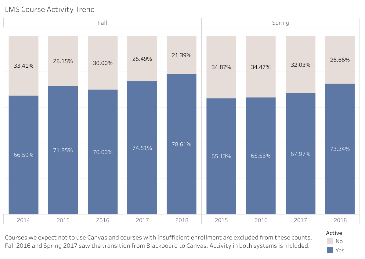
  1. The percentage of active courses hit new highs for the Spring and Fall terms in 2018, 73.34% and 78.61% respectively (more than 1,900 courses were active in each term).
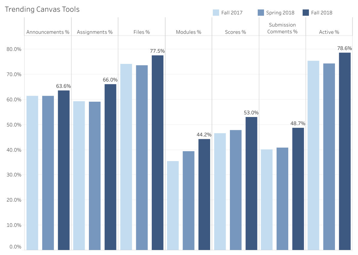
  2. Several features were more popular in Fall 2018 than ever before. Old standbys – Announcements, Assignments, and Files – lead the way followed by Canvas’s course material organization tool – Modules – and online grading features – Scores and Submission Comments.
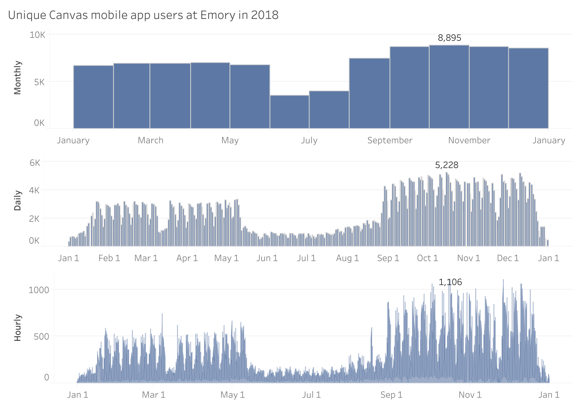
  3. Thousands of individuals at Emory use Canvas mobile apps every day. From Spring to Fall, the number of peak daily mobile app users increased by more than 50% and the number of monthly app users increased by more than 25%.
We have reported LMS (learning management system) course activity for almost five years using the same basic definition of course activity: having some content and some student access.
This chart’s percentages represent the proportion of all term courses with content of the given type. This means, for example, that almost all active courses contain some file uploads. I selected tools for this view to highlight the most striking trends. But Conversations (a.k.a. Inbox, a.k.a. Messages), Discussions, Quizzes, and Pages also saw increased use in Fall 2018.
When we put this dashboard together, we were pleasantly surprised how many individuals access Canvas via mobile apps each month. In the Fall semester, big growth in mobile app usage surprised us again with peaks in October of almost 8,900 individuals in the month, over 5,200 individuals on the peak day, and over 1,100 individuals in the peak hour.
This dashboard highlights when mobile apps are proportionally more and less popular than all agents (browsers) for accessing Canvas. It also shows that mobile app usage remains a steady proportion of daily users as the total numbers increase in 2018.