You’re given two minutes. With your time, do you
- improve the student learning experience,
- increase your course’s attractiveness, or
- make content easier to find?
The great news is that all three can be accomplished in record time!
Course menus are often left with the default list that makes them long and confusing while many items may go unused. Don’t use LockDown Browser or New Analytics? Not even sure what they are?

To reduce the number of unused or unwanted items that are visible in your course navigation, follow the steps below.
Select Settings > Navigation tab

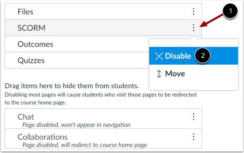
Either drag an item to the Hidden section towards the bottom, or (1) select the three dots to the right of any item and (2) choose Disable.

Alternatively, you can add items that are disabled in the Hidden section by dragging them up to the Visible section, or choosing Enable from the three dots feature.
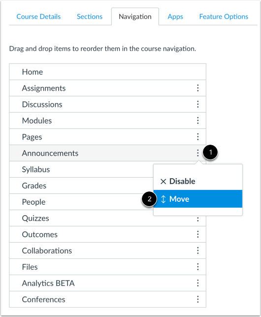
You may also try reordering your menu to suit your priorities as well as your students’. Prefer to have Modules listed above Grades, or perhaps Discussions above Assignments? Simply drag an item above or below others, or (1) select the three dots to the right and (2) choose Move.

When you’re done, don’t forget to click Save at the bottom of the page. Be sure to also check your handiwork using the Student View button in the upper left. You’ll get a chance to experience your new-and-improved menu the way your students will!

