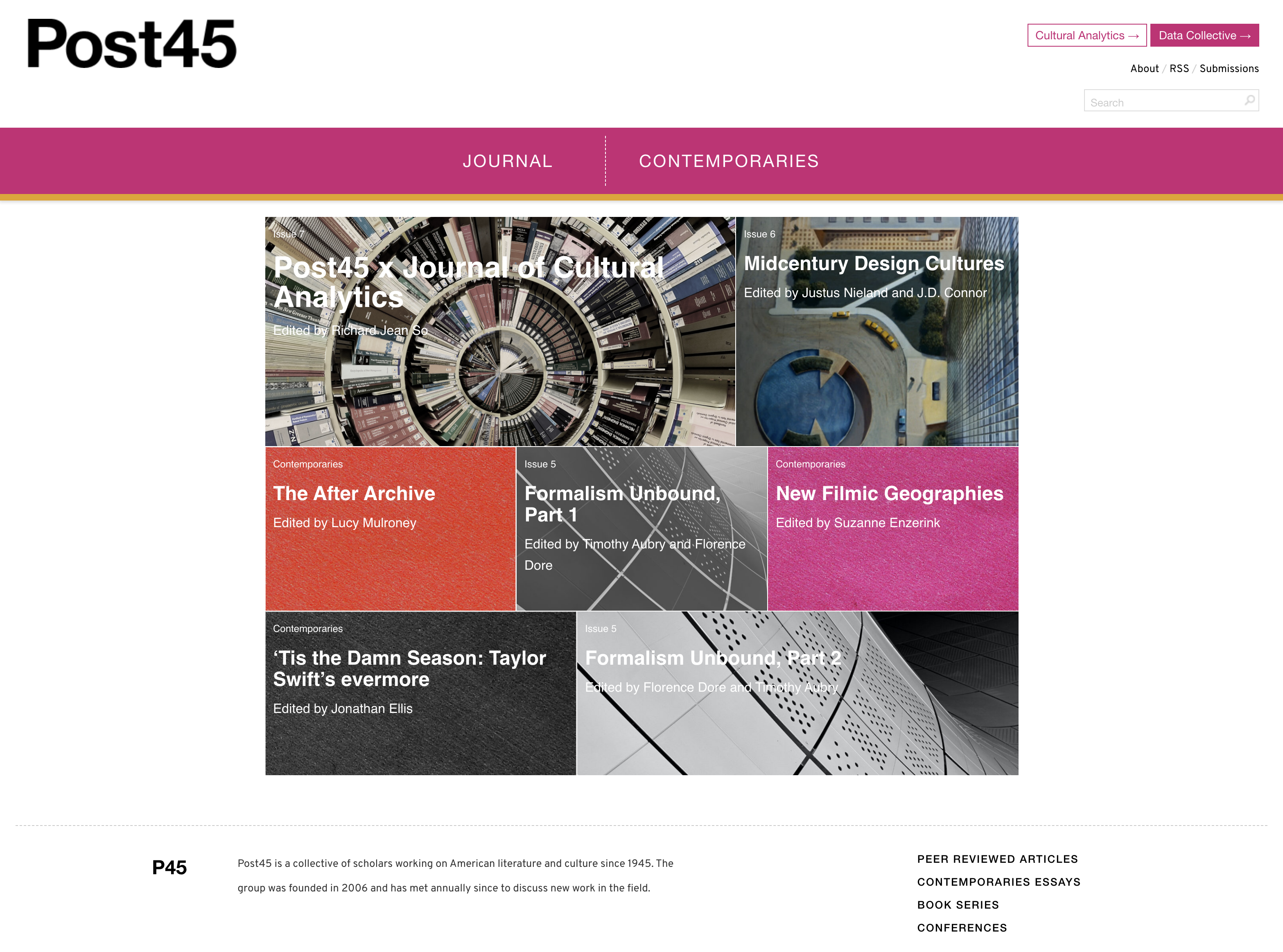
Back in March 2020, the Emory Center for Digital Scholarship (ECDS) hosted a launch party to celebrate the move of Post45 (a leading open-access and peer-reviewed journal of contemporary literature and culture) to Emory University. ECDS facilitated the transfer of Post45 to a new ECDS-maintained website, which has now been redesigned thanks to the work of ECDS Digital Scholarship Specialist Kayla Shipp. The launch of the redesigned website coincides with the publication of a new journal issue, “Post45 x Journal of Cultural Analytics,” as well as the launch of a new project, the Post45 Data Collective, whose website was also designed by Dr. Shipp.
-
Journal Website: post45.org

After Post45’s move to ECDS, Shipp met with the editorial team to discuss redesigning the journal. The team and editorial board wanted to maintain the site’s look and feel, which were recognizable to Post45’s current audience, but agreed that the UI/UX could be updated to make the journal more legible and accessible to a broader audience. The previous organization and presentation of the site worked for readers already familiar with its content and who knew where they wanted to go, but Shipp focused the redesign on giving all readers several clear pathways through the site based on their level of interest.
UX
Post45 has two distinct halves: the journal and the blog Contemporaries. The journal is a collection of peer-reviewed articles organized by issue, and the Contemporaries side is comprised of a series of essay clusters organized around different themes. From the site:
Journal
This section “aims to publish high quality, field-shaping work on any aspect of American literature and culture since the mid-twentieth century.” The journal page states that, unlike “many web-based journals, Post45 will not look to trim its essays to fit the imaginary, shortened attention span of the online reader. Neither will we automatically reject essays that fall outside the typical length of essays in academic journals—the mind-bending twelve-page position piece and the 50-page archival breakthrough can both find a home here. The publication format allows for embedded film clips, audio, images, and other digital objects.”
Contemporaries
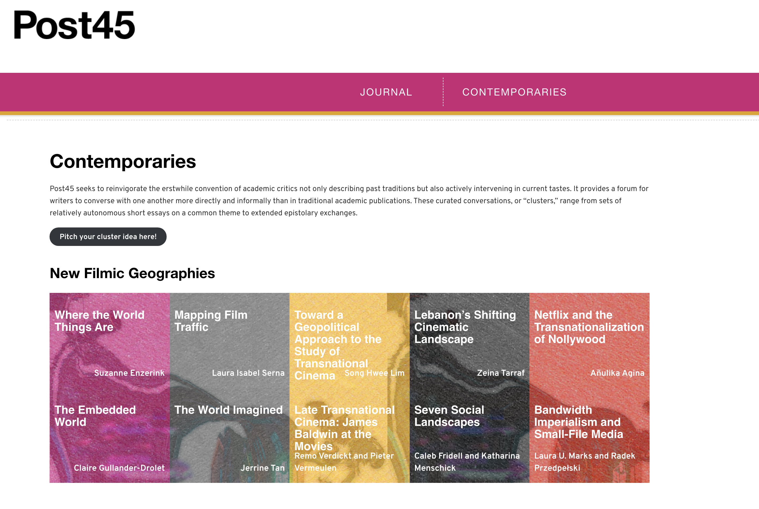
The Contemporaries section of Post45 publishes “clusters” of themed posts. It describes itself as “reinvigorating the erstwhile convention of academic critics not only describing past traditions but also actively intervening in current tastes. It provides a forum for writers to converse with one another more directly and informally than in traditional academic publications. These curated conversations, or ‘clusters,’ range from sets of relatively autonomous short essays on a common theme to extended epistolary exchanges.”

The former site did not clearly differentiate between and highlight Post45’s two distinct publications. Since its inception Post45 has added many journal issues and Contemporaries clusters, but past issues and clusters were previously discoverable only through sub-menus, and single articles and essays unattached to issues and clusters were essentially orphaned. In the redesign, we simplified the menu to direct readers to the landing pages for the two halves of the site. The Contemporaries side now features the most recent essay cluster, as well as a catalog of past clusters at the bottom; the journal page features a complete list of journal issues. Each journal article and Contemporaries essay includes a link back to its associated issue or cluster, and a grid of related reading at the bottom. We created separate categories for articles and essays, which allow readers to browse the full site content by category. We also added a link for submissions, and a button directing visitors to the newly-launched Post45 Data Collective.
UI
While the project team wanted to preserve the general aesthetic of the original site—especially its frequent use of high-contrast colors and translucent image grids—the previous version of the site was difficult to read on mobile devices, so we created a responsive, full-width layout. The new layout uses white space to draw attention to the images and text without requiring readers to zoom in or adjust their screens. The former site also used a light, extra small serif font for the article and essay text, which was not accessible to all readers and was especially tiring to follow in the journal’s longer pieces, so we updated the body text with a dark, modern sans-serif font.
Back end
During the redesign process we also upgraded the site to the newest version of WordPress. Shipp managed the project, redesigned the site, and updated the CSS; ECDS Senior Software Engineer Yang Li updated the template PHP. Tyler Tennant was instrumental in brainstorming the new design and implementing content updates during the site migration, and Arthur Wang and Dan Sinykin (and the rest of the editorial board) shared key background information and feedback.
Sinykin, Assistant Professor of English at Emory University, remarks that the redesign highlights the evolution of Post45’s content, especially the regular publication of journal issues and Contemporaries clusters. “Kayla’s redesign has opened up Post45,” he adds, “making the website an inviting space for visitors to come, explore and linger.”
