
Last month, I was trying to analyze books we bought in a previous year from a specific vendor. To do so, I wanted to create a script that would take a data from a spreadsheet, send a query to the Library of Congress API, and then process the response. I had never done this. I am an American Studies scholar by training. To tackle it, I pulled out Lynda.
Lynda.com is the secret weapon of anyone who hasn’t been trained in doing a specific technical skill, from programming to presentations, or for anyone who needs to know just-a-little-more in an area they are familiar with.
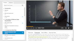
Lynda courses, which range from Mac shortcuts and SPSS to podcasting and 3-D animation, have two parts: video instruction and exercises. The instruction is broken up into lessons with clearly labeled parts. It is done with through high quality video and includes easily navigable transcripts that you can use to follow along, find subjects, or quickly gloss topics. The exercises are downloadable and allow you to practice the skills you are learning.
I have used Lynda to learn Excel, Python, making network graphs, APIs, Tableau, Photoshop, information literacy, and video editing. It is a great first step, which I usually supplement with message boards (like Stack Overflow) and web tutorials as I get into a project.
Emory Libraries allows you to access Lynda for free. Just go here and sign in: http://it.emory.edu/lynda/.
To start the new year by learning new skills, Woodruff Library is hosting the Lynda course Data Visualization Tips and Tricks beginning on Thursday, January 12, 2016, 2:30-4:00 in Woodruff Library Room 312. Students, faculty, and staff are invited to attend.
Presented by award-winning data visualization expert Matt Francis, this software-agnostic course provides as a bank of knowledge and best practices. Learn how to choose the right visualization for your data, and answer the 5 key questions you should ask yourself at the beginning of every project. Topics include understanding the relationships between data sets, making comparisons, charting relationships, visualizing data distributions, creating maps, and—most valuably—knowing when to use which types of graphs and charts. Matt also teaches you how to understand what others are doing with their own visualizations, ask informed questions, and look with a critical eye at the work of others.
We will learn together, doing the six lesson course over three Thursday afternoon sessions: January 12, 19, and 26. There is no need to RSVP, just show up! We’ll spend the first 45 minutes watching video lectures, then we’ll do the exercises together. While the principles of the course can be applied using a range of software, the course exercises use Tableau Public. The software will be on the computers in 312, but if you want to bring a laptop, you can install it in advance.
Contact Katie Rawson, katie [dot] rawson [at] emory [dot] edu, if you have questions.
To read more about Lynda at Emory: https://scholarblogs.emory.edu/woodruff/fyi/lynda-com